As the curtain comes down on the 2006/07 campaign, next season will see the Boro sporting a brand new club badge - but why the need for change?
Dave Allan, the club's Press and Media and Communication Director, recently revealed the reasons for altering the current crest in our Boro fans forum.
He said: "The current badge goes back to 1986 and at that time we felt there was a need to distance ourselves from the club that had gone bust, so back then it was all about the re-birth of the club and starting again.

"We're now 21 years on from that and we had to ask ourselves 'is 1986 what we are about now?' and we don't think so.
"We believe it's time to recognise the heritage of the club going right back to 1876 and the new badge will recognise that as well as looking forward to the future."
Colours and Crest
Although Middlesbrough F.C. was formed in 1876, it wasn't until 1899 that they adopted their current colours of red and white. Previous incarnations of the kit included an A.C. Milan-style red and black striped home shirt with white shorts and sock, and a white shirt with blue shorts and socks. The Middlesbrough kit remained broadly the same over the years with a red shirt and socks and either red or white shorts. The distinctive broad white stripe across the chest was introduced by Jack Charlton in 1973 and was brought back for a one-off in 1996-97 and then again for the 2004-05 season due to popular demand. However, rumours abound that the band will not be on the next incarnation of the home strip - a move proving controversial with Boro fans.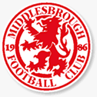
Middlesbrough F.C. crest 1986-2007The Middlesbrough crest has gone through four incarnations since the formation of the club. Initially, the badge was simply the town of Middlesbrough's crest with a red lion instead of a blue lion in order to fit in with the club's colours. Following the adoption of the white band on the shirts in 1973, only the red lion remained with the letters "M.F.C" underneath in red. This was further adapted following the reformation of the club in 1986 to a circular crest with the lion in the middle and the words "Middlesbrough Football Club 1986" around the circle in order to reflect this new era. In 2007, Middlesbrough changed their crest once again, this time with the lion inside a shield and the words "Middlesbrough Football Club 1876" underneath. The Club stated that this was to reflect the club's long history and not just it's post-liquidation status.
The current kit is produced by Errea and is only available in the UK from the official club shops and Middlesbrough's online store. The club's shirt sponsor since 2004 has been the Gibraltarian online gambling portal, 888.com.Car maker Toyota is believed to be the club`s shirt sponsor from 2007-8 season.


