kb banner 30

Burnley 08/09 Away Errea football kit

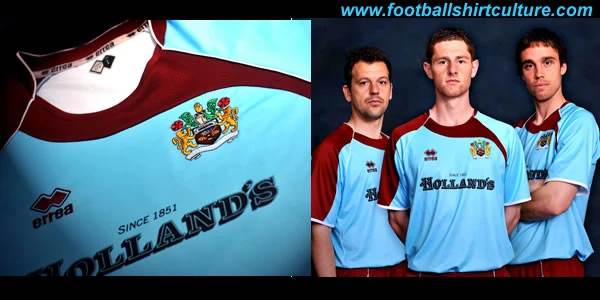
Burnley revealed the new away kit to be worn for the 2008/09 Championship season made by Errea.

Complimenting the predominantly claret home shirt the Errea-produced away kit sponsored by Holland's Pies, sees Burnley return to a sky blue shirt with a round-neck design which features a claret flash and is accompanied by claret shorts with a blue trim.

Claret socks will complete the new kit, which again utilises revolutionary 'Active Dry' technology, which is at the cutting-edge of research in technical fabrics, incorporating a fabric that draws moisture away from the body as a step towards improved sporting performance.

Sign in or create an account to earn points for voting, keep track of your reviews, edit them, and more.

The shirt, which will retail at £39.99 (adult and ladies) and £31.99 (juniors), will go on sale later this summer.

burnley_08_09_away_errea_kit_shirt.jpg


Write comments...
You are a guest ( Sign Up ? )
or post as a guest
Loading comment... The comment will be refreshed after 00:00.
  • This commment is unpublished.
    fsc · 16 years ago
    i wish u would all realise its the worse shirt ever
  • This commment is unpublished.
    fsc · 16 years ago
    I wish you would all realise its not maroon, its claret
  • This commment is unpublished.
    fsc · 16 years ago
    I know what you mean about the sleeve, but at least it is distinctive and different.
    Have you seen the [i]very imaginative [/i]shirt that umbro have put [i]hours and hours [/i]of work into for swansea?!?
  • This commment is unpublished.
    fsc · 16 years ago
    brill kit even if you dont like it it better than the p.n.e scum come on burnley lets go up this season!!!
  • This commment is unpublished.
    fsc · 16 years ago
    Amen to G Swike!
  • This commment is unpublished.
    fsc · 16 years ago
    It is the nicest awayvs*i* ever madethe coours are well nice , even the shirt have a nice wavy look if no 1 likes it ur not a true burnley fan coz those r our true colours !
  • This commment is unpublished.
    fsc · 16 years ago
    Well you know Drew, it\'s all about opinions. I think there are plenty of innovations you can bring to a shirt to give it a unique feel - there\'s piping, panels, shadows, double or single pin hoops or stripes, V\'s, bands, contrasting sleeves, the lot. In this case, it\'s very difficult to see exactly what\'s going on - half a claret sleeve on one side, completely blue on the other, and a random strip from the collar to the armpit - its components are messy and the overall effect is a bit of a hotchpotch. Nah, it\'s not a good strip.
  • This commment is unpublished.
    fsc · 16 years ago
    jeeez, it\'s either a \'boring\' shirt, with a lazy designer, or a \'horrible, dog of a shirt\' - they cant b*o*d* win with you \'connesueirs\' of football shirts!
  • This commment is unpublished.
    fsc · 16 years ago
    Here comes a lawsuit from Canterburry. Collar looks exactly like their rugby kits for South Africa, Australia, Scotland etc.
  • This commment is unpublished.
    burnley_lad · 16 years ago
    it\'s not maroon - it\'s claret - the predominant colour of our homes shirts.
  • This commment is unpublished.
    fsc · 16 years ago
    Assymetric designs on football shirts have always been crap, and now they\'re also unfashionable. It\'s the last resort of a manufacturer who has run out of ideas as to what to do with your kit. Errea shot their bolt years ago, and this is a dog of a shirt. What was wrong with a simple blue shirt, perhaps with a subtle feature - or is that beyond Errea\'s designers? Rotten.
  • This commment is unpublished.
    fsc · 16 years ago
    respectable kit
  • This commment is unpublished.
    fsc · 16 years ago
    I don\'t mind them trying the wavy thing, which actually looks pretty good, but they didn\'t match the maroons. That drops it to 3/5 for me.
  • This commment is unpublished.
    fsc · 16 years ago
    The shirt is Ok, I just think that the collar doesn\'t go with the maroon panel
  • This commment is unpublished.
    FDV · 16 years ago
    2/5

    The maroon panel on the sleeve has no sense