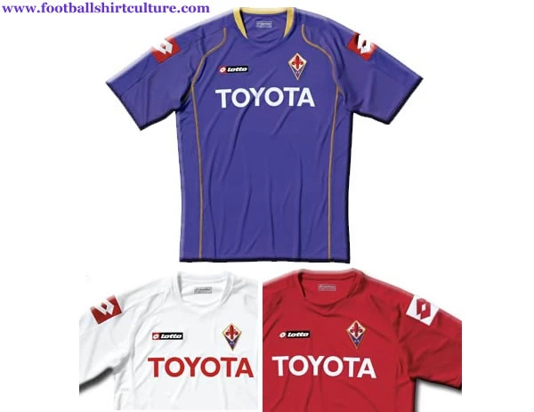
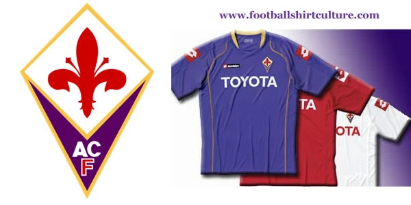
Fiorentina 08/09 Lotto Home, Away, 3rd shirts

These are the new Fiorentina 2008-2009 Home, away and 3rd football shirts made by Lotto.

Originally when Fiorentina was founded in 1926, the red and white halves shirts were derived from the colour of the city emblem. The more well known and highly distinctive purple kit was adopted in 1928 and has been theirs ever since; giving them the nickname La viola ("The Purple (team)").

Traditionally it is said that the purple kit became Fiorentina's by mistake, after an accident washing the old red and white coloured kits in the river.

Sign in or create an account to earn points for voting, keep track of your reviews, edit them, and more.

Today's logo is a gold bordered lozenge with a purple background, and the letters "AC" in white and the letter "F" in red, standing for the club's name. In the upper half, there is another gold bordered lozenge inside it, this time with a white background and the red fleur-de-lis of Florence.

This had been in use from 1992 to 2002, but after the financial crisis of the old society the new one couldn't use the same logo. Florence's comune, then, granted them the stylized coat of arms of the city used in other documents.

Diego Della Valle acquired the logo the next year in a judicial auction for a fee of €2.5 million, thus making it the most expensive logo in Italian football.
fiorentina_2008_09_lotto_football_shirt.jpg


Write comments...
You are a guest ( Sign Up ? )
or post as a guest
Loading comment... The comment will be refreshed after 00:00.
  • This commment is unpublished.
    stemcg1983 · 15 years ago
    curswine, i have done some ''action shots'' , I have done ronaldo and torres check them out
  • This commment is unpublished.
    MW FROM WIDEOPEN · 15 years ago
    the sleeve trim also looks a bit similar to the trim on the Bilbao and southampton shirts, but thats coincidence I assume. on the shirt, its good
  • This commment is unpublished.
    Guest · 15 years ago
    very innovative and better than the current crap worn by Arsenal
  • This commment is unpublished.
    · 15 years ago
    Can't say I'm a huge fan of the look, I too think the Nike ticks like that look quite corny, but I like the idea of something like this, if they blended in more it could work if you made them white, and I think Arsenal fans would moan less too about red being on the sleeves. Could possibly improve the font too to improve the overall look.

    About your idea for kits on action shots, it could indeed be awesome, but I am afraid that it would need some graphical skills to pull it off and make it look good. The blend on the Arshavin picture is quite good and doesn't look out of place but to do it on a full scale picture would be quite a challenge to make it look correct.
  • This commment is unpublished.
    stemcg1983 · 15 years ago
    cheers JBstokie yeah i do agree with you about the brazil one
  • This commment is unpublished.
    JBstokie · 15 years ago
    I think that's absolutely quality. Nike ticks look better on your Brazil one, more subtle. Great nonetheless
  • This commment is unpublished.
    Guest · 15 years ago
    emmekappa it is only similar in the fact that it has the half tone red nothingelse really.....i do like your away kit on that design though.
  • This commment is unpublished.
    Guest · 15 years ago
    brilliant again, never seen a playermodeling a fantasy kit on here before. i dont think the nike ticks are corny as the last poster did.
  • This commment is unpublished.
    Guest · 15 years ago
    the nike signs on the sleeves are a bit corny it would look good with a collar
  • This commment is unpublished.
    fsc · 16 years ago
    [quote=Russel1311]Anonymous - I thought I\'d dreamed that old Fiorentina away shirt! I\'m glad you\'ve confirmed that I wasn\'t going crazy - there really was a Fiorentina away shirt by Lotto in the mid-nineties which was white with purple across the shoulders with a swastika design. I vaguely remember it being at the time Stefan Effenburg played for them, and the sponsor being 7-Up. It seems absurd that any club could send their team out wearing swastikas but Fiorentina did, and it wasn\'t all that long ago. Does anyone have a picture of it?[/quote]
    :angry:
  • This commment is unpublished.
    fsc · 16 years ago
    I agree with the concensus. Fiorentina shirts typically look good but to produce similar looking shirts in such quick succession is pointless. You would have to be a die hard fan to buy them one after the other each season. As for this one, the gold piping and collar are different on the first team shirt but not enough to tempt me to get it. I agree with the Lotto slogan comments too although in fairness they do make very nice shirts.
  • This commment is unpublished.
    fsc · 16 years ago
    nothing special 2.5/5
  • This commment is unpublished.
    fsc · 16 years ago
    This is the exact same as last seasons :woohoo:
  • This commment is unpublished.
    fsc · 16 years ago
    Anonymous - I thought I\'d dreamed that old Fiorentina away shirt! I\'m glad you\'ve confirmed that I wasn\'t going crazy - there really was a Fiorentina away shirt by Lotto in the mid-nineties which was white with purple across the shoulders with a swastika design. I vaguely remember it being at the time Stefan Effenburg played for them, and the sponsor being 7-Up. It seems absurd that any club could send their team out wearing swastikas but Fiorentina did, and it wasn\'t all that long ago. Does anyone have a picture of it?
  • This commment is unpublished.
    Bells · 16 years ago
    same as 2005-2007 kit.... that\'s incredible..... it\'s the same...... as rome with kappa.....
    why does a fiorentina or roma supporter has to buy every year the same shirt.....???? they can use 3 year\'s ago ones that are the same ...... s*i* :0
  • This commment is unpublished.
    fsc · 16 years ago
    I agree. The big red lotto patches on sleeves mess everything up.
  • This commment is unpublished.
    fsc · 16 years ago
    The kit itself isn\'t bad, unfortunately the Lotto badges ruin everything... 2/5
  • This commment is unpublished.
    fsc · 16 years ago
    You don\'t have to even try hard to make a Fiorentina shirt look good. The shirt colour and the crest alone is unique, yet Lotto like to mess things up. The mid nineties Lotto Fiorentina were interesting although experimental (swastica designs). But this is very average!
  • This commment is unpublished.
    roger · 16 years ago
    That home kit template is similar to nike\'s 2004 template. :huh:
  • This commment is unpublished.
    fsc · 16 years ago
    not bad for a team with the colors red, white, and purple .