By Chris Simpson
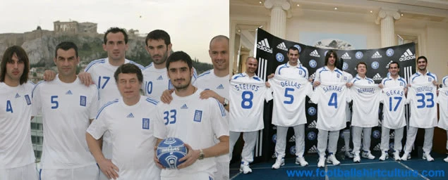
Adidas have taken simplicity to another level with this new Greece home shirt for the reigning European Champions.
Plain white with the logo, badge & shoulder stripes in blue - thats it! It is very good news to hear that they will be keeping with this design for the next four years instead of the usual two.
Other than that though there really is not much more to say about this clean & straight-forward effort which resembles more of a training/leisure top rather than what we have become accustomed to seeing match shirts look like recently.
With a real step away from the previous Greek kit it will be interesting to see if this minimalist policy is rolled-out to other sides across the Adidas stable and also how many other teams stick with their next shirts for this length of time.
ARGENTINA 2008/9 Home shirt
First impression of the new Adidas Argentina home shirt is a nostalgic nod back in time to the historic jersey immortalised by Mario Kempes in winning the Argentina World Cup in 1978. For starters the width of those famous aqua & white stripes bear more than a passing resemblance to the earlier Adidas version which also had a white rounded collar as has been adopted here too.

The makers have returned to a much more simple design than that of its predecessor but for my money they should have replaced the Adidas logo back in its traditional right hand side position instead of the centre of the neckline. That said, it is a vast improvement and I really like how they have reverted back to carrying those stripes onto the sleeves as well, a nice touch which has been missing from their home shirts for quite a while now.
A great effort from Adidas which warrants 4 out of 5, more for getting back to what an Argentina shirt should look like than anything else.
RUSSIA EURO 2008 Away Nike shirt
"I'm really drawn to this shirt from Nike and especially like the large panel in the colours of the Russian flag which dominate the centre of the chest area. The white 'Grandad' style collar rounds this shirt off very nicely too. Russia will most certainly be sporting one of the best change kits at the European Championships up in the Alps next summer.
I also cannot help feeling that we will see a few more variations of this design for other teams in the Nike stable coming along soon.
Overall a simple yet extremely effective shirt - a very good effort.
My rating 8 out of 10"


