New France Adidas Euro 2008 home shirt

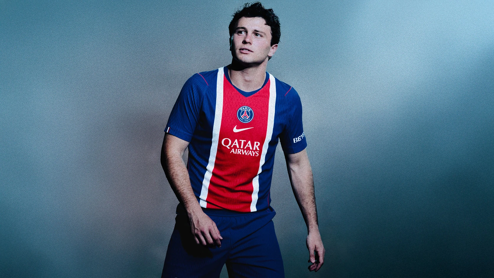
The new France 08/09 home shirt has officially been launched by the FFF. Adidas have gotten their inspiration from the kits used at the Euro 84 tournament.

New France home shirt 08/09 by adidas

Sign in or create an account to earn points for voting, keep track of your reviews, edit them, and more.


Write comments...
You are a guest ( Sign Up ? )
or post as a guest
Loading comment... The comment will be refreshed after 00:00.
  • This commment is unpublished.
    fsc · 15 years ago
    zdes bil rafik
  • This commment is unpublished.
    fsc · 16 years ago
    it is nice the design is sick and the fact it is by adidas makes it better
  • This commment is unpublished.
    fsc · 17 years ago
    I\'m utterly disappointed with current crops football jerseys from major football jerseys apparel makers (they should know who they are, cuz I don\'t need to pinpoint any one of them). The red line across the new France jersey is the worst career move of all!!!! The heat-pressed red line will wear-off and subsiquently peel-off after a certain period of been carefully hand-washed!!!!! How come the design did not follow the design of the Germany Euro 2008 Home jersey??? The front German flag colour design is permanently sublimated into the fabric itself, instead of being heat-pressed. And sad to say, many or should I say most of the current football club jerseys (starting from last season 2007/2008)have their major sponsors advertised in the front of the jerseys are based on heat-pressed technologies and not using the technique in which the advertisements are permanently sublimated into the football jersey fabric itself (making the advertisements permanently long-lasting). Football fans around the world are paying high premiums for an authentic football jersey, and a football jersey is considered a memorabilia, something that should last a lifetime (even though we keep buying and changing football jerseys ever season), not just a short period of time. Such shoddy workmanship of printing the major sponsors or designs on the front of the football jerseys by the major football apparel manufacturers are certainly disgraceful & are really short-changing millions of football fans around the world!!!!!!!!
  • This commment is unpublished.
    fsc · 17 years ago
    I think the 06-08 away with the white shorts was maybe one of the most beautiful kits of all time. Any news on the euro 2008 away kit? I heard rumors it was red but that has no proof, just a rumor.
  • This commment is unpublished.
    fsc · 17 years ago
    :-x nak termuntah
  • This commment is unpublished.
    fsc · 17 years ago
    agree with the collar......weird
  • This commment is unpublished.
    fsc · 17 years ago
    To be sure, some of the previous comments have merit. When I saw this shirt on-line I wasn\'t a big fan but it started growing on me. My local soccer shop began carrying it this week and I must admit, I like it. In fact, while certain details on the 06-08 model may arguably be better, this one has some nice features too. More than that, it seems to me to have a better fit than its predecessor.
  • This commment is unpublished.
    fsc · 17 years ago
    I actually bought it and was disappointed.

    It feels really cheap. The horizontal lines printed feels really cheap. And the collar makes it look like a regular t-shirt.

    Definitely a step back rom the previous one. The 06-07 Shirt was the nicest in a really long tim.
  • This commment is unpublished.
    fsc · 17 years ago
    brilliant
  • This commment is unpublished.
    HarbourBar Buckie · 17 years ago
    Agree with the logo comments. Why does everything have to get \'Groovy\'? The old French badge was distinctive - this new one bears too much resemblance to Kelllogs Corn Flake packet!
  • This commment is unpublished.
    fsc · 17 years ago
    It\'s not that bad, but I think it would have been better with the older logo, or at least this logo reverted
  • This commment is unpublished.
    fsc · 17 years ago
    this is ok but it looks way too modern, the new FFF logo is terrible. Alot like a big corporate logo. shame, cos france\'s old \'Cock\' logo (pardon the pun) was much nicer and traditional.

    At leaast adidas has tried with france & germany tho. otherwise they need burning.
  • This commment is unpublished.
    johnnycakes · 17 years ago
    if worn with white shorts and red socks,then very good,not that all blue look! :angry:
  • This commment is unpublished.
    fsc · 17 years ago
    best ever shirt. beautiful!
  • This commment is unpublished.
    fsc · 17 years ago
    This shirt is horrible!!!
  • This commment is unpublished.
    fsc · 17 years ago
    what\'s your problem Anonymous?
  • This commment is unpublished.
    fsc · 17 years ago
    Noooooooooooooooooooooooooo!

    Pity not this


    God praised itself