Borussia Mönchengladbach 14/15 Kappa Home Football Kit

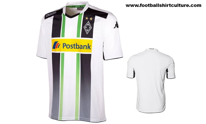
German club Borussia Mönchengladbach have unveiled their 2014-15 season Kappa Home football shirt and kit.

The shirt, inspired by the version worn in the 1974-75 season, features the white, black and green, this time the latter colours formed as each two thick stripes, descending into a gradient effect lower down.

Club sponsor Postbank - recently extending their agreement - appears on the front, and the look is completed with white shorts and socks.

Borussia-Monchengladbach-2014-2015-Kappa-Home-Football-Shirt-Kit-1

cfs Christmas Jumpers 10

Borussia-Monchengladbach-2014-2015-Kappa-Home-Football-Shirt-Kit-2

Borussia-Monchengladbach-2014-2015-Kappa-Home-Football-Shirt-Kit-3

Borussia-Monchengladbach-2014-2015-Kappa-Home-Football-Shirt-Kit-4

Borussia-Monchengladbach-2014-2015-Kappa-Home-Football-Shirt-Kit-5

Borussia-Monchengladbach-2014-2015-Kappa-Home-Football-Shirt-Kit-6

Borussia-Monchengladbach-2014-2015-Kappa-Home-Football-Shirt-Kit-7

Borussia-Monchengladbach-2014-2015-Kappa-Home-Football-Shirt-Kit-8

Borussia-Monchengladbach-2014-2015-Kappa-Home-Football-Shirt-Kit-9


Write comments...
You are a guest ( Sign Up ? )
or post as a guest
Loading comment... The comment will be refreshed after 00:00.
  • This commment is unpublished.
    Bog Brush · 11 years ago
    That. Is. Epic.
  • This commment is unpublished.
    Watford Junction · 11 years ago
    The overall kit design is great, however.... the sponsorship in so many colours turns the shirt into an artists palate - it ruins the essential kit design. What a great shame. I would think sponsorships and their colour mis-matches with so many kits probably ruin 75% or higher of most kit designs. Shame.
  • This commment is unpublished.
    TomBola · 11 years ago
    I think it's a bit of a mess (if I may be allowed to comment that is)
  • This commment is unpublished.
    wok · 11 years ago
    awful. THIS people like on this site? :o

    I am starting to suspect there's massive trolling going on here
  • This commment is unpublished.
    Seagull · 11 years ago
    Amazing Gladbach kit. Great retro style. A very nice kit for a great team full of tradition. Well done.
  • This commment is unpublished.
    Pane · 11 years ago
    That's one of the best Kappa kits I've seen.

    I always think Kappa kits look very uncomfortable, but I can't find fault with this - very nice indeed.
  • This commment is unpublished.
    Black&Amber · 11 years ago
    Tidy.
  • This commment is unpublished.
    jasonj7 · 16 years ago
    thanks and yeah bastien it was photoshop
  • This commment is unpublished.
    Fabian1902 · 16 years ago
    I agree with Bastien. It's a bit to 'yellow'. The orange color should be more powerpull.
    But nice kit ;-)
  • This commment is unpublished.
    bastien · 16 years ago
    I think that the orange is not strong enough, or too light, don't how to say. But it may be due to the program you used to make it, Photoshop certainly?
  • This commment is unpublished.
    Guest · 16 years ago
    but the current shirt also has it but then on the whole right side, so i thought you maybe forgot it.
  • This commment is unpublished.
    manu fan · 16 years ago
    sure u fkcin did you ffgdfg shiit wank:sad: :sad: :smilewinkgrin: :lol: :yes: :smile:
  • This commment is unpublished.
    jasonj7 · 16 years ago
    i done that on purpose
  • This commment is unpublished.
    Guest · 16 years ago
    You forgot to erase the red-white-blue stripes on the back of the collar