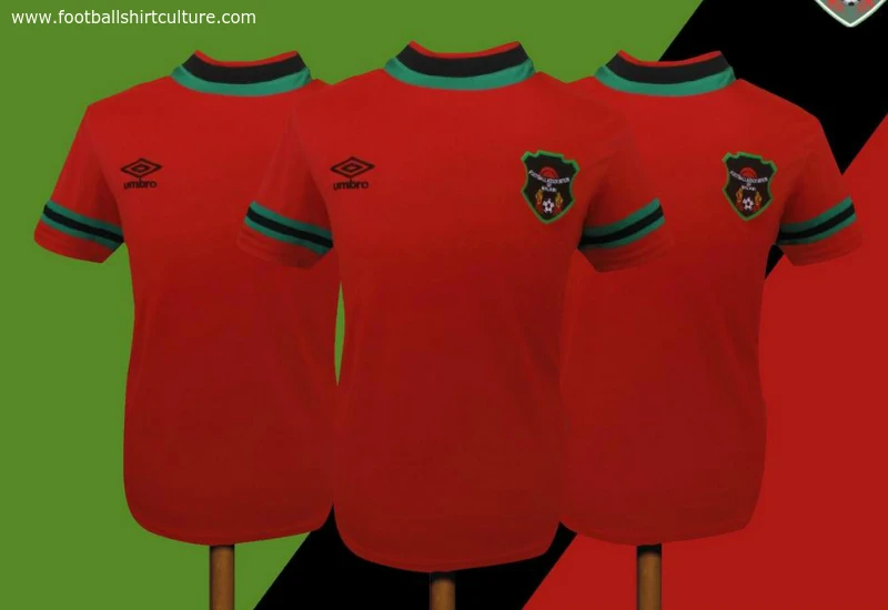
Malawi 14/15 Umbro Home Football Shirt

The Malawi FA have revealed the international side's new Umbro Home football shirt.

Despite being in the traditional red, the association had previously warned fans that “the uniforms are different from those that the national team has been wearing of late" and "what we took was
not our choice, but rather what was made available at the shelf".

This takes the form of a largely understated shirt, which is juxtaposed with flamboyantly bold - and national flag-styled - black, green and red roundneck collar and cuffs.

Sign in or create an account to earn points for voting, keep track of your reviews, edit them, and more.

The new shirts will be combined with red shorts and black socks on the pitch, though may be interchanged with the Away versions also.

 

Write comments...
You are a guest ( Sign Up ? )
or post as a guest
Loading comment... The comment will be refreshed after 00:00.
  • This commment is unpublished.
    the dean · 10 years ago
    what is going on with the turtleneck collar?
  • This commment is unpublished.
    samuelsdad · 10 years ago
    Nice looking shirt but it could be presented better. Even nicer than the away kit. Umbro putting some really good stuff out
  • This commment is unpublished.
    AKON · 10 years ago
    Beautiful kit! Umbro's African kits (Zimbabwe) look good!
  • This commment is unpublished.
    Footyfanatic · 10 years ago
    I like it because it's classy looking but unique.
  • This commment is unpublished.
    keimaa · 10 years ago
    The kit is not bad, it looks quite 90s but the picture is terrible...I'd like to see it in action
  • This commment is unpublished.
    wok · 10 years ago
    holy saturated colours, batman! :o
  • This commment is unpublished.
    dylan keenan · 15 years ago
    I'm liking the translation, so i am...
    :smilewinkgrin:
  • This commment is unpublished.
    Fabian1902 · 15 years ago
    Precies.

    Over het AIG logo heb ik zitten denken, maar als je het massief maakt, dan springt het er gelijk zo uit, terwijl ik vind dat het om de club gaat; niet om de sponsor.

    Het ManUtd-logo maak je zo met een stoke-lengte van 2 of 3 :wink:


    **
    About AIG logo; I have been thinking, but if you make it solid, then it has to much attention. And I think that the attention should go to the club, not to the sponsor.
    **
  • This commment is unpublished.
    Tony Sultana · 15 years ago
    Manchester 4 life:D:

    ziet er netjes uit! ik zou alleen het aig logo opvullen met bijvoorbeeld zwart om zo die zwarte rond om de letters weg te halen:wink:

    Hoe kom jij btw aan die vorm om het man utd logo? Heb je die ook in AI? Zo ja zou je die kunnen sturen?

    8/10