Blackburn Rovers 2018-19 Umbro Home Kit

Blackburn Rovers 2018-19 Umbro Home Kit

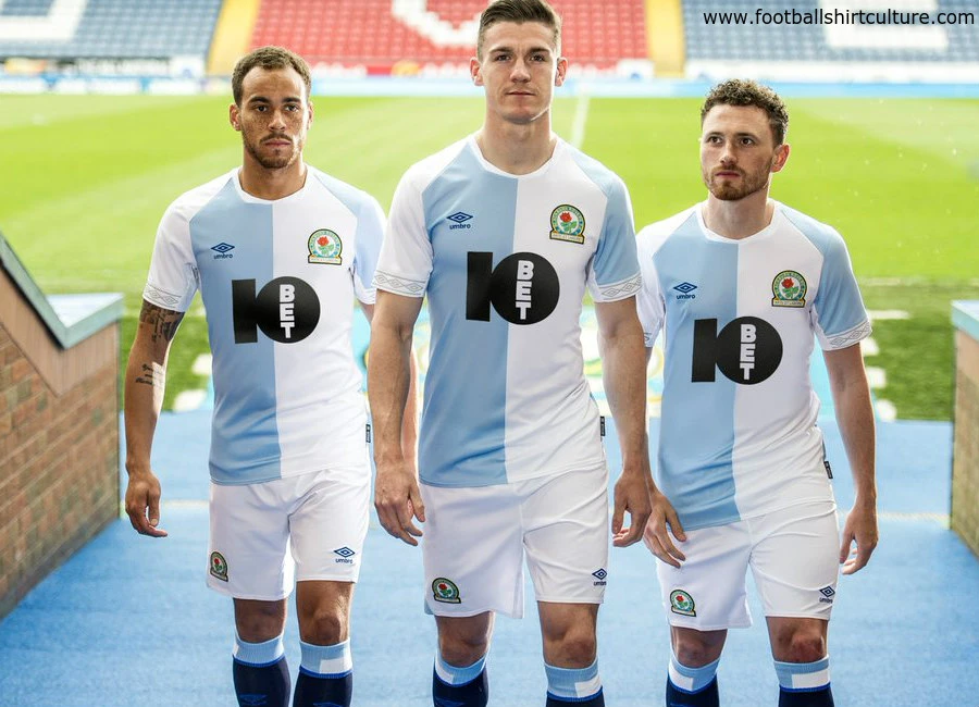
Blackburn Rovers unveiled the new 18/19 Umbro home kit, which is a celebration of the club’s proud heritage and origins.

The iconic and stylish strip sees the club revert to the original ‘Cambridge’ blue colours, which were worn when Rovers became founder members of the Football League in the 1880s.

The lighter blue design last appeared on Rovers’ home shirts during the 2014-15 Championship season and famously featured in the 1991-92 campaign, when Kenny Dalglish’s side triumphed at Wembley to secure promotion to the newly-formed Premier League.

Sign in or create an account to earn points for voting, commenting, reading articles, and more.

This season’s kit, which features new principal sponsor 10Bet on the front, marks a return to the club’s roots, but with a fresh, modern perspective. The classy and clean design, which is sure to prove popular with supporters of all ages, is also embedded in Umbro’s brand values of heritage, tradition and tailoring.

Umbro UK Marketing Manager, Jonathan McCourt, adds: "This season, Umbro are pushing forward with contemporary designs, player-led performance insight and compelling club stories. The result is a truly exciting one – the history and origins of Blackburn Rovers.

"All kits are constructed in lightweight durable fabrics and executed with great fit, which can withstand the pressures of the modern game, whilst creating a wearable uniform for the fan. To aid comfort, ergonomic mesh panels have been constructed at the underarm, providing maximum breathability.

"In 1977, Umbro introduced the iconic running diamond to the field of play. In the following decades, the double diamond continued to adapt with the ever-changing face of the game. For the new season, Umbro’s taping story evolves, moving from the traditional to the contemporary – a fresh outlook on a football staple.”


Write comments...
You are a guest ( Sign Up ? )
or post as a guest
Loading comment... The comment will be refreshed after 00:00.
  • This commment is unpublished.
    Goat · 5 years ago
    @E Wood Macron and Hummel are better than Nike as well.
  • This commment is unpublished.
    E Wood · 5 years ago
    Kit design order of merit.
    1 Umbro
    2 Adidas
    3 Puma
    A very very distant 4 Nike !!!!!!
    Sorry even worse than Nike you could have a kit made by Kappa .
  • This commment is unpublished.
    MrBoro · 5 years ago
    This is class.

    How good is the Rovers thing on the neck?! It's the seats in that old stand at Ewood Park. Is that new for this season of they had it before?
  • This commment is unpublished.
    wessex · 5 years ago
    Maybe a red v-neck collar and it would be perfect. Well done Umbro.
  • This commment is unpublished.
    E Wood · 5 years ago
    Hall of shame comments probably posted by some teams fans that wear a a shirt very similar to Aston Villa !!!!!Get a life you sad morons .
  • This commment is unpublished.
    Russel1311 · 5 years ago
    Oh man, so close to being the perfect kit. Once again the ugly online gambling website sponsor logo ruins an otherwise great shirt.
  • This commment is unpublished.
    NI Blackburn Fan · 5 years ago
    I am not a fan when we use the lighter colour but I can accept it because of the history. However the blue colour should ALWAYS be on the same side as the club logo. This is a Grasshoppers shirt with a Blackburn logo. Really dislike it!
  • This commment is unpublished.
    colin phippen · 5 years ago
    really like it, a classic design
  • This commment is unpublished.
    tom bola · 5 years ago
    Going to cause some confusion among refs. "So let me get this straight, you're all number tens?"
  • This commment is unpublished.
    Chris Watson · 5 years ago
    Right shade of blue. Just needs some Claret.

    Going Down Rovers.
  • This commment is unpublished.
    Cracker · 5 years ago
    Looks like a man city and Leeds kit combined ..
    Verdict. Shite
  • This commment is unpublished.
    BrianB · 5 years ago
    @MrBoro It's a new idea. In recent years we have had "Rovers" in the font of the Blackburn Rovers sign above the turnstiles. Rovers in the style of the seating in the Riverside stand is my favourite feature on this shirt. Classy.
  • This commment is unpublished.
    Paulburn Rovers 1981 · 5 years ago
    I like the lighter blue color on the shirt. But like most I don't like the sponsers logo on the front of the shirt. Other than that I have seem worse.
  • This commment is unpublished.
    Tony Blackburn · 5 years ago
    A nice design ruined by a black sponsor logo.

    ..at least make it fit in with the kits colours. Dark blue at least.
  • This commment is unpublished.
    Footyfanatic · 5 years ago
    @wessex I always loved the bit of red on their kits.
  • This commment is unpublished.
    Don Trump · 5 years ago
    That logo is like a giant zit on the face of a pretty woman
  • This commment is unpublished.
    Lofty · 5 years ago
    Awful sponsor ruins a great shirt
  • This commment is unpublished.
    E Wood · 5 years ago
    Claret and Who ?????
  • This commment is unpublished.
    Icon · 5 years ago
    @E Wood Or from Nike employees..
  • This commment is unpublished.
    Councillor Cox · 5 years ago
    Fantastic design let down by another ghastly betting sponsor, they could have st least matched the colours up ?