Southampton 2018-19 Under Armour Away Kit

Southampton 2018-19 Under Armour Away Kit

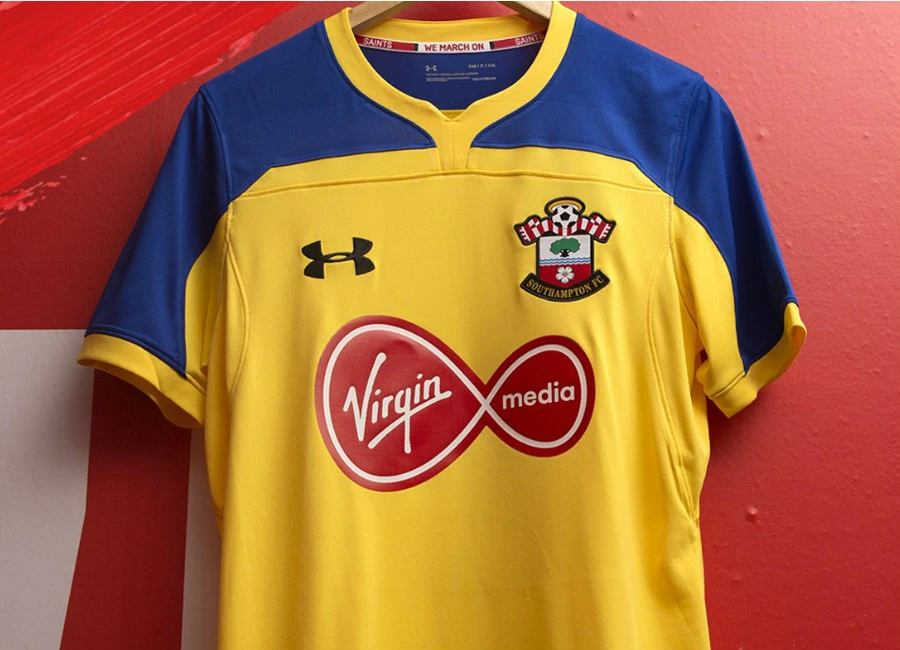
Southampton Football Club launched its brand new Under Armour away football shirt for the 2018/19 season.

The away kit takes inspiration from the past, with the club producing a brand new yellow-and-blue strip, reminiscent of what was worn in Saints’ famous 1976 FA Cup victory. yellow shirt, which is blue across the sleeves and shoulders, is accompanied by blue shorts and blue socks.

Get 10% DISCOUNT - Use Code FSC10: HERE


Write comments...
You are a guest ( Sign Up ? )
or post as a guest
Loading comment... The comment will be refreshed after 00:00.
  • This commment is unpublished.
    dex1lsp · 5 years ago
    I like the colors. I would like it better overall if it wasn't for that terrible clashing sponsor.
  • This commment is unpublished.
    Jude · 5 years ago
    So many nice kits this season being ruined by the sponsors.
  • This commment is unpublished.
    Portsmouth Nil · 5 years ago
    I wish I was a saints fan, ugly kit aside but a far better club in all areas. Quack. Portsmouth is such an awful unsuccessful club to follow, as I drag my inbred hunchback to watch no games because I don't have the funds to buy a TV licence and all of the chips are yours. Gerald?
  • This commment is unpublished.
    Ken Monk Aww · 5 years ago
    That collar is awful ..a rounded collar on both kits would have looked fine
  • This commment is unpublished.
    Designer · 5 years ago
    Manages to look on the cheap even though it probably wasn't. A bit 4th division not premier league
  • This commment is unpublished.
    Lemon & My car please · 5 years ago
    @Jude Hey Jude...
  • This commment is unpublished.
    peregrine gruntfuttock · 5 years ago
    @Portsmouth Nil ooooooooooooaaaaaaaarrrrr....you cow collecting benny hill knob cheddar....just cos your new kits are rather poo!! no need to be nasty about the only club in hampshire... oh by the way have you seen your pompey blue third kit...masterpiece!
  • This commment is unpublished.
    RM · 5 years ago
    Wouldn't look out of place being sold in the Early Learning Centre. Bloody awful!
  • This commment is unpublished.
    Matt Le Tiswas · 5 years ago
    Forget worrying about stuff as far down the shirt as the badge and sponsor.

    That collar, those seams and those colours make it look like a kids t-shirt from Asda.
  • This commment is unpublished.
    BUILD THE WALL · 5 years ago
    @dex1lsp Doesn't look as bad in person, but I agree it'd look better if it was blue and yellow or even just an outline like the goalkeeper kit or last seasons away. We've got a history of putting garish red sponsors on yellow and blue shirts though
  • This commment is unpublished.
    Scooblesworth Doo · 5 years ago
    @dex1lsp Not really fair to describe the red and white logo on a Southampton kit as clashing!
  • This commment is unpublished.
    Southernkid · 5 years ago
    @Ken Monk Aww i agree and maybe it was better in blue