West Ham United 2020-21 Umbro Away Kit

West Ham United 2020-21 Umbro Away Kit #WestHamUnited #westham #whufc #umbro

West Ham United unveiled the Club’s Commemorative 125th Anniversary Umbro Away kit, which the Hammers will wear in the 2020/21 season.

Alongside the Home kit, the Away kit is inspired by the Club’s golden period of the 1960s, during which the east Londoners won the FA Cup and European Cup Winners’ Cup and provided three members of England’s 1966 FIFA World Cup-winning team glory, the 125th Anniversary Away kit is a modern twist on the strip worn by all-time greats Bobby Moore, Geoff Hurst and Martin Peters.

weekly deals

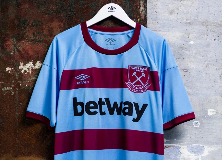
The iconic Vista Blue shirt with two Claret bands became a timeless classic, and its popularity has seen it recreated on a number of occasions since, most notably in Club’s inaugural Premier League season in 1993/94, and the 2011/12 campaign, which climaxed in Play-Off final glory at Wembley.

Sign in or create an account to earn points for voting, commenting, reading articles, and more.

The 2020/21 Away shirt features a traditional Vista Blue body and two wide Claret bands, complete with Claret collar and cuffs, a stylized rib neckline and the 125th anniversary two-colour crest.

The Away shorts are in Vista Blue, and feature the two-colour crest, while the Away socks are Vista Blue, with a Claret cuff fold over and ‘WHU’ embroidered on the back.


Write comments...
You are a guest ( Sign Up ? )
or post as a guest
Loading comment... The comment will be refreshed after 00:00.
  • This commment is unpublished.
    Willie · 3 years ago
    @Wessex My thoughts entirely. Saved me posting.
  • This commment is unpublished.
    Wessex · 3 years ago
    Too large a gap between bands but I suppose it's to fit in the Betway logo... otherwise near perfect.
  • This commment is unpublished.
    Turnips for Norman's yard · 3 years ago
    Did it stretch in the wash? The hoops are too far apart. Doris - another slice please...
  • This commment is unpublished.
    Alfs Barnet · 3 years ago
    Retro ... Luv it!
  • This commment is unpublished.
    Tony · 3 years ago
    So the home strip is claret and blue and the away is blue and claret? What is the point apart from.. oh we now need a third kit to make even more money from fans.
  • This commment is unpublished.
    Tony Cottee · 3 years ago
    Can I come out of retirement? I simply want to be seen on the pitch wearing this gem of a shirt.
  • This commment is unpublished.
    Benny Kill · 3 years ago
    Looks a bit Tesco Value with the stripes so wide apart. should have put them closer together and had Betway in a different colour
  • This commment is unpublished.
    Sir trevor · 3 years ago
    I'm sick of these technical looking footy tops. The back looks ridiculous...
    Umbro have made some shite uk kits this season the fk is up wi yer.the European kits and especially south American kits have been top drawer.
  • This commment is unpublished.
    skem hammer · 3 years ago
    @Willie Yep, me too. And on the home kit, it looks weird where the blue sleeve meets the claret body.
  • This commment is unpublished.
    Croxdge · 3 years ago
    Looked absolutely awful on the hanger until I scrolled down to see it worn. It's a beauty.
  • This commment is unpublished.
    VillaFan · 3 years ago
    Like that, like Umbro, good kit made with our colours.
6.0
1 rating
Vote now!
  • 0
  • 1
  • 0
  • 0
  • 0
  • 0
  • 0
 · 1 year ago
Show more