Loading comment... The comment will be refreshed after 00:00.
This commment is unpublished.
frjjjy· 11 years ago
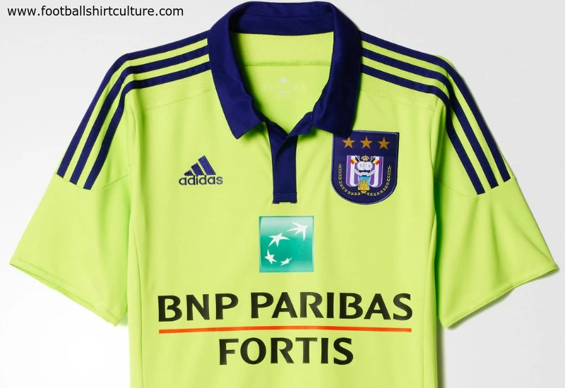
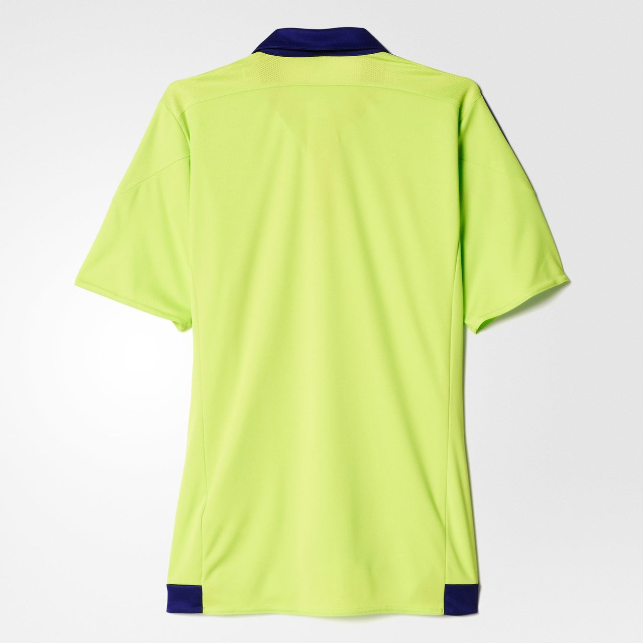
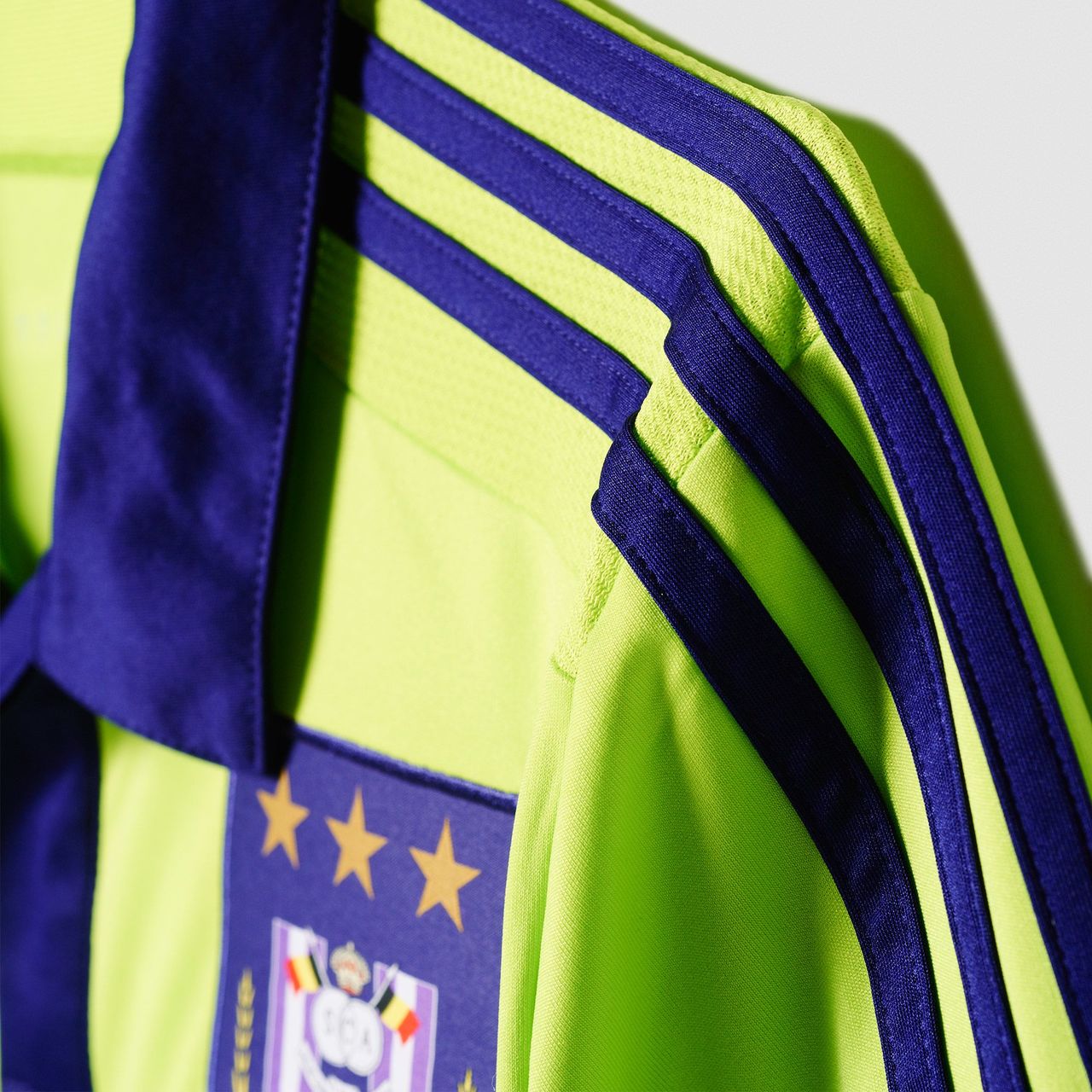
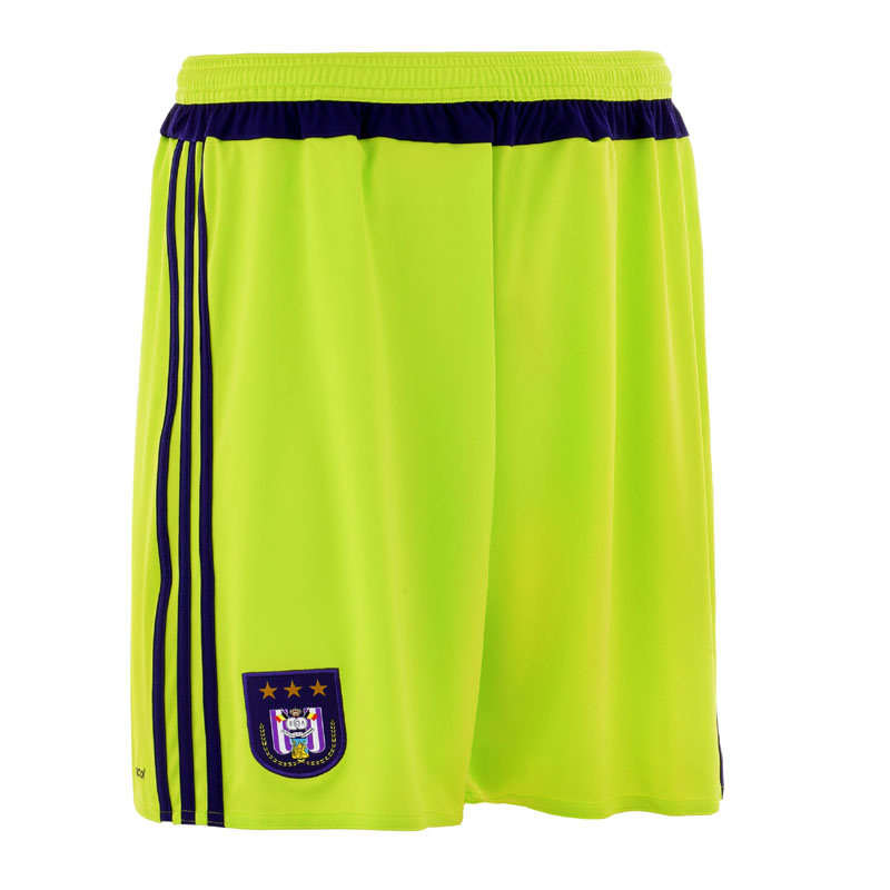
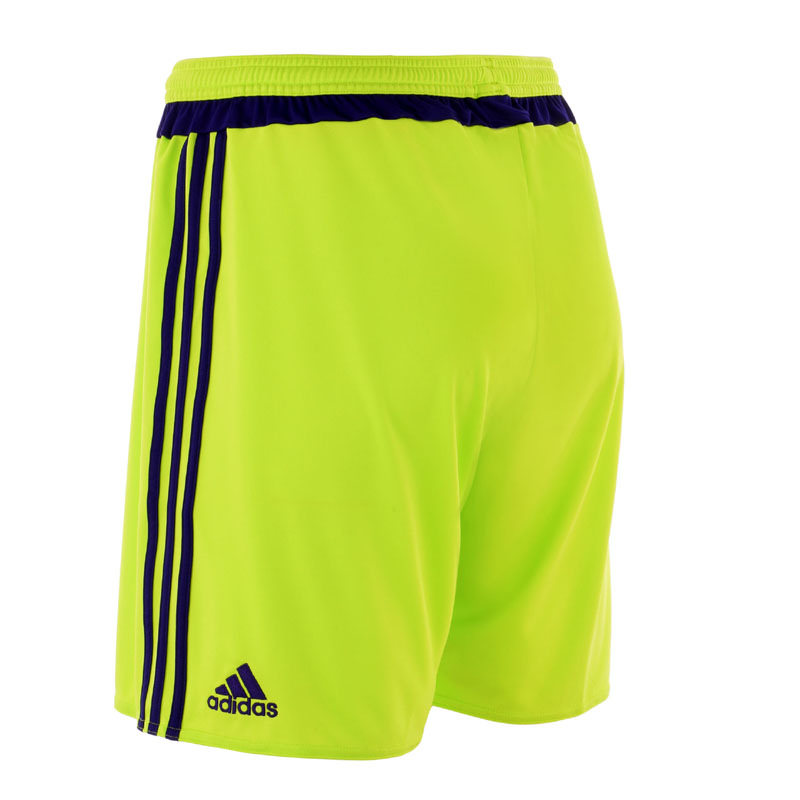
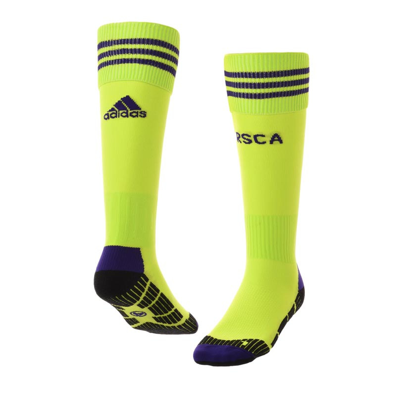
This is one of those shades of colour that only exists for use on away shirts no one cares about.
We usually have that bright light blue colour of away shirt blue here at Sunderland. You never see these colours anywhere else, they must only come out when the kit designers can't be bothered.
This commment is unpublished.
Baskerville Hound· 11 years ago
I stopped looking when it said Adidas
This commment is unpublished.
FTOF· 11 years ago
'Slime' - what a lovely name for a colour... :-x
Poor effort.
This commment is unpublished.
tom bola· 11 years ago
This shirt actually looks like a sad face!
This commment is unpublished.
ShowedGreatCharacter· 11 years ago
Same problem with the Ajax and Feyenoord kits this season. Adidas are trying something new but absoluty mess up the full away kit. Why do they use these bright and irrelevant colors?
This commment is unpublished.
Oh I...· 11 years ago
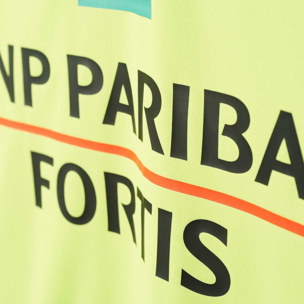
Ugh, bleh! Get rid of that green square in the BNP logo and this looks a lot better.
This commment is unpublished.
Guesty· 16 years ago
Make the dragon dark red and shorten the stripes slightly and it'll be great.