Partick Thistle 15/16 Joma Away Kit

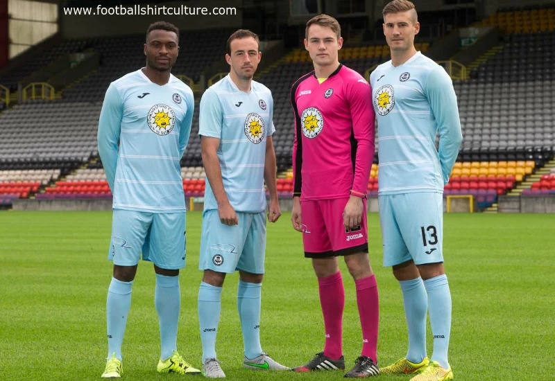
This is the new Partick Thistle FC 2015/16 away football kit, manufactured by Joma. 

The kit is the first away strip to feature the logo of their new sponsor, Kingsford Capital Management, which was designed exclusively for Thistle by Turner Prize nominated artist, David Shrigley. The logo is complete with its own version of superstar mascot, Kingsley.

cfs Christmas Jumpers 10


Write comments...
You are a guest ( Sign Up ? )
or post as a guest
Loading comment... The comment will be refreshed after 00:00.
  • This commment is unpublished.
    I · 10 years ago
    That is about as bad as sponsors go.
  • This commment is unpublished.
    frjjjy · 10 years ago
    above average

    more teams need mascots who look like they're gonna glass someone
  • This commment is unpublished.
    Ron Swanson · 10 years ago
    Whatever Kingsford Capital Management paid David Shrigley to design that horrific excuse for a logo, it was too much.
  • This commment is unpublished.
    pachyderm · 10 years ago
    nice kit.

    but... MON 'EH SONS!
  • This commment is unpublished.
    sheridan · 10 years ago
    Coventry United ?
  • This commment is unpublished.
    Sep Bladder · 10 years ago
    Bit bland really, had so much potential but it just is flat as could be.
  • This commment is unpublished.
    Baskerville Hound · 10 years ago
    Nothing worth commenting on it is so average.
  • This commment is unpublished.
    Barefoot Cuntessa · 10 years ago
    Nightmarish sponsor/mascot.
  • This commment is unpublished.
    FTOF · 10 years ago
    Is there any more dull a colour than light blue?

    Disappointing, considering the inventive away kits they've had in recent years.
  • This commment is unpublished.
    batatitas · 10 years ago
    the sponsor's sun has diarrhea (^_^)
  • This commment is unpublished.
    ttt · 10 years ago
    Oh dear
  • This commment is unpublished.
    Pras · 16 years ago
    napoli use macron not nike
  • This commment is unpublished.
    Kenetico · 16 years ago
    Really nice :yes:
  • This commment is unpublished.
    Guest · 16 years ago
    Very nice design. Too bad Napoli have that red Lete sponsor logo. It would be better just in black or white letters without the square. But that's the way it is.