Bordeaux 16/17 Puma Home Kit

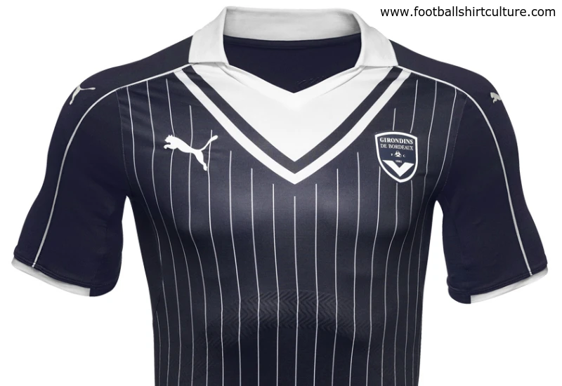
This is the new FC Girondins de Bordeaux 16/17 Home Kit by Puma which is inspired by the 1980's.

The new Bordeaux home kit will be worn during the 2016–17 Ligue 1 season, which will be the 79th season since its establishment.

Calling all shirt collectors: FootballShirtCollector.com is coming soon!

We’re launching a new community site created especially for shirt collectors. It’s a dedicated space to connect with others, create your profile, and join a growing network of fellow football shirt collectors.

FSC community


Write comments...
You are a guest ( Sign Up ? )
or post as a guest
Loading comment... The comment will be refreshed after 00:00.
  • This commment is unpublished.
    Busty bird · 9 years ago
    Lovely looking kit. My baps will look epic in one of these
  • This commment is unpublished.
    Daniel-San · 9 years ago
    Looks a bit 'naval' with the blue and the big white v-neck. "In the navy...."
  • This commment is unpublished.
    Anthony-- · 9 years ago
    [quote name="Marseillais"]The collar sure is strange. Still the shirt looks allright in these pictures - because the horrible logo from the sponsor, KIA, is missing[/quote]

    Si tu ne vois pas Kia c'et parce que Kia n'est plus sponsor de Bordeaux
  • This commment is unpublished.
    Marseillais · 9 years ago
    The collar sure is strange. Still the shirt looks allright in these pictures - because the horrible logo from the sponsor, KIA, is missing
  • This commment is unpublished.
    Swanson for Bronson · 9 years ago
    Usually not a fan of the faux v-neck look, but I think it works for Bordeaux, as the V is their thing.
  • This commment is unpublished.
    Laslow123 · 9 years ago
    Absolutely epic.
  • This commment is unpublished.
    The Cat · 9 years ago
    That is a thing of beauty!
  • This commment is unpublished.
    Éire · 9 years ago
    Nice shirt but a bit too much going on. V-neck, stripes, collar, pinstripes.
  • This commment is unpublished.
    vigilante · 14 years ago
    Nice attempt, although I would like to see the shorts and socks as well.
  • This commment is unpublished.
    Jambo · 15 years ago
    I love that second kit, the black and gold work together so well!!

    Jambo, Leeds fan
  • This commment is unpublished.
    MW FROM WIDEOPEN · 15 years ago
    Third is in the colours of 1860, so thats a non starter, but the home is a good kit.
  • This commment is unpublished.
    bastien · 15 years ago
    Very nice, I really like the idea. Adidas Originals works here, and the flag-font is a very interesting way to integrate the crest to the shirt.

    I would just make it more "subtle" or "-)iscreet" (call it as you want), especially on the home shirt where the colours kind of clash (3 different shades of red).

    I would have even prefered the away in dark blue with white stripes, and the third in white, but with light-gray details. But good job anyway :-)