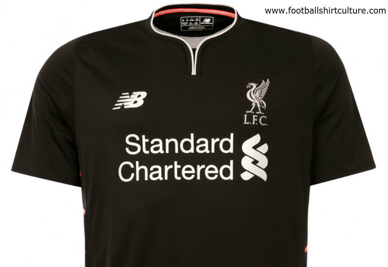
Liverpool 16/17 New Balance Away Kit

Liverpool 16/17 New Balance Away Kit

Liverpool FC and New Balance revealed the team’s 2016-17 away kit.

With a fitting tribute to the team that won the European Cup on that memorable night in Rome on the May 25, 1977, the jersey has been designed in black, red and silver – reminiscent of the colours of the matchday programme thousands of fans still cherish to this day.

Black was chosen as the base colour to create an imposing canvas for the flame red warning vents down either side of the torso. Silver trim has been detailed on the front, including the iconic Liver Bird crest, to commemorate the club’s first of five European Cup victories.

Sign in or create an account to earn points for voting, keep track of your reviews, edit them, and more.

The kit has been developed using NB Dry technology, a moisture-wicking fabric that helps keep players cool and dry whilst wicking sweat from the body, making it fast drying. It also features a gradiated mesh to the back of the jersey, which allows for improved air movement around the body compared to traditional fabrics and is engineered into the construction of the fabric.

The shirt’s design has been developed using the latest heat bonding technology. It features body mapping mesh to key zonal areas of the shoulders, running the full length of the back into the lumber panel, and reinforced bonded seams down the side panels and shoulders to increase comfort and reduce friction compared to traditional fabric constructions. Laser-cut and bonded eyelets placed to the under arms further aid airflow around the body. The jersey is finished with a silver-tipped shaped crew neck collar.

The kit is finished off with black shorts, accompanied by flame red detailing. The socks have built-in comfort zones while the foot-bed has been developed with polypropylene to help alleviate excess moisture when the foot makes contact with the boot.
 

Write comments...
You are a guest ( Sign Up ? )
or post as a guest
Loading comment... The comment will be refreshed after 00:00.
  • This commment is unpublished.
    Ian G · 8 years ago
    [quote name="Monty"]Don't know why you are gurning about the crest. It is clearly embroidered[/quote]

    It's not embroidered as it is stuck on the shirt. The feature of it may look like it's stitched but honestly it's a cheap sticker. Bring back Adidas or go for Nike.
  • This commment is unpublished.
    franchise scum raped my cat · 8 years ago
    [quote name="Busty bird"]Lovely looking kit. Very stylish & Ideally suited to covering up my wonderful wangers[/quote]
    :P :P :P :P :P :P
  • This commment is unpublished.
    Dom Matteo · 8 years ago
    It's not just another black shirt. Its been tastefully designed with very subtle orange trimmings at very specific placements on the shirt. Overall a classy looking shirt. Designers adopted the 'less is more' concept.
  • This commment is unpublished.
    tom bola · 8 years ago
    [quote name="Dan 2.0"]It's just a basic shirt with stickers - lazy designing, at least when it was Warrior the crest was stitched. I'm not paying the increasingly high prices for a new kit each year when they're clearly spending less and less on manufacturing them.[/quote]
    Spot on Dan. The profit margin on new kits must be huge. As you say, the materials are cheap and the construction shoddy. Less for more seems to the modern way sadly.
  • This commment is unpublished.
    Monty · 8 years ago
    Don't know why you are gurning about the crest. It is clearly embroidered
  • This commment is unpublished.
    WHUFC · 8 years ago
    not bad ;)
  • This commment is unpublished.
    KVee · 8 years ago
    So I've decided to quit my job and become a kit designer. I will mostly specialise in the Away or 3rd kit department where plain black or luminous pink are the only requirements needed by clubs.

    Wish me luck! :zzz
  • This commment is unpublished.
    Just isfor the 96 · 8 years ago
    Typical Liverpool dragging up history yet again...inspired by bla bla..

    ..its a black shirt.
  • This commment is unpublished.
    reds · 8 years ago
    Why not post pictures with players wearing it? which looks really nice with those red stripes. no way its boring.
  • This commment is unpublished.
    AB · 8 years ago
    [quote name="Busty bird"]Lovely looking kit. Very stylish & Ideally suited to covering up my wonderful wangers[/quote]

    This is getting boring... just saying
  • This commment is unpublished.
    Dan 2.0 · 8 years ago
    It's just a basic shirt with stickers - lazy designing, at least when it was Warrior the crest was stitched. I'm not paying the increasingly high prices for a new kit each year when they're clearly spending less and less on manufacturing them.
  • This commment is unpublished.
    Busty bird · 8 years ago
    Lovely looking kit. Very stylish & Ideally suited to covering up my wonderful wangers
  • This commment is unpublished.
    PaulieWalnuts · 8 years ago
    Black again - with some tenuous link to a programme from the 1977 EC final. Jeez - marketing eh?
  • This commment is unpublished.
    danel · 8 years ago
    Porto Announced 16 27 HOME SHIRT. Amazing design
  • This commment is unpublished.
    Guest · 14 years ago
    not a fan of the red on the collar !!!!!
    you most hate the new kit then
  • This commment is unpublished.
    ChelseaBlueBoy · 14 years ago
    Too heavy. I am not a fan of the red on the collar. Should be white. And the grey on the shirt should be white..