kb banner 30

MK Dons 16/17 Errea Home, Away and Third Kits

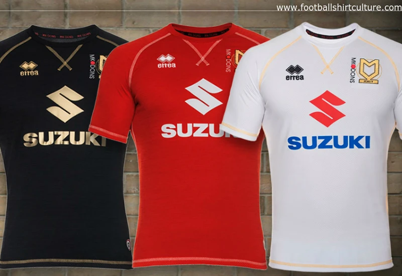
MK Dons unveiled its new Home, Away and Third kits for the 2016/17 season made by Errea. 

The men from MK1 will don white, red and black in the upcoming campaign – the latter makes a return after a two-year absence. Goalkeepers, meanwhile, will wear yellow, green and pink colours.  

This year shirts are made utilising a brand new fabric from Erreà, which has a textured finish providing an almost flamed effect.  

Sign in or create an account to earn points for voting, keep track of your reviews, edit them, and more.

This latest generation polyester fabric is woven in a honeycomb pattern, which means that there is less of the fabric in direct contact with the skin. 

Small pockets of air are also created to help keep the skin fresher and cooler, which in turns aids in regulating body temperature and make the shirt more comfortable to wear. 

Additional comfort also comes from the stylish tailored cut of the shirt, with the tailoring being enhanced by the contrast stitching which also provides the main detailing of the shirt.



Write comments...
You are a guest ( Sign Up ? )
or post as a guest
Loading comment... The comment will be refreshed after 00:00.
  • This commment is unpublished.
    Manc · 8 years ago
    [quote name="Bongo"]:zzz
    Don't care if they play stark bol**** naked.. That club shouldn't even exist, full stop.They stole their way into the football league.[/quote]

    It's getting boring hearing this rant every time they unveil a new kit in the last 10 years. I'm sure people will be posting the same thing in 2033 when their new kit is unveiled. Franchise blah blah blah.
  • This commment is unpublished.
    Dave Bassett · 8 years ago
    The club badge looks more like a second sponsor, and the kit design itself looks more at home on the Tour de France than a cold Tuesday evening at Kenilworth Road.

    Minor credit for function over form: choosing 3 kit colours that will actually do the job of home/away/third.
  • This commment is unpublished.
    Nickolas Name · 8 years ago
    Really like them, although that first promo picture makes it look like an undershirt for some reason.
  • This commment is unpublished.
    Biggust23 · 8 years ago
    Class design Puts the lazy big brands to shame
  • This commment is unpublished.
    Bongo · 8 years ago
    :zzz
    Don't care if they play stark bol**** naked.. That club shouldn't even exist, full stop.They stole their way into the football league.
  • This commment is unpublished.
    Dave Angel · 8 years ago
    Plastic club.
  • This commment is unpublished.
    Smalls BigGuns · 8 years ago
    Good effort Errea
  • This commment is unpublished.
    Busty bird · 8 years ago
    Simple stylish and a superb set ( just like mine) of shirts. Errea seem to do the simple things very well.
  • This commment is unpublished.
    forest phil · 8 years ago
    i bet it didn't take 5 minutes to design those !
  • This commment is unpublished.
    TheArab · 8 years ago
    Home shirt: black, white, gold, red, blue. Needs a few more colours to finish it off.
  • This commment is unpublished.
    franchise scum · 8 years ago
    why would u allow the franchise fc scum any publicity at all?
    to 99% of football fans this abortion of a club does not even exist..
    oh and winkleman looks like a p*d*
  • This commment is unpublished.
    Duncan70s · 8 years ago
    Slick and impressive. Especially the black jersey.
  • This commment is unpublished.
    ttt · 8 years ago
    Nice!