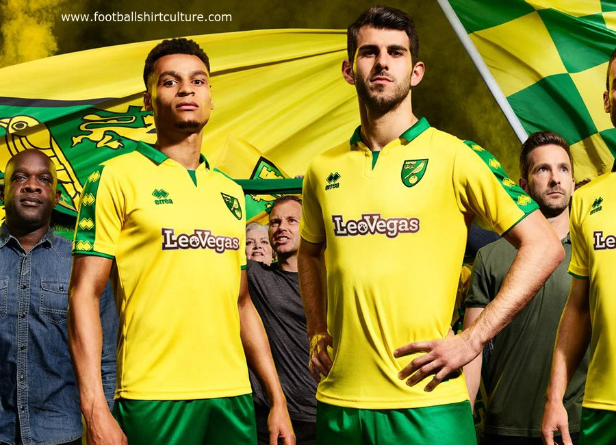
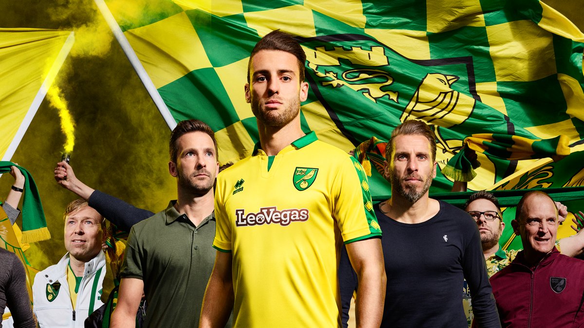
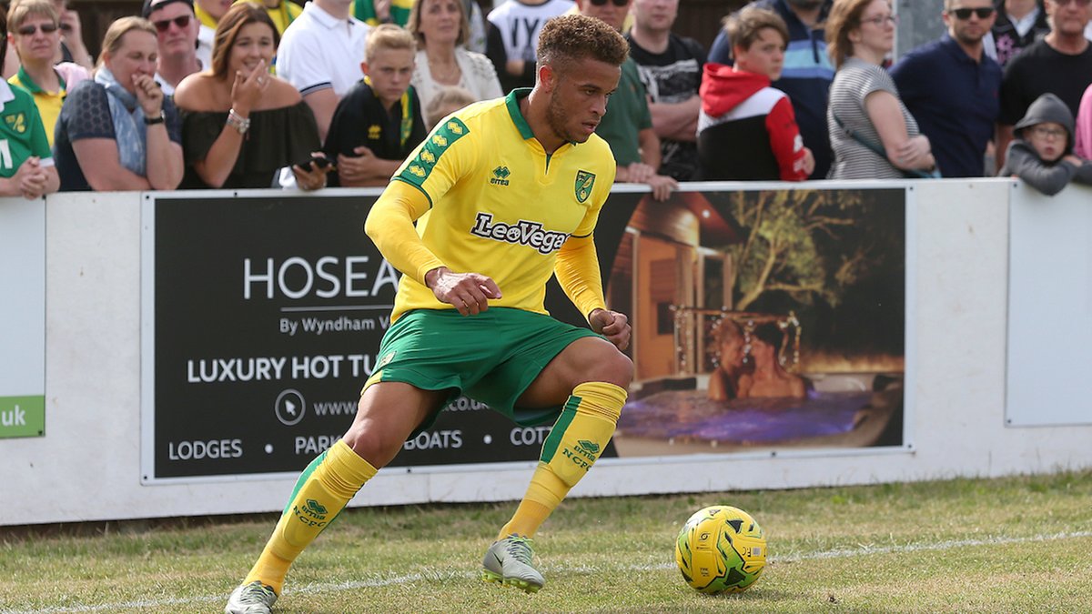
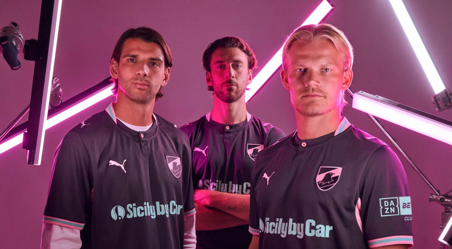
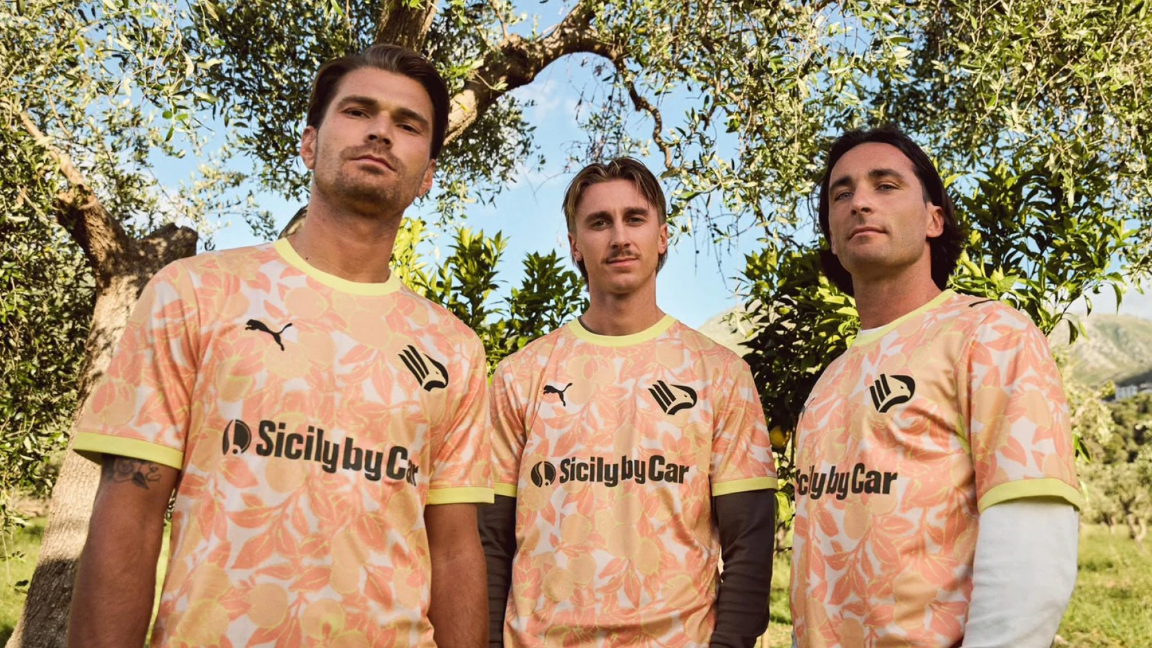
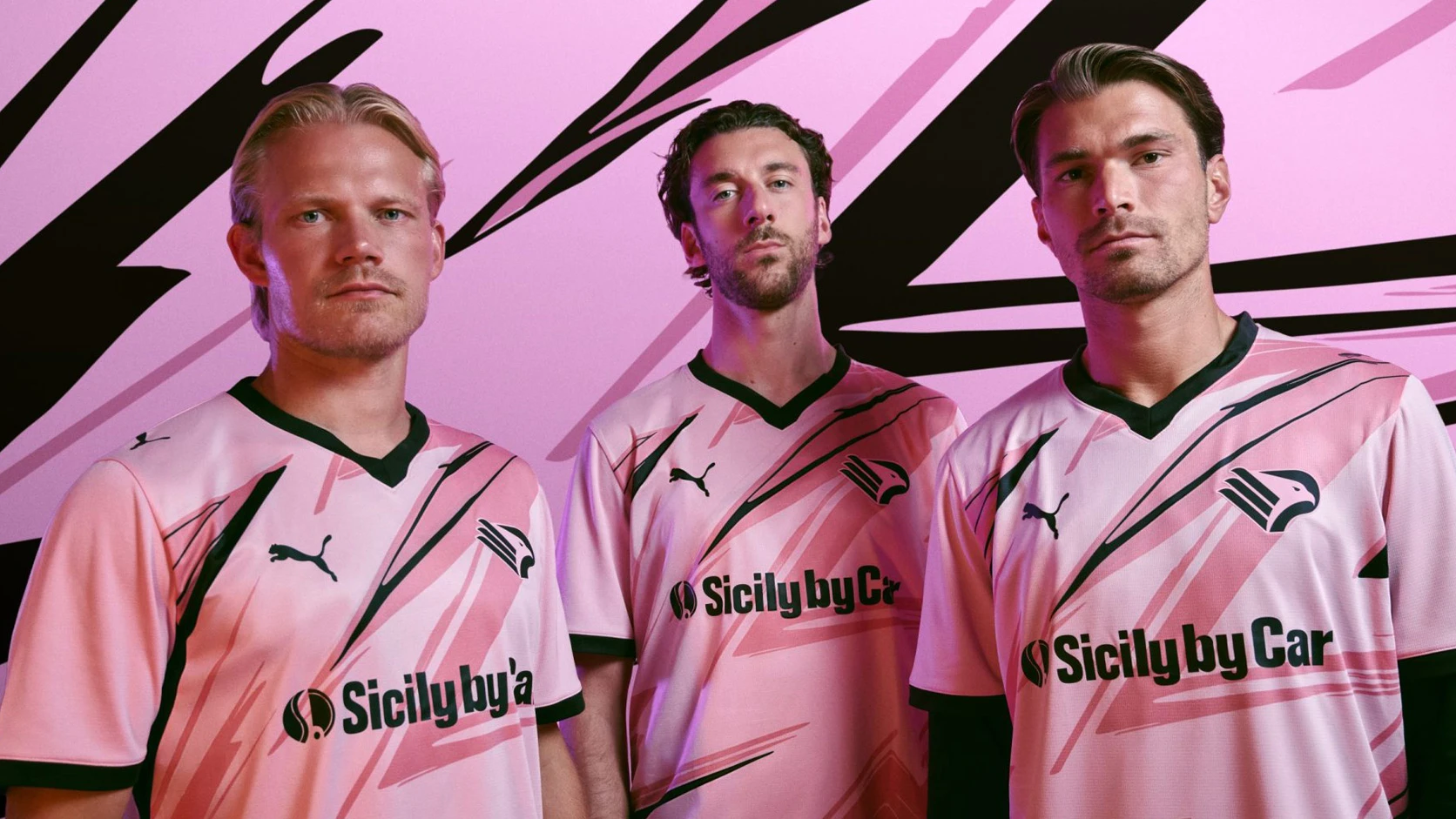
Norwich City have unveiled their new Errea home kit for the 2017-18 season.
The kit takes a classic look inspired by the famous Admiral kit of the late 1970s but with a modern twist carefully brought to life by long-term technical partner, Errea.
Loading comment... The comment will be refreshed after 00:00.
This commment is unpublished.
Arlu· 9 years ago
Norwich have had worse designs in the recent past, this is not too bad. The sponsor logo is just embarrassing though.
This commment is unpublished.
ANON· 9 years ago
how much does an EFL side get from a sponsor like this? Just wondering why they don't prefer to take a couple of hundred grand from a local business rather than this indignity.
The sleeve motif is nice - a shame it will be obscured by a massive Skybet badge.
This commment is unpublished.
Neutral Ned· 9 years ago
Errea logos on the sleeve would look better if they were all the way from the collar down to the hem (perhaps with a space for the league badge).
This commment is unpublished.
Stevo· 9 years ago
Would be quite nice, if not for the hideous shirt sponsor. One of the worst I've ever seen that.
This commment is unpublished.
Wessex· 9 years ago
Errea a number of years ago did a Palace strip that had the logos down the sleeves and looked also like a 70s/80s Admiral strip...I like this Norwich one.
This commment is unpublished.
PeteJF· 9 years ago
Reminds me of when Admiral did Norwich back in the 70s/80s - reasonable.