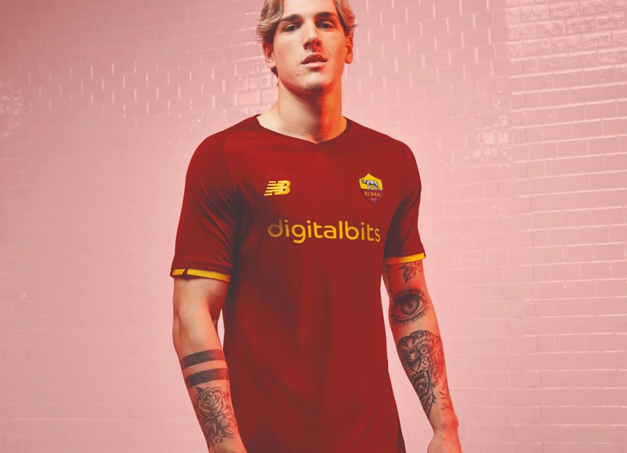
AS Roma 2021-22 New Balance Home Kit

AS Roma 2021-22 New Balance Home Kit #NBFootball #OnlyRoma #asroma #forzaroma #roma

AS Roma revealed their new Home kit for the 21/22 season.

The debut collaboration between New Balance and the Italian giant introduces the brand's first interpretation of the club’s signature look.

I Giallorossi’s famous colour palette is presented in rich yellow and red shades which are synonymous with AS Roma and the city of Rome. A subtle tonal pin-stripe design is visible on the front of the jersey, accompanied by matching shorts.

The unique shirt incorporates a v-neck collar and ribbon cuff details in yellow, whilst an outer label bearing the words La Lupa - a reference to AS Roma’s iconic female wolf symbol and a historic nickname of the Capitoline team is also added.

cfs Christmas Jumpers 10

AS Roma’s traditional rich red socks are completed with coloured hoops to match the home strip design.

 

4.4
47 ratings
Vote now!
  • 5
  • 13
  • 8
  • 10
  • 3
  • 3
  • 5
Chaz
 · 4 years ago
Comment (Not Required)
Way too boring imo for a Roma kit
Show more
Rat's behind
 · 4 years ago
Comment (Not Required)
Nice
Show more
Trousers
 · 4 years ago
Comment (Not Required)
The new Liverpool kit?
Show more
MarkRod
 · 4 years ago
Comment (Not Required)
Underwhelming. Dull compared to the 20/21 Nike range.
Show more
MrTito
 · 4 years ago
Comment (Not Required)
The last couple of Roma shirts have, in my opinion, been brilliant because they've succeeded in keeping it simple but adding a twist and flair (last seasons is one of my all time favourites). This is utterly meh, the sort of thing the clubshop should have as a discount 'works for all seasons' t-shirt.
Show more
Stu
 · 4 years ago
Comment (Not Required)
Squint and it's Liverpool's old kit
Show more
Rufjon
 · 4 years ago
Comment (Not Required)
People will come on here and say “finally roma getting good shirts when this is just the same as any Nike product”
Show more
Arnold Taylor
 · 4 years ago
Comment (Not Required)
Nice solid colour, but once again the sponsor on the back and front spoil it. Would have preferred the Inter route of having a lower back sponsor only and leaving the front clean.
Show more
John B
 · 4 years ago
Comment (Not Required)
Very nice. Simple and clean design.
Show more
Karl
 · 4 years ago
Comment (Not Required)
Horrible neck line and boring kit
Show more