Inter Milan 2021-22 Nike Home Kit

Inter Milan 2021-22 Nike Home Kit #IMScudetto #IMInter #InterMilan #FCInternazionale #nikefootball #fcinter

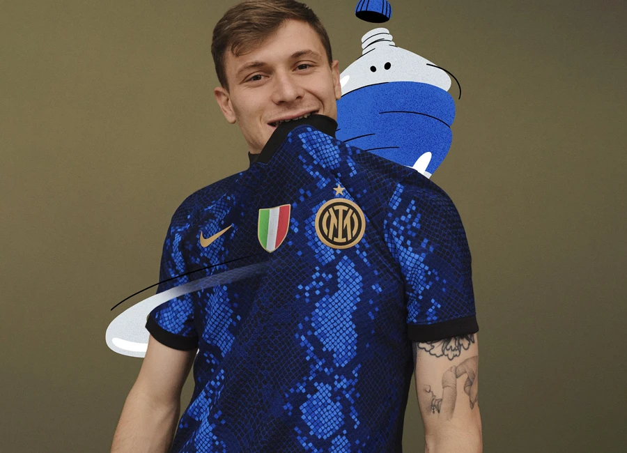
Inter Milan revealed their new 21/22 Home Kit by Nike.

FC Internazionale Milano home kit uses pixeled royal, navy blue and black to resemble snakeskin, forming the club’s familiar Nerazzurri stripes.

The snakeskin pattern is an ode to the coiled grass snake, or Biscione, an important historical symbol for the city of Milan and for the club. The kit marks the first time in a decade that the club’s home kit references the serpent.

Debuted in April 2021, the club’s crest appears on the left chest, and, indirectly, beneath the Scudetto on the center chest.

cfs Christmas Jumpers 10

The kits are constructed with at least 95% recycled plastic bottles as part of Nike’s Move to Zero initiative.

 

3.3
163 ratings
Vote now!
  • 46
  • 13
  • 6
  • 4
  • 7
  • 17
  • 70
GD
 · 4 years ago
Comment (Not Required)
I kind of like it, wish more black was in it. G
Show more
Facchetti_68_NZ
 · 4 years ago
Comment (Not Required)
The more i look at this the more i like it , will look even better with a sponsor on the front too.
Show more
Darren
 · 4 years ago
Comment (Not Required)
Absolutely stunning design. Just half a star short because of the lack of a sponsor
Show more
.
 · 4 years ago
Comment (Not Required)
This ain't it. Could have still done the pattern with better execution, and brought back the serpent crest from the '70s and '80s instead of dumbing down the iconic IMFC crest.
Show more
Django
 · 4 years ago
Comment (Not Required)
Abomination
Show more
Gagan
 · 4 years ago
Comment (Not Required)
Good ??
Show more
Pitt
 · 4 years ago
Comment (Not Required)
It's looklike Aquarman.
Show more
w
 · 4 years ago
Comment (Not Required)
i dont know why a lot of people hate this, this shows a new era of inter where they grow into say new skin. with them winning the previous season I feel like this is a perfect fit for the team. all the people hating on not hate new things or are just boring old heads
Show more
Idi ‘Big Daddy’ Amin
 · 4 years ago
Comment (Not Required)
This is absolutely appalling. Changing the crest is bad enough, but this is another level altogether. Nike have well and truly messed the bed here.
Show more
Wally
 · 4 years ago
Comment (Not Required)
I thought last year's Inter kit was an abomination, but this is something else. I get the need to be creative but it's iconic black and blue stripes, why mess with it?
Show more