Manchester City 2021-22 Puma Third Kit

Manchester City 2021-22 Puma Third Kit #ManchesterCity #ManCity #pumafootball #mcfc

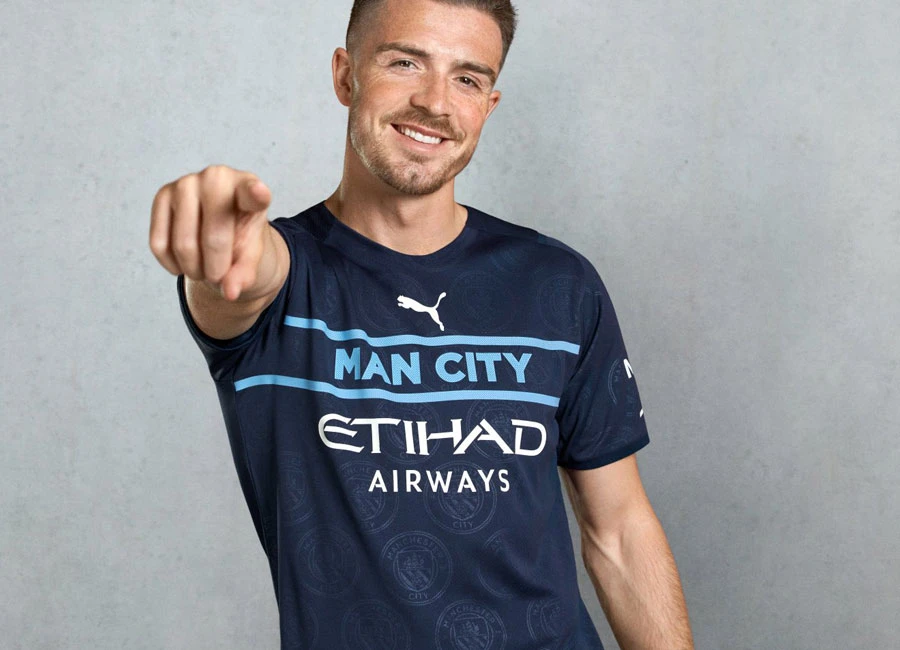
Manchester City revealed their new Third kit for the 21/22 season.

As part of PUMA's Faster Football movement, the brand aims to challenge convention, innovate, and bring fresh products to football.

The navy blue jersey with light blue detailing features an innovative use of the Club’s crest as a tonal repeat graphic embossed into the fabric. The crest also appearing on the back of the jersey beneath the collar.

The most eye-catching feature of the jersey is the placement at the heart, of the club’s name ‘MAN CITY’, emblazed across the front of the jersey in the Club’s bespoke font, with the PUMA cat centrally positioned to add balance to the visionary design.

cfs Christmas Jumpers 10


0.9
125 ratings
Vote now!
  • 3
  • 3
  • 1
  • 0
  • 1
  • 3
  • 114
AB76
 · 4 years ago
Comment (Not Required)
Utterly dreadful, so up to Puma's usual standard
Show more
Matt
 · 4 years ago
Comment (Not Required)
So I'm a City fan and I honestly think my bias is overriding my natural instinct to be impartial on this one. It is very 1990's, styled very similarly to training tops from that era. Those types of tops often had lettering splashed across the front in lieu of a badge for example and you always knew which team it represented without question. This absolutely hammers home it's a City shirt. It's looks smart, has bold styling without having a cluttered pattern. I really like.
Show more
  • Guy 4 years ago
    Are you taking the p##so or on something ? It's abysmal .
    • Tricky 4 years ago
      Your bots can’t save you now puma?
  • Matt 4 years ago
    I'm absolutely not a bot. I'm all in for opinion and this is my view on this kit. If you don't like it- that's fair, you just don't have to hunt someone down because they do.
  • Andyk 4 years ago
    Load of ********. Teams in the 90's were not sad enough to have this style of shirt in training!
Tim Burr
 · 4 years ago
Comment (Not Required)
Good grief, my two year old granddaughter could of come up with that!
Show more
Jim
 · 4 years ago
Comment (Not Required)
What were they thinking!!

Dog sh!t.
Show more
Andyk
 · 4 years ago
Comment (Not Required)
Terrible. A football shirt has to have the team badge to represent a team. Having a team name printed on make it a plain t-shirt
Show more
Guest
 · 4 years ago
Comment (Not Required)
Nice pattern but as a city fan, I'm so annoyed because the badge isn't there. What is the point in just having the words 'MAN CITY' on instead. If it had the badge and the dark imprint of the badge on it, this would be nice.
Show more
  • Guest 4 years ago
    Also it looks like a training shirt. I forgot to add this.
Ant
 · 4 years ago
Comment (Not Required)
Shocking would have been sort of ok if the club badge was on the sleeve but this looks like a normal t shirt waste of money
Show more
Tess Tickle
 · 4 years ago
Comment (Not Required)
Just pants
Show more
zebio
 · 4 years ago
Comment (Not Required)
Looks like an expensive version of a market stall counterfeit...Without the sponsor it would have been acceptable...Wot a stinker!
Show more
WBA Fan
 · 4 years ago
Comment (Not Required)
This deserves 0 stars
Show more