Borussia Dortmund 2021-22 Puma Cup Shirt

Borussia Dortmund 2021-22 Puma Cup Shirt #BorussiaDortmund #bvb #pumafootball

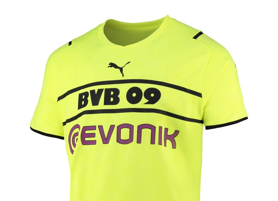
Borussia Dortmund has revealed the new Puma Cup Kit for the 21/22 season.

Worn by the Dortmund players in domestic and European cup matches, it sees the BVB 09 wordmark take centre stage on the chest, sitting between two horizontal black lines.

weekly deals

Dortmund's iconic club crest is found on the back neck, while it also appears in jacquard form on the front. PUMA's patented dryCELL technology is also present and keeps you cool and calm while it wicks away sweat from the body.

Sign in or create an account to earn points for voting, commenting, reading articles, and more.


1.2
48 ratings
Vote now!
  • 1
  • 1
  • 1
  • 0
  • 4
  • 1
  • 40
Cardiff Soul
 · 2 years ago
Comment (Not Required)
😂😂😂 God, that's bad...
Show more
spud
 · 2 years ago
Comment (Not Required)
better luck next year - puma!

this time your design template sucks.
Show more
PB
 · 2 years ago
Comment (Not Required)
Puma are slowly probing themselves to be one of the worst football kit makers out there. Lazy, cheap and boring. Not a slither of imagination has gone into these designs.
Show more
Ben
 · 2 years ago
Comment (Not Required)
Terrible kit. Puma are bad
Show more
Kyle
 · 2 years ago
Comment (Not Required)
Terrible jersey. Very disrespectful putting the puma logo front and center and getting rid of the club badge. Ive always liked Puma kits especially the last few years but this is disgusting and every true fan should be embaressed
Show more
Stone
 · 2 years ago
Comment (Not Required)
Another horrific example of a major manufacturer putting their own branding above the club they are supposed to serve. Shame on you Puma!
Show more
Stan lye
 · 2 years ago
Comment (Not Required)
Hall. Of. Shame.

This is F tier, Puma. Get the f-king dunce cap on
Show more
z
 · 2 years ago
Comment (Not Required)
awful.
Show more
No Puma. No.
 · 2 years ago
Comment (Not Required)
colour ist awful, design uncreative since every puma club uses this, no crest is a no go, two letterings look bad.

just bad...
Show more
A
 · 2 years ago
Comment (Not Required)
No crest. Lazy design
Show more