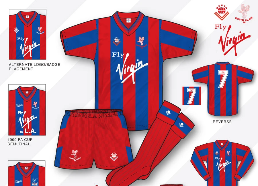
Sometimes, the beauty in a football shirt is the debate over nailing down the definitive version. The Bukta Home shirt, or shirts, worn by Crystal Palace in the last couple of years of the Eighties and into 1990 is - or are - an example of this.
As illustrated in this in-depth True Colours take, logo placement differed between, generally, the players’ version and the replica, the Bukta logo was amended for huge matches at the end of the lifespan, the crest was updated for the latter of those, and the neck changed between the short and long-sleeved versions.

However, for football fans of a certain age, there’s one difference which stands head and shoulder above the others in importance: the addition of “to L.A.” (sic) to the ultra-iconic (“Fly”) Virgin sponsorship branding in the famous 4-3 win over Liverpool in the 1990 FA Cup semi-final and the 3-3 draw with Manchester United in the Final.
Sign in or create an account to earn points for voting, commenting, reading articles, and more.
Whilst Palace eventually lost the Cup Final replay - the kit they wore on that occasion is a story for another day - manager Steve Coppell had predicted in early 1989-90 that the Eagles’ 9-0 defeat to Liverpool at Anfield would haunt the side for the rest of their lives, but mere months later, in a particular version of this particular kit, those fears were completely “L.A.’d”.
This rendering is the work of True Colours author John Devlin - truecoloursfootballkits.com. Keep up to date with True Colours by following @TrueColoursKits on Twitter.
Click to enlarge Image