Olympique de Marseille have introduced a new club crest and visual identity, officially presented on 8 April 2026 during a gala event linked to the club’s Treizième Homme foundation at Fort Ganteaume.
The updated Olympique de Marseille crest forms part of a wider identity refresh developed internally, combining historical references with a contemporary graphic structure.

Middlesbrough FC have unveiled a new club crest, developed through extensive consultation with supporters, which will be introduced permanently from the 2026/27 season to coincide with the team’s 150th anniversary.
The main crest returns to a circular form, a shape that fans strongly favoured and one that recalls the badge worn when the club was reborn in 1986. Within the design, the club’s founding year, 1876, is split across the central white band, a feature associated with Boro since the 1970s under Jack Charlton. The full club name appears in a bold slab-serif font, referencing the region’s industrial heritage.

Stoke City have announced that a new club crest will be introduced from the 2026/27 season following a fan vote.
Supporters opted for a redesigned identity inspired by the badge used between 1977 and 1992, updated with a modern interpretation. The result saw 68 percent vote in favour of the change, with 32 percent preferring to retain the current version.
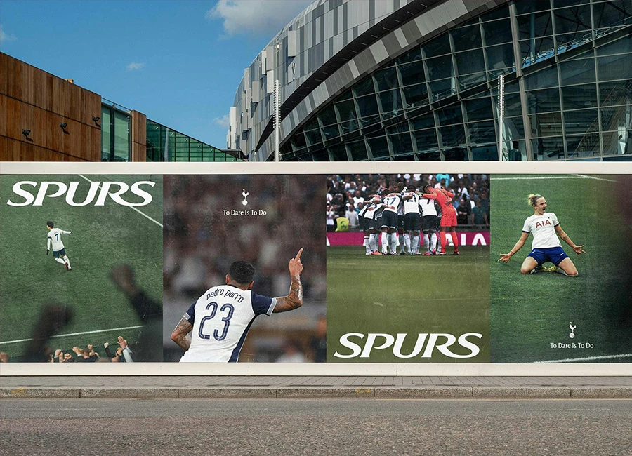
Tottenham Hotspur have unveiled a remastered brand identity, celebrating its history and heritage while embracing modern design. The updated branding will appear across all physical and digital platforms, including the stadium and Tottenham High Road, debuting during the match against AS Roma on 28 November.
This redesign followed a nine-month collaboration with Studio Nomad, involving input from over 300 players, coaches, staff, and fan groups to capture what the Club represents.The world-famous crest, simplified in 2006, now has the club’s name removed beneath the cockerel and is complemented by a silhouette version for greater creative expression. The THFC monogram, a fan favourite from the 1950s, has been reintroduced and modernised.
In a landscape where many clubs are modernising their crests, Ajax has announced the return of its classic logo as the club’s emblem from the 2025/2026 season, marking its official permanent reappearance on match shirts after 34 years.
The Ajax logo has a rich history, rooted in the story of the Greek hero Ajax. First introduced in 1928, the original crest featured a detailed depiction of the hero’s head. In 1990, the club opted for a modern redesign, replacing the intricate artwork with an abstract interpretation. This version retained the head of Ajax but was drawn using just 11 lines, a deliberate nod to the 11 players on a football team.
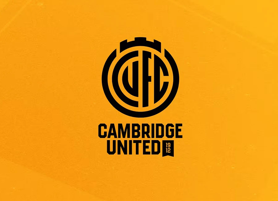
Cambridge United have unveiled a new club identity, featuring a primary crest and secondary symbols that honour the club and city’s heritage.
Over the past 18 months, the club worked to modernise its image while preserving historical roots. After developing new concepts, fans were invited to vote on three design directions: Evolution (a modern take on previous crests), Abbey Inspired (drawing from Cambridge’s architecture), and Book & Ball (referencing an older identity).
New York City FC have introduced an updated club badge, as part of a broader visual identity refresh launched earlier this year.
The revised badge builds on the club’s established identity, honouring the original design by retaining the iconic NYC monogram and core elements, while making subtle improvements to enhance the brand's visual strength.

This is the new crest for English National League South side Yeovil Town Football Club.
Nicknamed “The Glovers”, the Somerset-based team now pay tribute to the glove-making traditions of their home town in their streamlined emblem, with the other detailing limited to the identity spelt out in an arc over a retro-styled football branded with their year of establishment (1895).

Japanese J1 League side Nagoya Grampus - formerly known as Nagoya Grampus Eight - have unveiled an updated identity, including a new crest.
From 2024 onwards, the club will use a palette of warm colours, branded as incorporating “Grampus Red”, “Grampus Yellow” and “Grampus Gold”, as well as “Noble Red”, Star Orange” and “Legend Yellow”, with this taking in the new club badge as well as a new type logo/wordmark and the club flag on which both feature.

This is the freshly unveiled new crest for Japanese J1 League side Football Club Tokyo.
The new direction for “Gas” - focused on a marriage of the "inheritance" of a history and forward-looking "innovation" - sees the creation of a red-and-blue shield-based modern badge with the striping of the previous version rendered at 45-degree angles and the team name, “F C TOKYO”, in white.