Middlesbrough FC have unveiled a new club crest, developed through extensive consultation with supporters, which will be introduced permanently from the 2026/27 season to coincide with the team’s 150th anniversary.
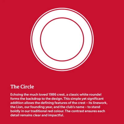
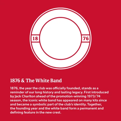
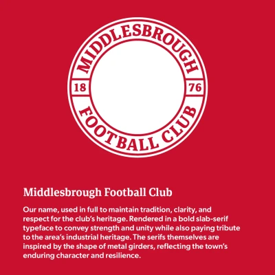
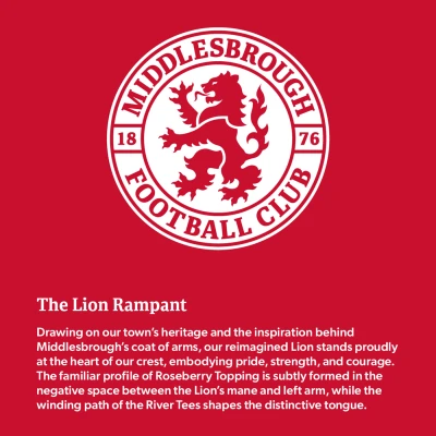
The main crest returns to a circular form, a shape that fans strongly favoured and one that recalls the badge worn when the club was reborn in 1986. Within the design, the club’s founding year, 1876, is split across the central white band, a feature associated with Boro since the 1970s under Jack Charlton. The full club name appears in a bold slab-serif font, referencing the region’s industrial heritage.
At the centre stands the lion rampant, a long-standing symbol of Middlesbrough with origins linked to the De Brus family. Subtle local details are incorporated within the lion’s form, including the curve of the River Tees at the Riverside Stadium represented in its tongue, and the outline of Roseberry Topping traced into its mane.
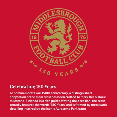
For the 2026/27 season, a special anniversary edition will also be used. This version features a “150 Years” inscription inspired by the wrought-iron gates of Ayresome Park, paying tribute to the club’s former home.
The new crest will officially come into use from June 2026 as Middlesbrough prepare to celebrate their milestone anniversary later that year.
Click to enlarge images


