Stoke City Unveil New Club Crest

Stoke City Unveil New Club Crest

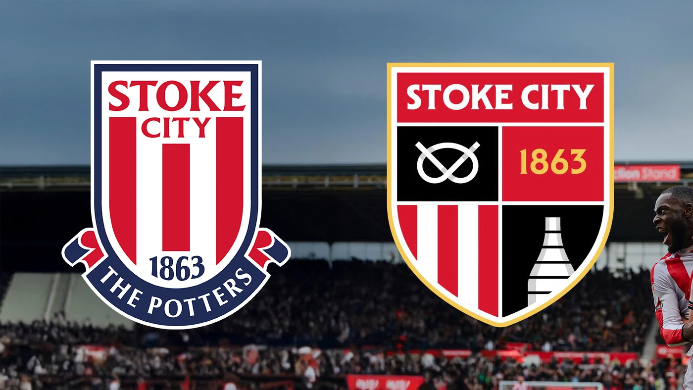
Stoke City have announced that a new club crest will be introduced from the 2026/27 season following a fan vote.

Supporters opted for a redesigned identity inspired by the badge used between 1977 and 1992, updated with a modern interpretation. The result saw 68 percent vote in favour of the change, with 32 percent preferring to retain the current version.

The decision came at the conclusion of a consultation process that included surveys, fan assemblies, and ongoing discussions with the independent advisory body, Stoke City Connect. To ensure transparency, the vote was hosted and validated by sports industry specialists Two Circles.

The updated crest will first appear on the 2026/27 home, away, and third shirts. It will also be visible across official digital platforms and within key areas of the bet365 Stadium from the start of the campaign. The transition will continue gradually over subsequent seasons until the new look is fully adopted across all club assets.

cfs Christmas Jumpers 10

stoke city unveil new club crest

Stoke City Connect Chair, Clare Beardmore, added: “The Club engaged with Connect from start to finish. Supporters’ voices were heard and acted upon, and a well-defined process was followed throughout.

“We are, of course, aware that no new design could ever please everybody. The aspiration was always for the Club to produce something that gained approval from the majority.

“With supporters having been asked for their opinions on what features should be included, and with the wishes of the majority incorporated as much as possible, we know the crest seeks to be representative of our Club and our City.”


4.2
33 ratings
Vote now!
  • 1
  • 9
  • 9
  • 5
  • 5
  • 3
  • 1
DiscoDom19
  • Member
  • 21
  • 2
  • 23
 · 3 months ago
Comment (Not Required)
Old one was better
Show more
lukedeux
  • Member
  • 175
  • 1
  • 72
 · 3 months ago
Comment (Not Required)
I've got to say I'm not a fan. I like that they're calling back on the older crest but I would have liked to see a bit more done with it.
Show more
Andy
 · 3 months ago
Comment (Not Required)
So much better than the dreadful design they have now. Badges that just show the colours of the team completely lack inspiration - Newcastle take note
Show more
Guest14
 · 3 months ago
Comment (Not Required)
Looks really good. As others have said, a big improvement on the current badge.
Show more
Polp
 · 3 months ago
Comment (Not Required)
Not bad would like just at Staffordshire knot with SC63. In a minimal style
Show more
Greggs
 · 3 months ago
Comment (Not Required)
A massive improvement on the current badge, which I was never a fan of. The existing badge lacks any connection with the tradition or historical relevance to the area, it was always felt like a corporate scribble designed on the back of a fag packet.
Show more
Knight of the Vale
 · 3 months ago
Comment (Not Required)
About time
Show more
Markymark
 · 3 months ago
Comment (Not Required)
Big improvement. Can’t stand badges that are just stripes or hoops, or a letter. Tell me something about your community in your badge!
Show more
Wessex
 · 3 months ago
Comment (Not Required)
Mutch better than the meaningless one they currently have.
Show more
Tostao
 · 3 months ago
Comment (Not Required)
Excellent. Their current one is one of the most unimaginative & bland there is (along with Fulhams)
Show more
  • Chansiri is the Messiah 3 months ago
    And leeds
  • Greggs 3 months ago
    Fulham definitely have the worst badge.