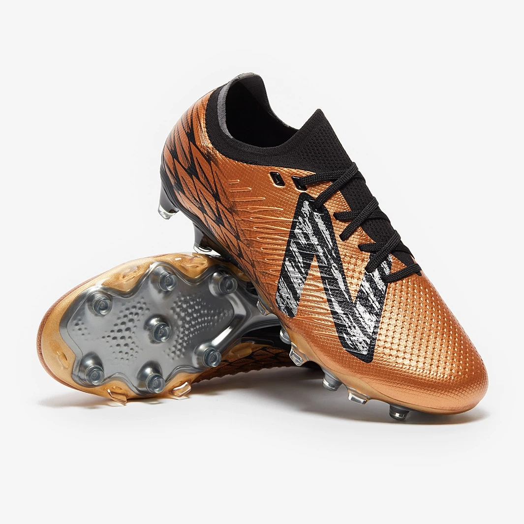
Experience the game to the fullest with the Copper/Black New Balance Tekela V4 Low Pro FG Own Now football boots, boasting a next-gen minimalist upper for heightened sensation on the ball. Redesigned...

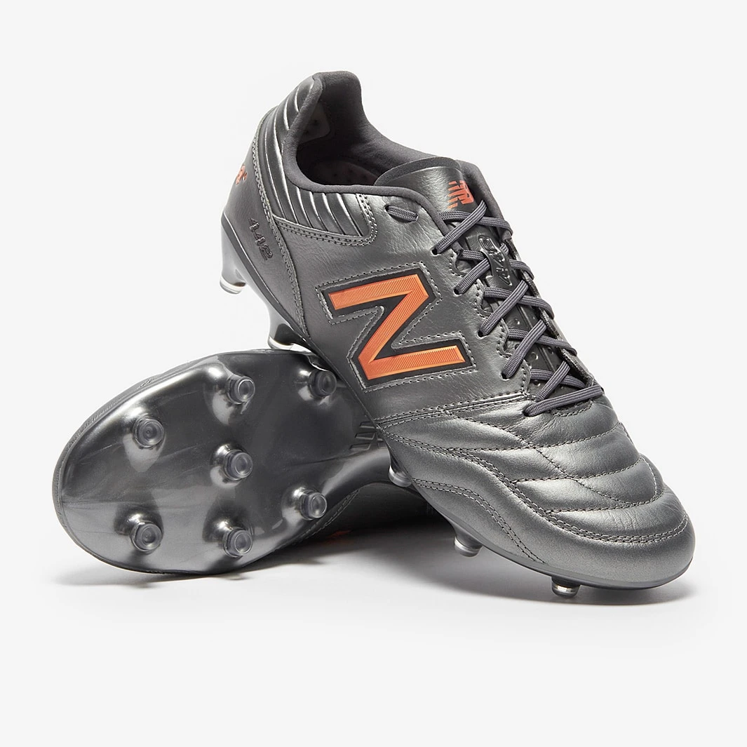
These are the New Balance 442 V2 Pro FG Own Now football boots in Silver, a premium K-leather boot featuring an updated stitching pattern and elite-level nylon soleplate. Quality players recognize...
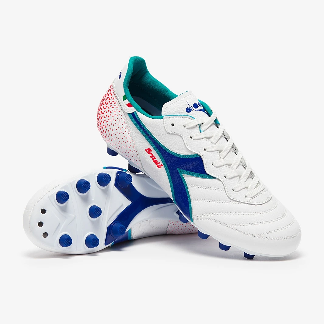
These are the new Diadora Brasil Made in Italy OG FG football boots in White/Navy. This classic version of the Brasil is tailored to suit the demands of the modern game and is expertly crafted in...
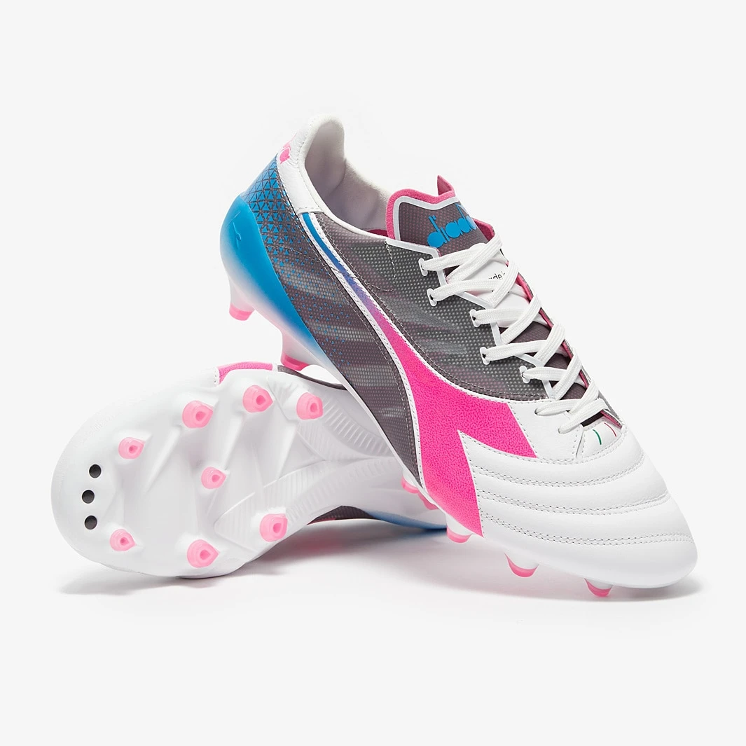
Take flight on the pitch with the Diadora Veloce SL Made in Italy FG football boots in White/Pink Fluo/Blue/Fluo. Designed for ultimate speed, these boots feature a superlight construction that will elevate...
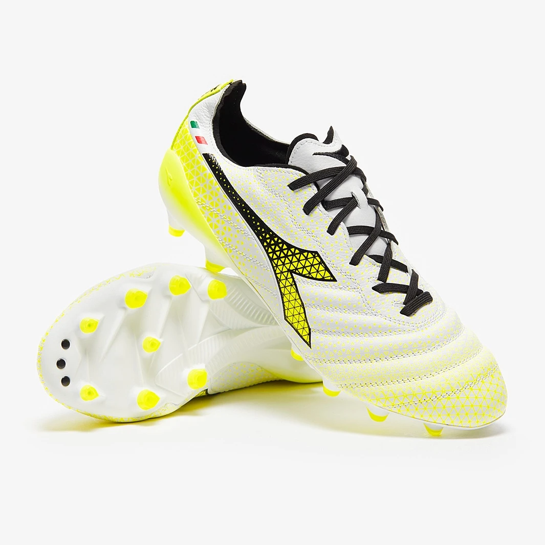
Experience unparalleled performance with the Diadora B-Elite Tech Made in Italy FG in White/Black/Fluo Yellow. Crafted from the finest leather, this boot offers a luxurious touch and an immaculate...

These are the Nike CTR360 Maestri III SE FG football boots in Sonic Yellow/White/Black. This special edition boot is a faithful recreation of the legendary 2012 model. Formerly donned by football...
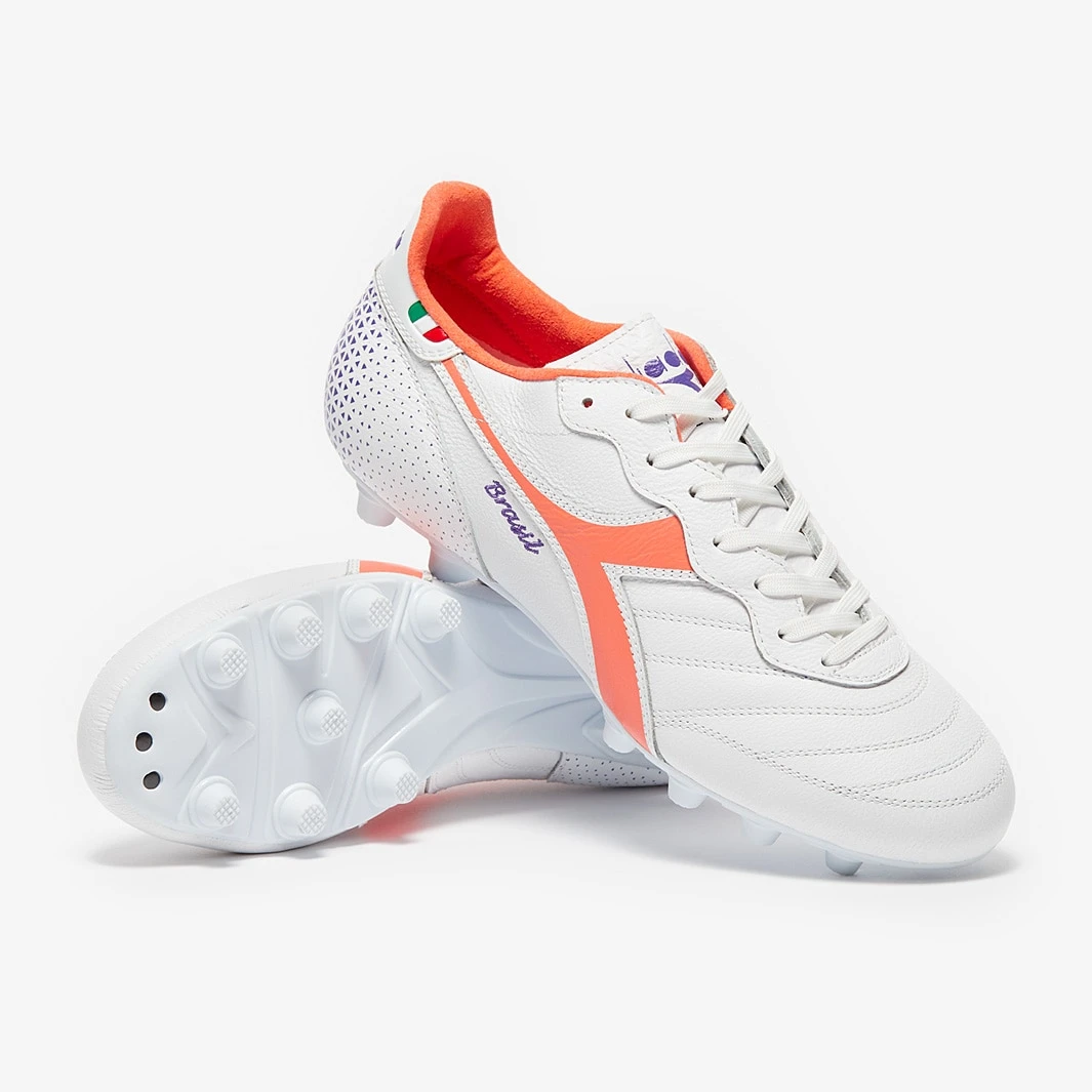
Embrace retro style and display your elegance with the Diadora Brasil Made in Italy OG FG football boots in White/Fresh Salmon. This limited edition colourway pays homage to classic Diadora...
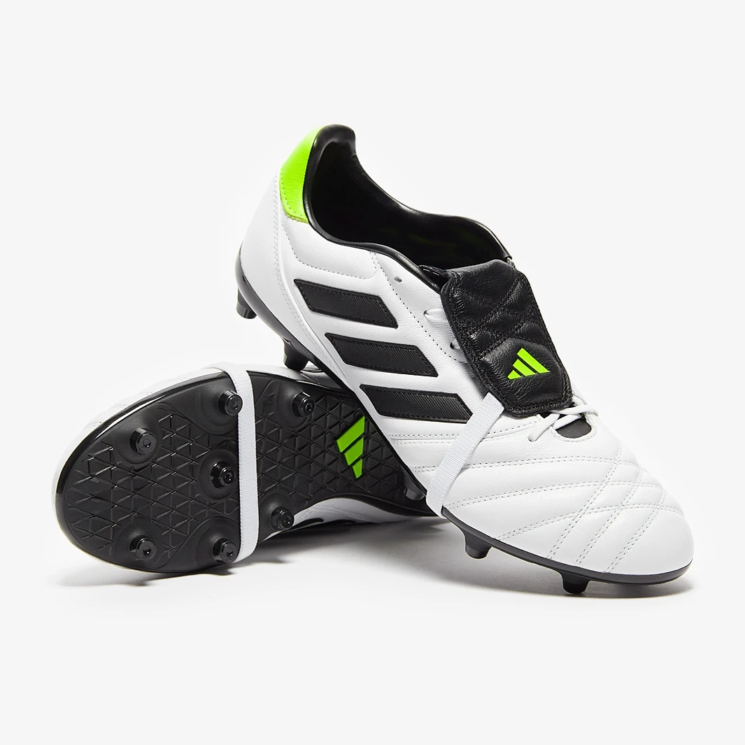
These are the new adidas Copa Gloro FG football boots in White/Core Black/Lucient Lemon. These boots feature stitched details to maintain the classic Copa look. The Copa Gloro carries on the...

Introducing the Nike Zoom Mercurial Superfly 9 Elite NU FG football boots in Guava Ice/Black, a standout design from "The United Pack". These boots feature a striking iridescent plate, futuristic...

Part of "The United Pack," the Nike Phantom Luna Elite NU FG football boots in Guava Ice/Black are designed to elevate your game to the next level. With a flashy iridescent plate, futuristic...