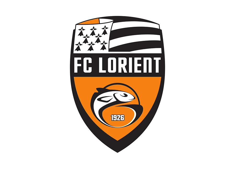
The FC Lorient crest is the official visual identity of the French club and reflects both its maritime roots and regional heritage in Brittany. The current FC Lorient logo, introduced in 2010, is presented as a shield-shaped badge combining orange and black, colours long associated with the club.
At the centre of the FC Lorient badge is a stylised European hake, or merlu, depicted leaping over a football. This figure directly relates to the club’s nickname, Les Merlus, and references Lorient’s historical connection to the fishing industry. The lower section of the crest includes the year “1926”, indicating the club’s founding. Across the middle, a black band carries the club name in white lettering.
The upper portion of the football crest incorporates elements of the Gwenn-ha-du, the traditional flag of Brittany. The inclusion of ermine spots and striped detailing reflects the club’s geographical identity and links it to the wider Breton region.
FC Lorient’s visual identity has evolved over time, with earlier versions featuring a diamond-shaped emblem. This original form was referenced again in the 2025/26 season, when a special centenary crest was introduced to celebrate 100 years of the club. The anniversary version combines aspects of the modern shield with the historic 1926 design through a reflective finish.

