West Germany and, latterly, the side representing the reunified Germany - a natural progression from the previous Fifa member, and absorbing Germany DR (East Germany) - have one of the most glorious histories in international football. And a kit history to match.
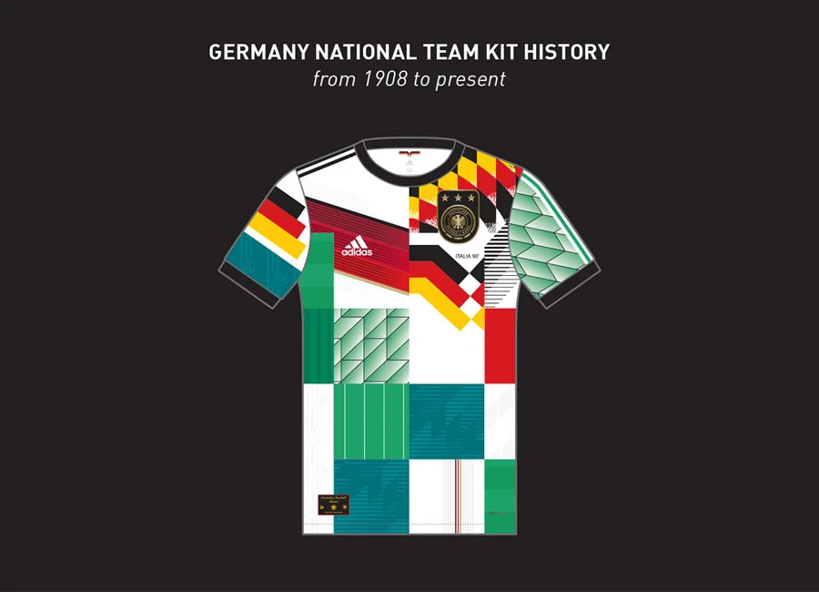
Courtesy of designer Emre Gultekin, this progression has been beautifully rendered. The Home designs have generally been white and black, with varying proportions, from beginning to end, but there have been notable exceptions.
While the lace-up neck offerings of almost 100 years ago could be mistaken for versions of the Die Mannschaft kit worn 40 years later - and are arguably due a revisit today - the designs worn at the 1912 and 1928 Olympic Games with the VfB Stuttgart-like red band are notable for different reasons.
The inclusion of red is rare, but it was the secondary colour via, primarily, a chest chevron, on a kit with white shorts as first choice when the said reunited German national side won their first World Cup in 2014 - the fourth on the official record. A deviation from traditions it may have been, but the inspiration becomes clear with retrospect.
The German teams are, of course, notable for their change kits too. Green first came into formal use in the 1950s and has been a go-to ever since, with grey, red and black all being deployed too in recent years - red and black together in a CR Flamengo style was worn in the demolition of Brazil two mondials ago, while the latest release essentially goes full blackout.
But it is green which is the most iconic colour, providing the fill for legendary kits such as that worn in a penalty shootout victory over England at the glorious Italia ‘90 tournament and another worn at Wembley the following year - post-reunification.
The latter was derivative of probably the most iconic (West) Germany shirt ever - for many, the most iconic football shirt ever - the German tricolour flag-incorporating ribbon-style graphic Home. Emre has represented Ina Franzmann’s graphic on these in mirror image form, compromising the adidas logo position rather than the crest - which, with hindsight, is the way it should have been.
adidas seem to have admitted this themselves, flipping the detail for the 2018 retread - as depicted here - as well as dispensing the Schwartz-Rot-Gold colouring in favour of a black line texture fill which is interpreted as grey.
And adidas call the shots, as much as any technical partner ever could, and have done for decades - including an overlap with the associated Erima. Perhaps the future will bring a new manufacturer, but “The Brand with the 3 Stripes” have delivered for their countrymen with some regularity and often in spectacular fashion, and surely will continue to do so for many kits to come.
Visit Behance to view more of Emre's work. Keep up to date with it by following egsportsdesign on Instagram.

