Mary's Hall of Shame - Part 1

 hall-of-shame-1.jpg


Coventry 1978. Arsenal 1991. Hull city 1993. These words are enough to strike fear across the football shirt world.

Sign in or create an account to earn points for voting, keep track of your reviews, edit them, and more.


These are not notorious firms of hooligans, nor even the scenes of particularly calamitous defeats. No, they are examples of that most dreadful football kit design disasters who earned their place in football’s Hall of Shame.


Every now and then, some wild-eyed idiot in a club's marketing department gets together with a cack-handed graphic design student to create something awful.

Maire Ofeire, who has a lot of interest in football kit design, will make  a random Top 10 Hall of Shame followed by a random Hall of Fame Top 10 on FSC every week.  

Enjoy part 1..


10.  Ajax 1989-1990    

A design that appears to be typical of the time. Unfortunately it is not very nice.


9. Kaiserslautern home 1990-1991

Sometimes zigzag works, sometimes it won’t. Sadly for Kaiserslautern, this didn’t.


8. Arsenal away 1990-1991

The infamous ‘bruised banana’ kit sported by Arsenal in the early 1990s.


7. Huddersfield Town GK 1993-1994

I think you could say the Huddersfield Town’s Goalkeeping Kit of the 1993-1994 season is a cacophony of colour.


6. Tiburones Rojos de Vercruz 2000-2001 away shirt

The Mexican club seem to have hired a rugby designer to create their 2000-01 home shirt.


5. Melbourne Victory (2007-2008)

Another club who seem to have hired a rugby shirt designer.


4. Scotland 1986 Umbro

Scotland may have exited the Mexican World Cup at the group stages but they certainly left a lasting impression with this combination.


3. Hull 1993-1994 Matchwinner

Known as the ‘Tigers’, Hull took their nickname to the extreme during the early 90s.


2. York City 2002-2003

One can be forgiven for thinking that this is more suitable to Ascot than Bootham Crescent.


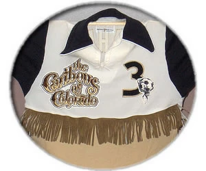
1. Caribous of Colorado 1978

This fetching shirt, complete with fringing, was sported by NASL side Caribous of Colorado in 1978. The Denver based team lasted a mere season and counted NFL place kicker Matt Bahr amongst their ranks.


The newly formed side of ’78 complied the worst record in the league, winning 8 and losing 22. Fortunately for the players, the team folded and moved to Atlanta the next year, leaving this jersey to top many ‘Hall’s of Shame’.



Write comments...
You are a guest ( Sign Up ? )
or post as a guest
Loading comment... The comment will be refreshed after 00:00.
  • This commment is unpublished.
    fsc · 16 years ago
    the thing about melboure victory is...

    1) they didn\'t \'hire\' a \'rugby shirt designer\'/Reebok, the a-league did, and like the mls all there is a league kitmaking deal in place. reebok makes all the kits for all the teams

    2) on this reebok thingy, all the a-league kits are utter s*i*e and all look like rugby shirts. and reebok also dont want the clubs to have any individuality whatsoever. by this i mean no team has stripes or hoops, and it has been reported that melbourne had a struggle getting reebok to whack a V on their chests.

    3) furthermore, look at the other a-league clubs\' shirts, they\'re exceedingly s*i* and the replicas are also fairly tacky. like i said before, clubs kits are either plain-coloured or different sleeved-coloured (like Arsenal\'s home). the new wellington team wanted to have stripes, but reebok didnt want to give it to them.

    so yeah, lets hope the league lets the teams go free range and get their own shirt deals or at least gets a quality kit supplier. i could crap a better kit than reebok could make, just look at bolton\'s.
  • This commment is unpublished.
    fsc · 16 years ago
    theres nothing wrong with the Melbourne Victory kit. The reason behind the white V across the chest is that Melbourne is in Victoria and historically teams from Victoria have been known to have a V on the front.
  • This commment is unpublished.
    johnnycakes · 16 years ago
    the scotland shirt is great....................those shorts though!!!
  • This commment is unpublished.
    fsc · 16 years ago
    Being from Denver Colorado I am so proud that the caribou jerseys got the number 1 spot. Absolutely the most... um..unique kit I\'ve ever seen!
  • This commment is unpublished.
    fsc · 16 years ago
    [quote=Tim]Other than the tightness of those shorts, what exactly was wrong with that Scotland kit, It was pretty unoffensive really as all teams wore tight kits back then.[/quote]
    It\'s not the tight shorts which were the problem, its the horizontal band going across them complete with rather odd logo placement.
  • This commment is unpublished.
    fsc · 16 years ago
    I agree with \'I disagree\'. The Melbourne Victory shirt is a bit like a rugby shirt but it\'s alright.

    There\'s nothing wrong with the Scotland shirt but the weird blue band on the already short, tight, white shorts makes them look even worse.

    The Caribous of Colorado is probably the campest football shirt that I\'ve seen. It looks like a cheerleader\'s shirt.
  • This commment is unpublished.
    fsc · 16 years ago
    Other than the tightness of those shorts, what exactly was wrong with that Scotland kit, It was pretty unoffensive really as all teams wore tight kits back then.
  • This commment is unpublished.
    fsc · 16 years ago
    Melbourne victory doesn\'t belong here. That\'s a good kit.
  • This commment is unpublished.
    fsc · 16 years ago
    Matt Bahr was to New York American Football Giants in the 90s as Scotland born Lawrence Tynes is to the current NFL Champion team. Bahr sent the Giants into Superbowl XXV with a last second winning field goal against the heavily favoured San Francisco 49ers. Then in the big game he put the Giants into the lead before Scott Norwood missed a last second field goal for the Buffalo Bills.