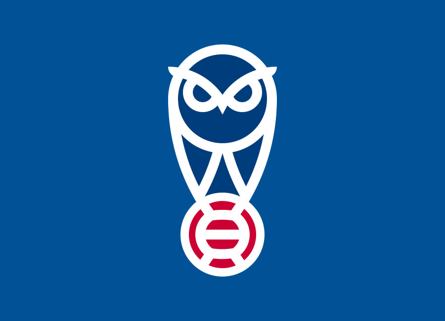
Oldham Athletic Crest Redesign by MikeM

Oldham Athletic Crest Redesign by MikeM #crestdesign #logodesign #OldhamAthletic #oafc #OldhamAthleticAFC

Our sister site, DesignFootball.com, regularly provides alternate - as in “universe” - branding for professional football clubs and national teams. This Oldham Athletic example is one such example.

The Latics have a new crest for 2021-22, but “MikeM”’s ultra-modern and minimalist stylings would have arguably provided another suitable replacement for the much-maligned design which was dispensed with last summer.

Visit Designfootball.com to view all our members designs, and join up to showcase your own creations.

Learn to design your own kits in this Tutorial
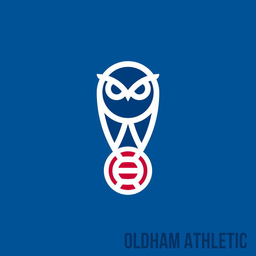
oldham athletic crest redesign by mikem full

Write comments...
You are a guest ( Sign Up ? )
or post as a guest
Loading comment... The comment will be refreshed after 00:00.
  • This commment is unpublished.
    P. Edant · 3 years ago
    Oh, no, this is too Wednesday crossed with Drake's OVO branding.
  • This commment is unpublished.
    Strawberries & Cream · 3 years ago
    The owl looks like he's still raging about Paul Scholes period in the dugout.
  • This commment is unpublished.
    GroundHopper92 · 3 years ago
    The original was classic then they changed it again. The question is will the fans like the new logo why do clubs keep on changing their logos. Is it to do with money?
  • This commment is unpublished.
    droopy · 3 years ago
    Good design but would suit Sheffield Wednesday better
  • This commment is unpublished.
    VanillaThomas69 · 3 years ago
    This is incredibly good!