AC Milan 25/26 Puma Home Kit

AC Milan 25/26 Puma Home Kit

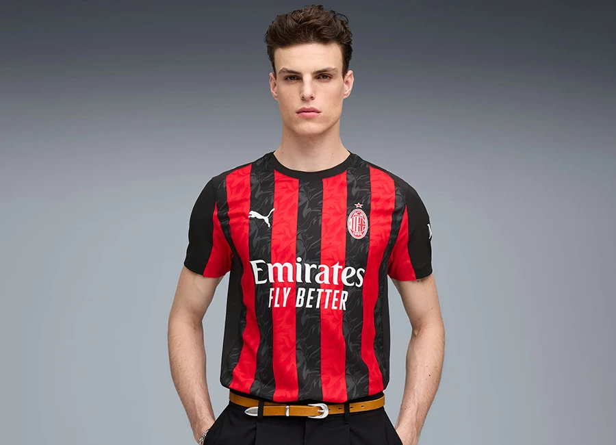
AC Milan have released their 2025–26 home kit, produced by Puma.

The jersey retains the club’s classic red and black vertical stripes, with a tonal flame motif incorporated throughout as a nod to the club’s “team of devils” identity. This reference harks back to club founder Herbert Kilpin’s declaration in 1899 that their colours would be red like fire and black to strike fear.

The front of the shirt features a red club crest, the Puma logo, and the Emirates Fly Better sponsor. The sleeves and back are predominantly black with red side inserts, and “MILAN” is printed in red lettering just below the collar on the upper back. The wordmark also appears within the stripe pattern on the lower back.

Calling all shirt collectors: FootballShirtCollector.com is coming soon!

We’re launching a new community site created especially for shirt collectors. It’s a dedicated space to connect with others, create your profile, and join a growing network of fellow football shirt collectors.

FSC community

The shirt is paired with black shorts and socks to complete the full home kit.

Load More


4.8
125 ratings
Vote now!
  • 27
  • 33
  • 20
  • 26
  • 6
  • 7
  • 6
i like football shirts
  • Member
  • 97
  • 6
  • 66
 · 13 days ago
Comment (Not Required)
Better than some of their more recent efforts, but it needs a full colour badge. Milan are one of those teams where having full colour backs kills their shirt, but black on the back is better than red.
Show more
Comment (Not Required)
It shouldn’t be this hard to design a good kit for AC Milan. Red and black stripes: how is it possible to screw that up? By leaving the back of the shirt completely black and rendering the club crest in 1970s UK comic-style red and white.

A shame: from the front, it’s near perfect.
Show more
MnM
 · 14 days ago
Comment (Not Required)
The front of the short is classy, the back lacks imagination and is a lazy way to finish the shirt. The black and red lines should be front and back
Show more
Bob24
 · 18 days ago
Comment (Not Required)
As you can see from the white sponsor logo across the red and black stripes on the front, legibility is not an issue as there is plenty of contrast. So why leave the back plain?
Show more
Phat Mike
 · 19 days ago
Comment (Not Required)
can't stand the badge, hate the back and the sleeve look a weird fit
Show more
Matt
 · 22 days ago
Comment (Not Required)
For a club like AC Milan the shirt should be iconic but again it's another annoying missed opportunity.
Show more
David L
 · 23 days ago
Comment (Not Required)
When you order a Bournemouth shirt from Temu.
Show more
Ant
 · 23 days ago
Comment (Not Required)
It’s ok but the English cross on the badge is wrong colour
Show more
  • Flavio 23 days ago
    It's a St George Cross smh, its Palestinian not English, God dammit!
Alex
 · 23 days ago
Comment (Not Required)
Class!
Show more
Shabba
 · 24 days ago
Comment (Not Required)
Poundland Bournemouth
Show more