Athletic Bilbao 25/26 Castore Home Kit

Athletic Bilbao 25/26 Castore Home Kit

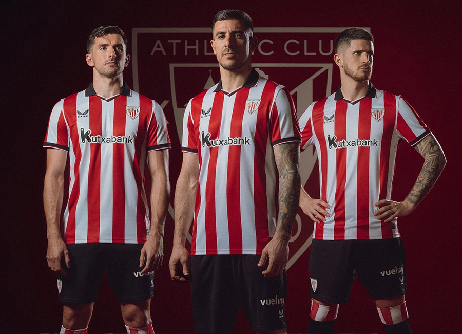
Athletic Club have unveiled their 2025–26 home kit in collaboration with Castore.

The release commemorates the centenary of the bust of Pichichi being placed at San Mamés in December 1926, a tradition that gave rise to the floral tribute presented by visiting teams during their first official match at the stadium.

This year’s shirt continues that ritual by incorporating a symbol rooted in Basque heritage; the Eguzkilore, a flower associated with protection and resilience in Basque mythology. It appears on the upper back of the shirt, representing a modern extension of the tribute to Pichichi.

The kit features the club’s classic red and white stripes, a black polo collar with red and white trim, and matching sleeve cuffs. The Castore logo and main sponsor Kutxabank appear on the chest, while women's team versions feature Kosner branding. The badge is silicone on the Pro edition and embroidered on the Replica.

cfs Christmas Jumpers 10

Created from breathable Aertex fabric, the kit is completed with black shorts and red-white-accented socks.

Click to enlarge images

Load More


4.6
96 ratings
Vote now!
  • 13
  • 22
  • 23
  • 22
  • 6
  • 5
  • 5
Razza
 · 6 months ago
Comment (Not Required)
Castore.......ofcourse it's bad
Show more
Jorge Valdez Gonzalez
 · 6 months ago
Comment (Not Required)
Not a Castore fan but this is good. Simple and effective.
Show more
PNH
 · 6 months ago
Comment (Not Required)
When simple is good
Show more
Bob24
 · 6 months ago
Comment (Not Required)
Fairly ordinary design with no outstanding or ridiculous features. What is annoying is that the sponsor logos on the front and back have a black border so are easy to pick out against the red and white stripes, so why couldn't the stripes just continue on the back? I know there's a UEFA rule but I feel the reasoning they give (being easier to pick out names and numbers on a solid background) loses a lot of credibility when they don't say anything about some of the ****** typefaces used down the years. I say keep the stripes on the back, but use either a solid contrasting border around the typeface or put it within a box that can be ironed on over the stripes.
Show more
Bosolomon41
  • Member
  • 525
 · 6 months ago
Show more
Fløthe
  • Member
  • 1412
 · 6 months ago
Show more
Jk
 · 5 months ago
Show more
Sammyboy
 · 6 months ago
Show more
Smallhausen
 · 6 months ago
Show more
.
 · 6 months ago
Show more