Brentford 25/26 Joma Third Kit

Brentford 25/26 Joma Third Kit

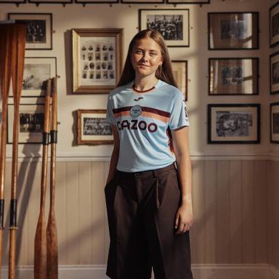
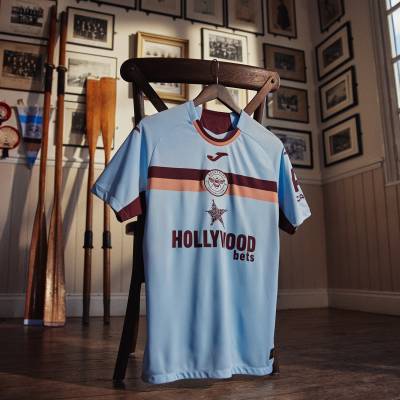
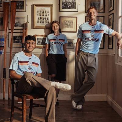
Brentford FC have revealed their new 2025/26 third kit, produced by Joma, which returns to the colours first adopted in 1889 by the Brentford Rowing Club.

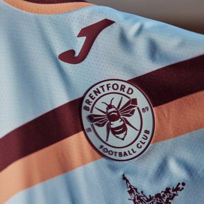
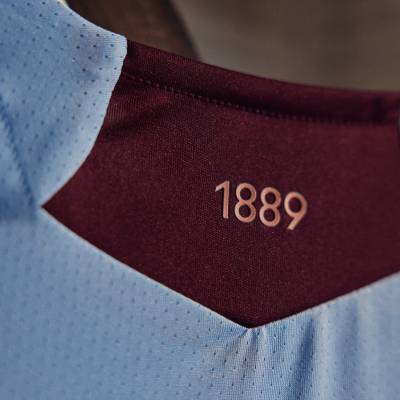
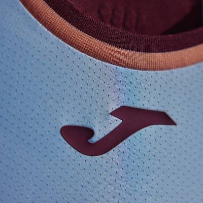
The light-blue shirt features horizontal claret and salmon bands that sweep across the chest, sleeves and side panels, with the club crest positioned centrally beneath a claret Joma logo and ‘1889’ printed inside the collar to honour Brentford’s founding year.

A jacquard knit with micro mesh zones promotes breathability while keeping the players shirt light. Replica versions are made entirely from recycled polyester which supports the club sustainability goals by lowering energy use and diverting waste from landfill.

Hollywoodbets remains the front of shirt partner. Cazoo features on the sleeves of first team items and will take the main position on kits for Brentford B Brentford Women and academy sides where PensionBee is added to the sleeve.

cfs Christmas Jumpers 10

Light-blue shorts and socks with claret and salmon accents complete the outfit and finalise the full match collection for the upcoming campaign.

View the: Brentford 25/26 Home Kit

View the: Brentford 25/26 Away Kit

Click to enlarge images

Load More


4.9
115 ratings
Vote now!
  • 24
  • 36
  • 20
  • 17
  • 10
  • 2
  • 6
DiscoDom19
  • Member
  • 21
  • 2
  • 23
 · 3 months ago
Comment (Not Required)
Its okay ig, the colors are a bit weird.
Show more
Bill Borkle
 · 3 months ago
Comment (Not Required)
It's got a retro feel to it. Pretty well done.
Show more
Thamesbank casual
 · 3 months ago
Comment (Not Required)
Terrible kit from the pride of middlesex.
Gonna get dirty when they jump in bushes to hide from certain group of fans.
Show more
Frank Sidebottom
 · 3 months ago
Comment (Not Required)
A rasper. You know it is, it really is.
Show more
Razza
 · 3 months ago
Comment (Not Required)
Doesn't scream Brentford. More Bradford City or Motherwell if you ask me
Show more
Nick
 · 3 months ago
Comment (Not Required)
Perhaps the best of Joma's three Brentford kits and still not very good. I don't like the placement of the badge, the pasty blue or Hollywood Nets logo. At least it's not as fussy as the home shirt or brown like the 2nd kit. A money saving effort from Joma, I won't be buying any of them.
Show more
NaplesBrit
 · 3 months ago
Comment (Not Required)
Screams Bradford City away kit. Would have worked really well.
Show more
S
 · 3 months ago
Comment (Not Required)
Surprisingly, I like this.
It's different than most other kits out there and the colours seems to work well together.

Well done Brentford.👋
Show more
Balu
 · 3 months ago
Comment (Not Required)
Classy looking shirt. The colour combination of light-blue with claret and salmon makes it look fresh and modern. The central placement of the crest and the Joma logo is a nice touch.
The shift to a light-blue base colour is also a fantastic choice for an away kit, as it provides a strong contrast to their traditional red and white home shirts.


Show more
Tim
 · 3 months ago
Comment (Not Required)
Nice shirt. The advertising looks better on the ladies version.
Show more
  • LesBron 3 months ago
    "Ladies".??. what century are you from .