Everton 2022-23 Hummel Away Kit

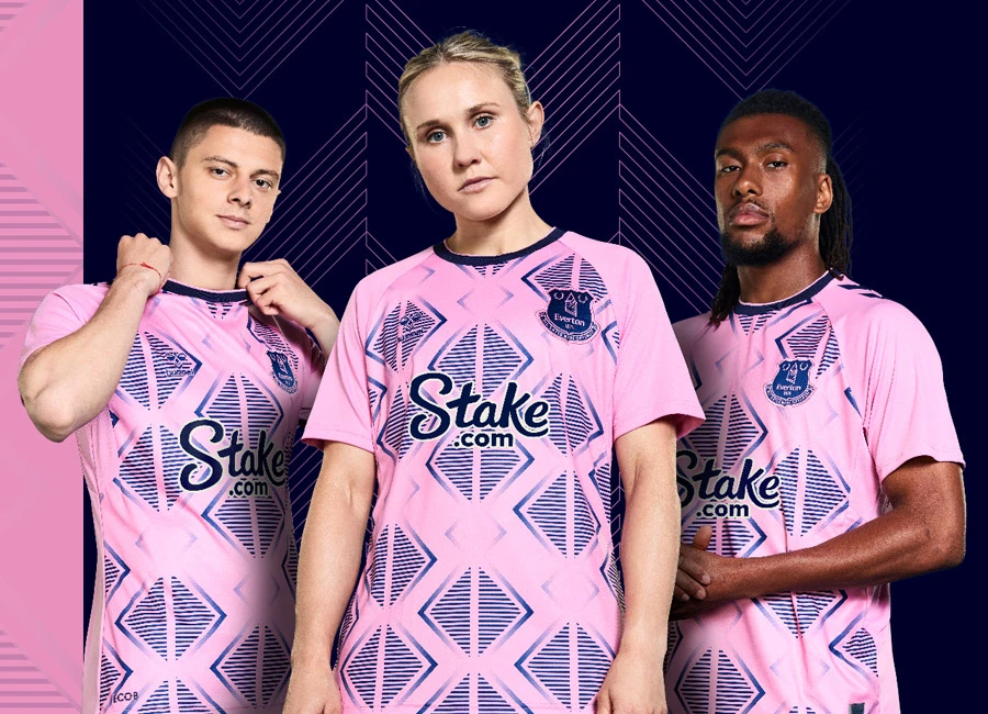
Everton have unveiled their new 2022/23 away kit by hummel, which pays tribute to the iconic Prince Rupert’s Tower – with a modern twist.

The away shirt, in an eye-catching rosebloom pink, features a distinctive, patriot blue pattern inspired by the angled roof of the tower in the Club crest - and amplified into a geometric print for 2022.

The away shirt is complemented by a tonal Club crest and a round, patriot blue neckline, with pink trim and block sleeves.

Mirroring the home kit, the traditional four hummel chevrons down the arms are pared back to two, providing a striking contrast with the sleeving.

cfs Christmas Jumpers 10

The back-of-neck also features the famous Prince Rupert’s tower motif, which forms an integral part of this year’s overall kit branding.

Blue shorts see the two chevrons from the jersey replicated, this time in pink, with the hummel logo moving from the front to the back of the right leg, providing a clean, fresh look. Shorts mirror the shirt side panels, via pink mesh inserts.

Socks are rosebloom pink with patriot blue trim, featuring two hummel chevrons on the front and the tower on the reverse.

View the: Everton 2022-23 Home Kit

View the: Everton 2022-23 Third Kit


1.4
144 ratings
Vote now!
  • 8
  • 3
  • 4
  • 4
  • 5
  • 14
  • 106
Tim Toffeemunch
 · 3 years ago
Comment (Not Required)
Very odd, absolutely no reference to the club whatsoever. Lost our way with money and now our kits. More interested in commercialism, take the sponsor for example. Cash registers are all this club like to hear.
Show more
  • Bob Stanley 3 years ago
    Totally agree, only no one will buy this crap.
    • Terry 3 years ago
      @Dave I doubt it’ll sell many
    • Dave 3 years ago
      Yes they will
Cart Horse
 · 3 years ago
Comment (Not Required)
Awful… from a blue! Feel pretty daft for laughing at the Spurs and Liverpool away kits now!
Show more
Goodbuytojane
 · 3 years ago
Comment (Not Required)
Nothing to. Add
Show more
Scott
 · 3 years ago
Comment (Not Required)
Makes the dreadful Spurs away top look good. What sane man would buy this? I like the new elevated Hummel logo, just like on the Southampton kit, but thats about it. Vile.
This year Hummel have been largely boring with home kits and bat**** crazy with some away kits.
Show more
Back to Reality
 · 3 years ago
Comment (Not Required)
That is a shocker. Who on earth thinks this is a decent shirt design? It's repulsive. I do not particularly care for Everton at all, but their fans do not deserve this. Some of these 'designers' know nothing of club history or football culture. To try to loosely put a 'twist' on this design is simply abusing their role as a kit designer. Awful.
Show more
tv
 · 3 years ago
Comment (Not Required)
the worst part about this kit is that people have agreed it was a good idea
Show more
Oliver
 · 3 years ago
Comment (Not Required)
What a clanger
Show more
Orange kitchen clean
 · 3 years ago
Comment (Not Required)
Bad bad bad bad bad very bad Everton what have you done it is terrible the third kit better be good!


1.5/10
Show more
Barry Borkle
 · 3 years ago
Comment (Not Required)
Oh dear. Not great is it? Pays tribute to Prince Rupert’s tower, what tosh!

I get why the white is around the sponsor, without it it’d be lost against the “patriot blue” - more tosh.

Even the salmon pink and blue striped kit was better than this.

Hope the third kit is decent because these efforts have been lame.
Show more
  • Didumms 3 years ago
    I do agree with you Barry it better be better next year the third kit has to be better!
B
 · 3 years ago
Comment (Not Required)
This ain’t it
Show more