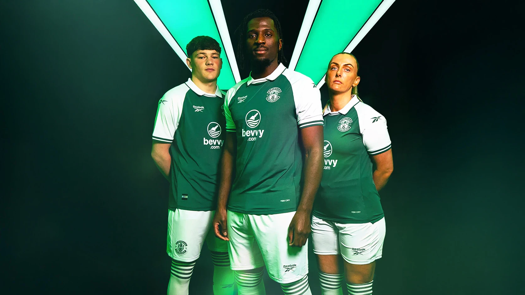
Hibernian 25/26 Joma 150th Anniversary Home Kit

Hibernian 25/26 Joma 150th Anniversary Home Kit

Hibernian have revealed their 2025/26 home kit, produced in partnership with technical supplier Joma.

The design marks the club’s 150th anniversary with a number of commemorative details integrated into the shirt.

The top features a dark green body with white sleeves, available in short or long sleeve versions and a women’s fit. A bespoke 150th anniversary crest appears on the chest, with an additional symbol embroidered on the upper back. Inside the collar, the founding date of 06 August 1875 is printed.

Calling all shirt collectors: FootballShirtCollector.com is coming soon!

We’re launching a new community site created especially for shirt collectors. It’s a dedicated space to connect with others, create your profile, and join a growing network of fellow football shirt collectors.

FSC community

The shirt is sponsored by bevvy, with their logo customised for the occasion using the text “Hibernian FC 1875 2025.”

Made from 100 percent recycled polyester, the shirt continues the club’s commitment to sustainability and is paired with white shorts and dark green socks with a white trim to complete the strip.

View the: Hibernian 25/26 150th Anniversary Away Kit

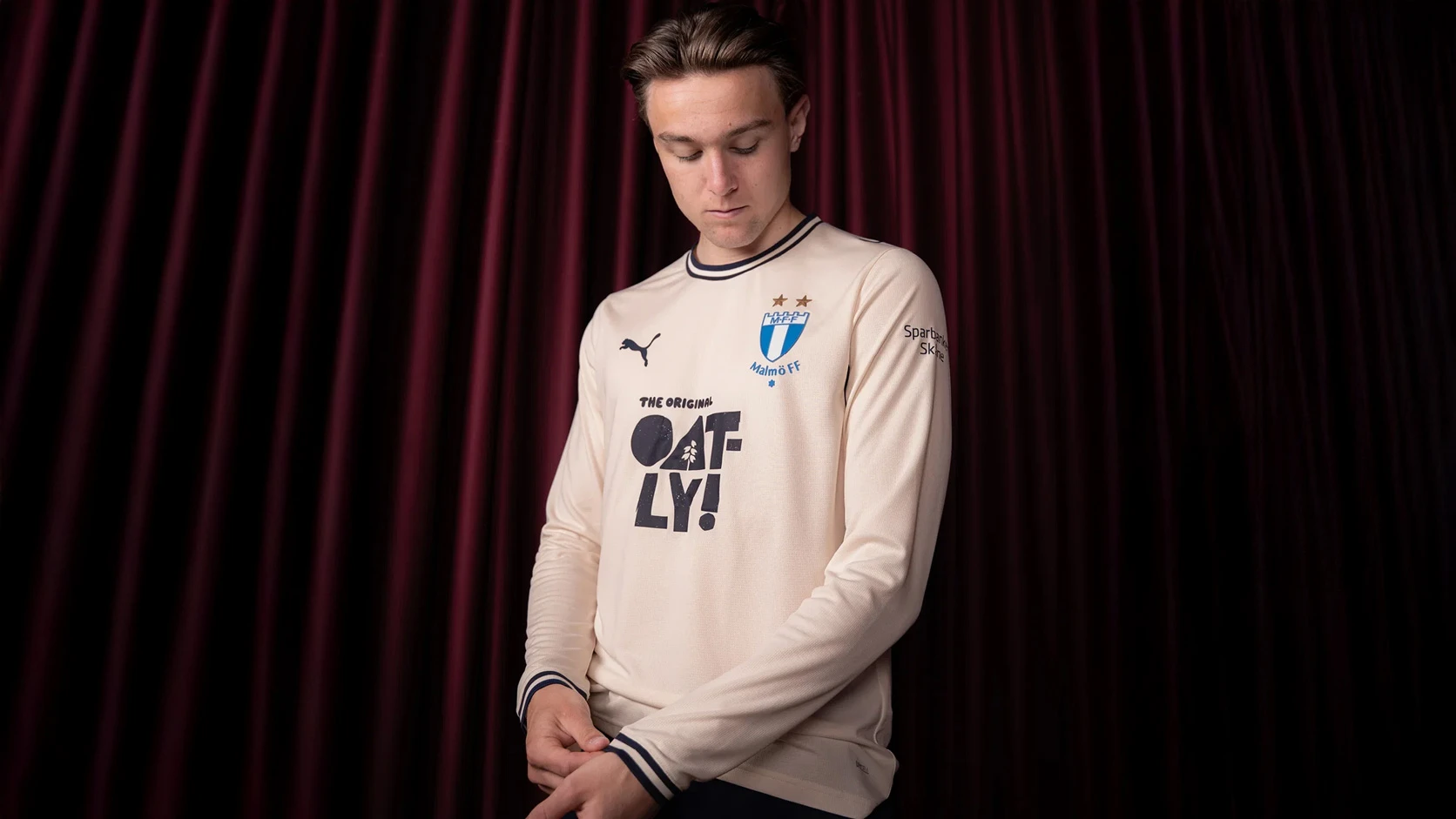
Click to enlarge images

Load More


5.1
169 ratings
Vote now!
  • 55
  • 45
  • 23
  • 15
  • 12
  • 8
  • 11
pachyderm
  • Member
  • 218
  • 123
  • 2
 · 17 days ago
Comment (Not Required)
6/7 nice shirt
Show more
Get Shirty
 · 21 days ago
Comment (Not Required)
Absolute class
Show more
Dj
 · 21 days ago
Comment (Not Required)
How shirts should be done. As a previous commenter said, no need for garish rubbish.
Love the shade of green. Classy shirt.
Show more
Alan Farnell
 · 22 days ago
Comment (Not Required)
Bootiful 👌🏻
Show more
Knights of the Vale
 · 22 days ago
Comment (Not Required)
Everyone likes a 70s throwback shirt. Would have preferred a less dingy green however
Show more
Razza
 · 23 days ago
Comment (Not Required)
Stunning
Show more
Rangerbird
 · 24 days ago
Comment (Not Required)
See? Most fans like a simple, bold kit. Why do we have all these darts, squiggles, water marked patterns evoking the watermill which crushed bobby the mascot dog just before the local derby or a tribute to the 1930s north stand pie barrow or whatever. Love it, plain, timeless and classy.
Show more
david lyell
 · 24 days ago
Comment (Not Required)
Could be better
Show more
John
 · 24 days ago
Comment (Not Required)
Perfect design, would just have preferred a lighter shade of green
Show more
Red Cyril
 · 25 days ago
Comment (Not Required)
Neat, tidy a classic
Show more