Leeds United 2023-24 Adidas Home Kit

Leeds United 2023-24 Adidas Home Kit

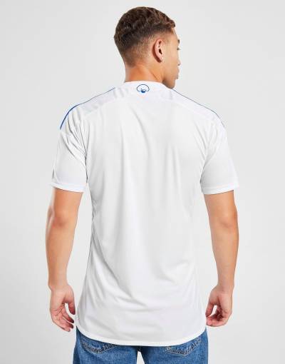
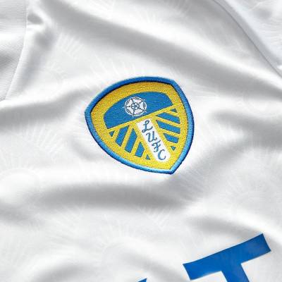
Leeds United and adidas have revealed their new home kit for the 2023/24 season.

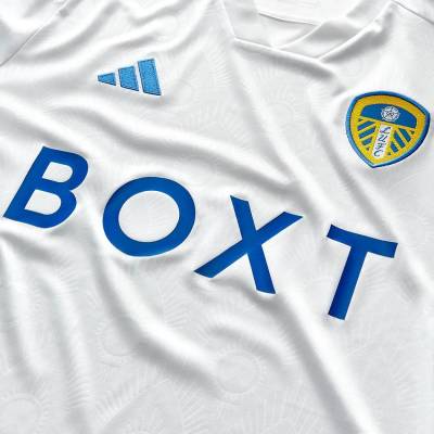
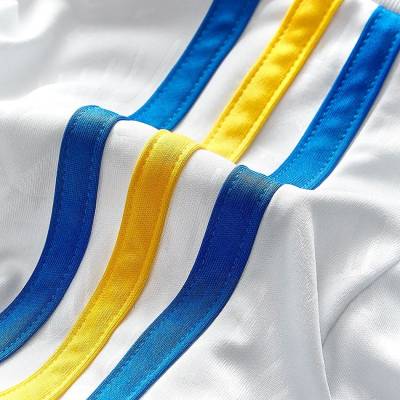
The white shirt displays the iconic adidas stripes in royal blue and yellow, staying true to the club's traditional colours.

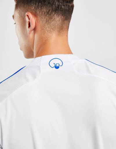
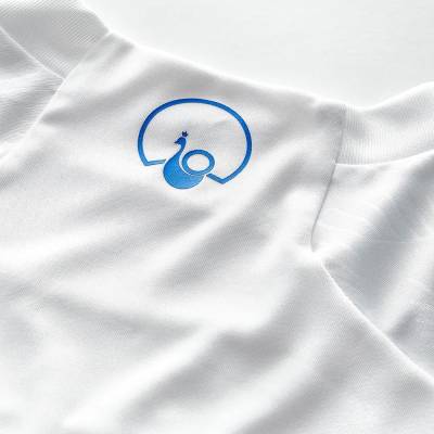
In collaboration with Acid FC, the design of the shirt celebrates Leeds United's historical connection to the peacock. The fabric features a custom pattern with a debossed peacock motif throughout, and a peacock on the back neck.

Sign in or create an account to earn points for voting, keep track of your reviews, edit them, and more.

The peacock holds a special significance in the history of Leeds United and Elland Road. During the early 1980s, the club was affectionately referred to as the Peacocks, and the peacock badge was proudly worn during that period.

View the: Leeds United 2023-24 Away Kit

View the: Leeds United 2023-24 Third Kit


5.4
117 ratings
Vote now!
  • 49
  • 33
  • 14
  • 4
  • 5
  • 3
  • 9
...
 · 1 year ago
Comment (Not Required)
BQT
Show more
Cammy Cheeseshredder
 · 1 year ago
Comment (Not Required)
Very pleasing.
Show more
BQT
 · 1 year ago
Comment (Not Required)
///
Show more
LVF
 · 1 year ago
Comment (Not Required)
Love the added little touch of the duochrome sleeve stripes.
Show more
  • Bacon Bonces 1 year ago
    Now then now then
Pep
 · 1 year ago
Comment (Not Required)
Don’t think they could make sponsors logo any bigger
Show more
Givenchy
 · 1 year ago
Comment (Not Required)
The last 2 adidas hiome kits infact since the first one ive said the adidas stripes should be that colour .seems like someone was on the same wavelength
Show more
Becchio Well Placed
 · 1 year ago
Comment (Not Required)
A solid effort but the neckline lets it down for me. Could've improved with it with one of the button grandad collar variations like on some of the adidas efforts this year. That would've given them the chance to run the yellow and blue piping behind the button similar to the Asics 93-95 home shirt.
Show more
AAL
 · 1 year ago
Comment (Not Required)
Some photos give an impression that there are different shades of blue among different elements of the shirt which would be very bad for an overall perception. The sponsor logo lacking any appeal.
Show more
  • Terey 1 year ago
    Don't really think the sponsors logo is there too add appeal. Lol
Jophda
 · 1 year ago
Comment (Not Required)
Really like the blue yellow blue. Also learnt from the comments navy is frowned upon on a leeds home shirt lol.
Show more
tv
 · 1 year ago
Comment (Not Required)
*chefs kiss*
Show more