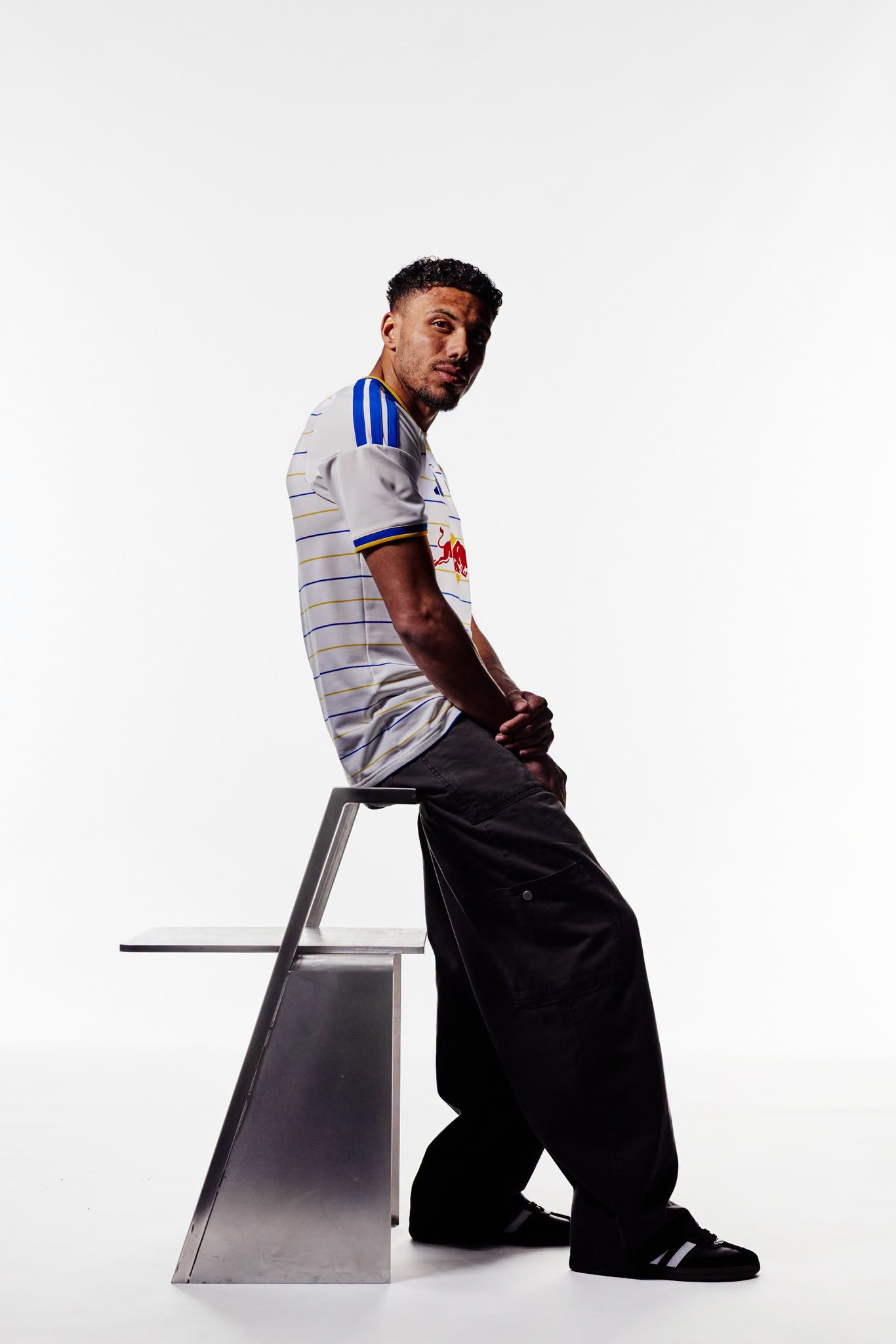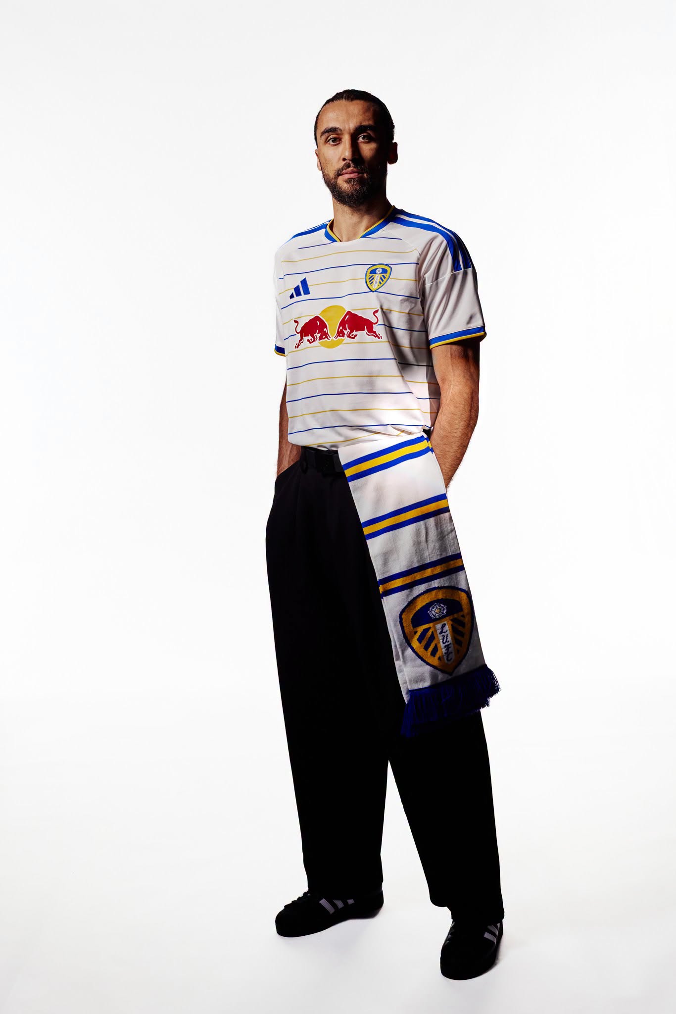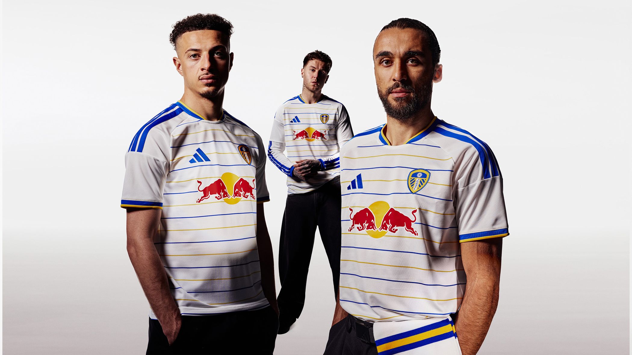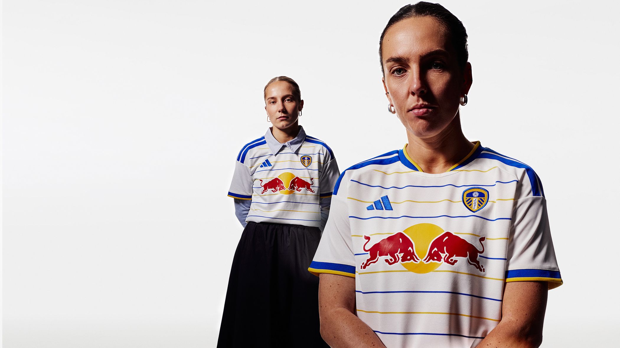
Leeds United Football Club and adidas have unveiled the Leeds United 26/27 Home kit for the 2026-27 Premier League season.
Leeds United Kit Design & Inspiration
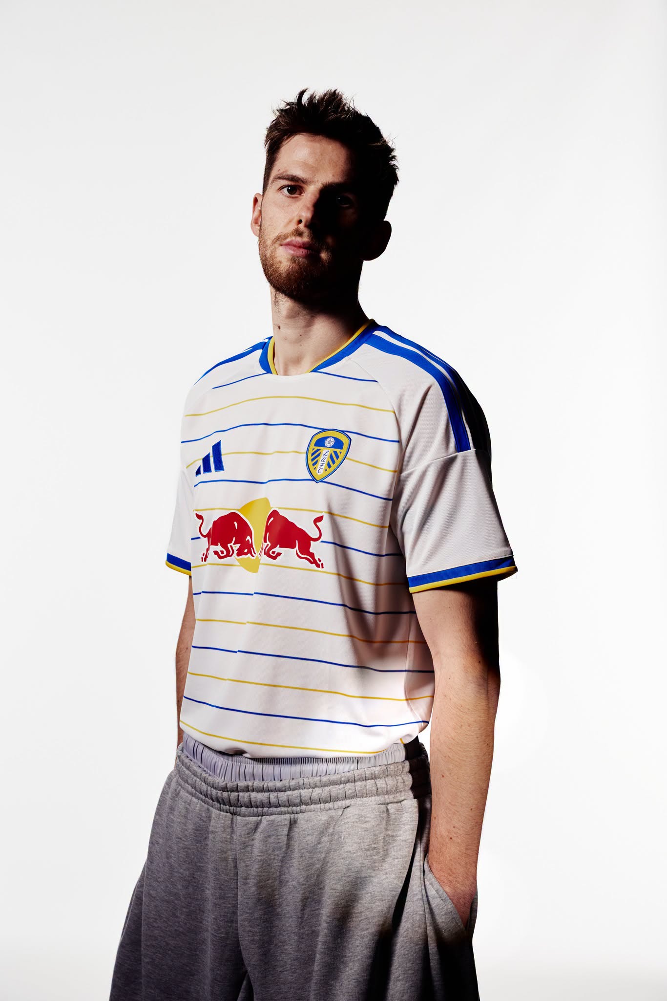
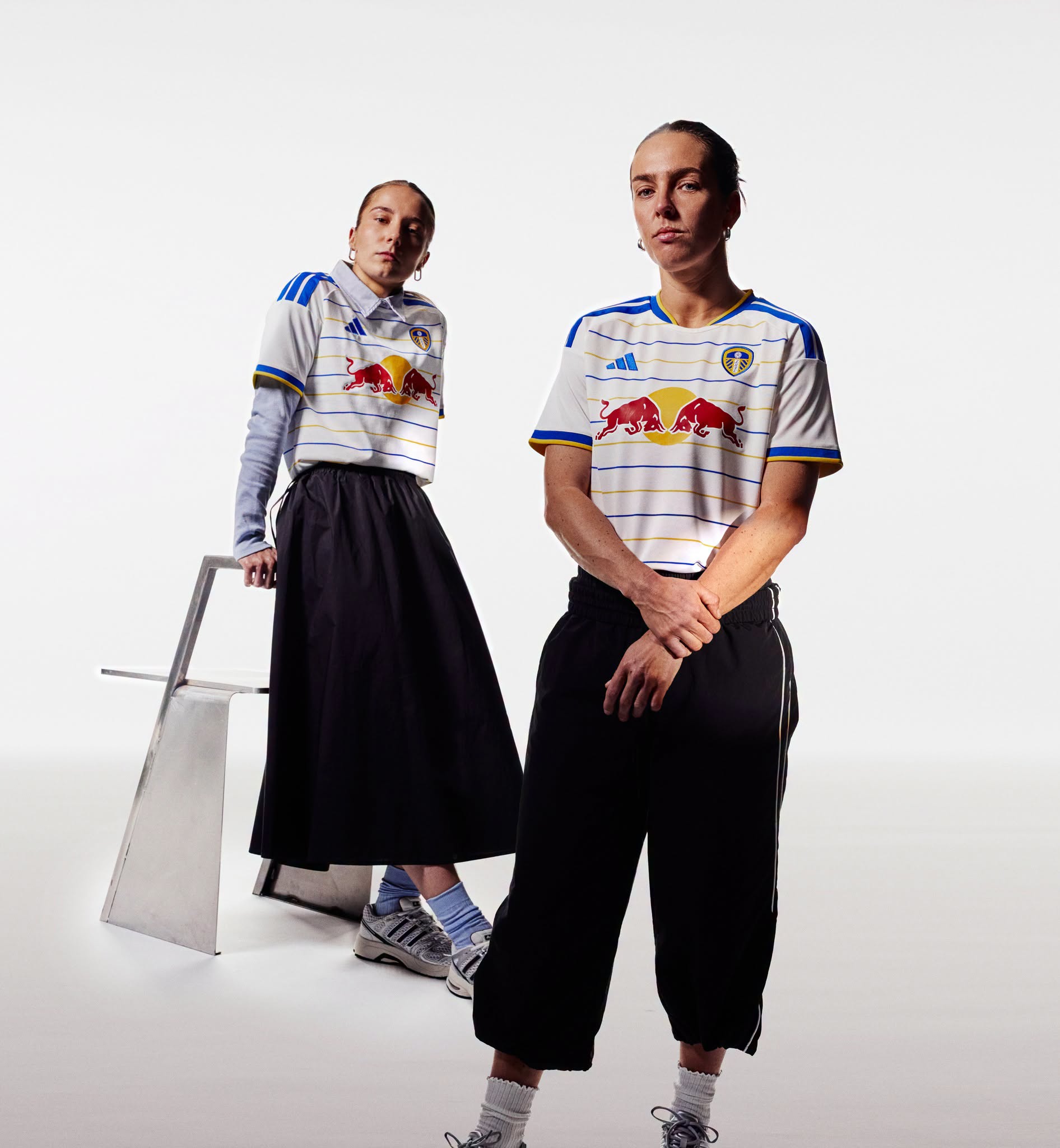
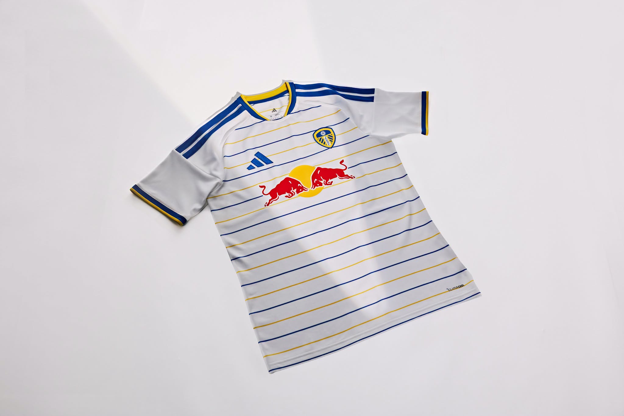
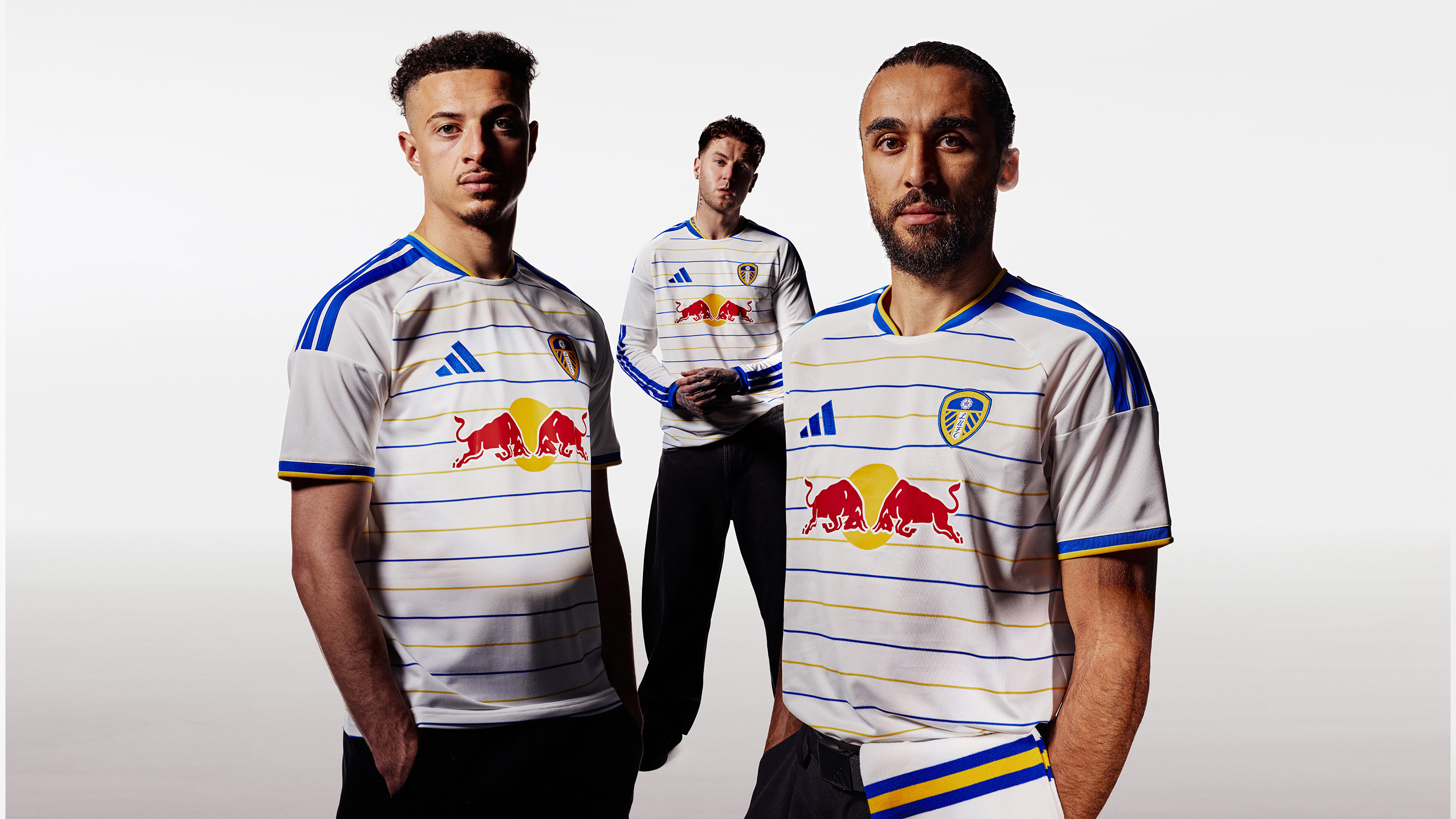
The release celebrates 400 years since King Charles I granted the Leeds Town Charter on 13 July 1626. White remains the primary colour of the new Leeds United jersey, joined by narrow horizontal lines alternating between blue and yellow across the front, sleeves and back.
A blue crew neckline is finished with yellow trim around the upper edge. The sleeve cuffs follow the same colour arrangement, using a blue band bordered by yellow. The manufacurer's Three Stripes run across the shoulders in blue, and the adidas logo is positioned on the right side of the chest.
The Leeds United crest appears opposite in blue and yellow. Red Bull is displayed as the principal shirt sponsor across the centre of the adult and women’s jerseys, with the company’s red and yellow branding applied over the striped base.

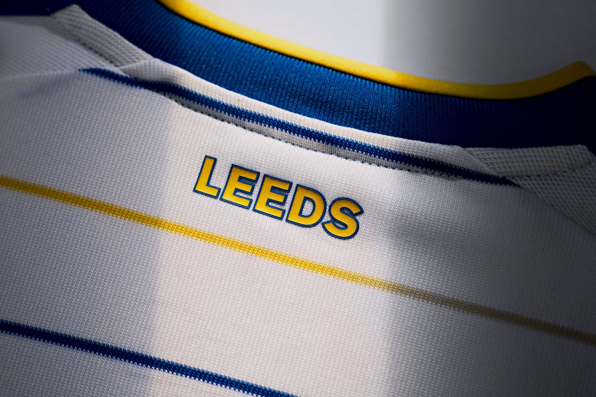
Additional detailing includes “LEEDS” beneath the rear collar in yellow lettering outlined in blue. The alternating horizontal lines continue through this section, maintaining the blue, yellow and white colour combination throughout the shirt.
Technical Features
Adidas has equipped the Leeds United shirt with CLIMACOOL technology, designed to wick and disperse moisture to support a cool, dry feel during play and everyday wear.
Full Leeds United Home Kit details
The new Leeds United football shirt is paired with white shorts and matching white socks, completing the Leeds United Home kit for the Premier League campaign.
View the: Leeds United 26/27 Away Kit
View the: Leeds United 26/27 Third Kit
Click to enlarge images