Manchester City 2026-27 Home Kit by Puma Revealed

Manchester City 26/27 Puma Home Kit

Manchester City and Puma have unveiled the Man City 26/27 Home Kit for the 2026-27 Premier League, FA Cup and UEFA Champions League campaigns.

Manchester City Kit Design & Inspiration

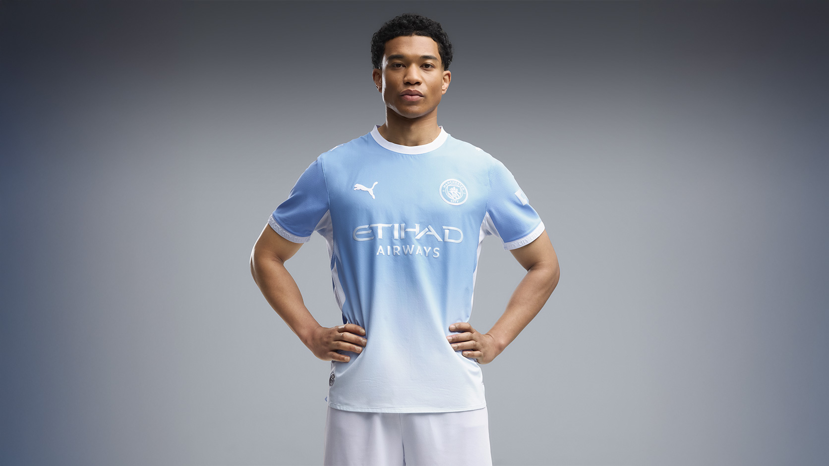
The new Manchester City jersey retains the club’s established sky blue identity while introducing a tonal gradient effect that darkens across the shoulders before fading into a lighter shade through the body. White detailing is used throughout, including the Puma logos, Etihad Airways shirt sponsor and the monochrome Manchester City crest positioned on the left chest.

The shirt features a white crew neck collar with matching sleeve cuffs carrying repeated “CITY” wording, while white mesh side panels run from the underarm area down the sides of the jersey. Additional details include “CITY” text on the upper back and an inner collar graphic carrying the phrase “NOT YOUR TYPICAL CITY”.

Technical Features

A subtle geometric texture is integrated into the fabric across the front and back panels, while the Authentic version is produced using Puma’s ULTRAWEAVE construction. The lightweight material is combined with dryCELL and ThermoAdapt technology to support moisture management, breathability and temperature regulation during match play.

Design FC

The Replica version uses Puma’s RE:FIBRE technology, incorporating recycled polyester sourced from textile waste while maintaining the same overall appearance as the player issue shirt.

Full Man City Home Kit details

The Manchester City football shirt is completed with white shorts and matching white socks to form the full Manchester City 26/27 home kit.

Load More


4.0
30 ratings
Vote now!
  • 5
  • 5
  • 4
  • 6
  • 3
  • 3
  • 4
Razza
 · 1 hour ago
Comment (Not Required)
Too much white in the kot as a whole
Show more
Scott
 · 3 hours ago
Comment (Not Required)
Dire lol 😂😆
No wonder Pep has decided to abandon ship...
Show more
Sean Goater
 · 3 hours ago
Comment (Not Required)
Decent enough, but just not City as such.
Show more
The Cat
 · 3 hours ago
Comment (Not Required)
That is genuinely one of the worst kits of all time. The gradient doesn't work, and the monochrome badge is, as all monochrome badges are, awful.
Show more
Blue’n’Red
 · 4 hours ago
Comment (Not Required)
Looks like their printer ran out of ink
Show more
Grey Ham
 · 4 hours ago
Comment (Not Required)
Never seen one of these gradated / faded colours kits that looks good. Just doesn’t work for football shirts.
Show more
Latch
 · 4 hours ago
Comment (Not Required)
Bad Real wannabe
Show more
Smallhausen
 · 5 hours ago
Comment (Not Required)
Not for me, too much white.
Show more
Ewan
 · 5 hours ago
Comment (Not Required)
Aweful as usual from Puma. Looks like a poor quality tee shirt that the colour has been washed out of. Designed at about 5mins to 5 on a FA afternoon.
Show more
  • Ewan 5 hours ago
    That should have read Friday 😂
Russel1311
 · 6 hours ago
Comment (Not Required)
Refreshing to see a kit release without the b*ll5**t backstory. I was expecting to see something like the kit was inspired by the great snow of 1954 that caused the Maine Road pitch to freeze like the ice in the veins of City players. Or something.
Show more