Millwall 25/26 Erreà Home Kit

Millwall 25/26 Erreà Home Kit

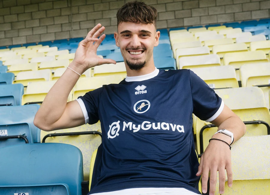
Millwall FC have revealed their 2025/26 Home kit by Erreà, marking the club’s 140th anniversary.

The shirt is navy blue with a white round collar and sleeve trim, featuring a centrally placed club crest. Inside the collar, the initials MRFC honour Millwall Rovers, the club’s original name.

The shirt is made using Erreà’s Future fabric, created from recycled fibres to reduce the carbon footprint by 30 percent per unit and increase the use of eco-friendly materials by 20 percent by 2030, supporting Millwall’s Lion Living project. The shirt is paired with white shorts and blue socks to complete the full kit.

View the: Millwall 25/26 Away Kit

cfs Christmas Jumpers 10

View the: Millwall 25/26 Third Kit

Click to enlarge images

Load More


3.6
163 ratings
Vote now!
  • 10
  • 20
  • 33
  • 35
  • 25
  • 13
  • 27
Octo
  • Member
  • 454
  • 3
  • 105
 · 5 months ago
Comment (Not Required)
Looks good. Thinking how it could have looked if the brand logo, errea, would have blended in the navy fabric of the shirt so the club crest stands out more.
Show more
Kymran78
 · 5 months ago
Comment (Not Required)
It’s just about a 6/10 on a good day! 💁🏻‍♂️🦁
Show more
Mark hines
 · 5 months ago
Comment (Not Required)
Decent top
Show more
Razza
 · 5 months ago
Comment (Not Required)
Total snooze fest so 2 stars is a decent mark👍
Show more
Dobbin
 · 5 months ago
Comment (Not Required)
Not that good. But it’s. Okay
Show more
Ian
 · 5 months ago
Comment (Not Required)
Central badge doesn't work with this shirt.
Show more
BigAlan69
 · 5 months ago
Comment (Not Required)
P!keys
Show more
  • Oh Teddy Teddy 5 months ago
    Hold up… aren’t west ham camped out on a piece of land they don’t own? Costing the tax payers money!

    • Kes 5 months ago
      Isrealis that
Matt
 · 5 months ago
Comment (Not Required)
A solid kit that isn't flashy or trying to show off.
Show more
Bfc1887
 · 5 months ago
Comment (Not Required)
Its ok , but a bit of bad feng shui ...it's a bit central-centric. Not sure about the white at the bottom of the shirt either .
Show more
Matt
 · 5 months ago
Comment (Not Required)
Someone got paid real money to 'design' this. Someone else has the cheek to try to sell it to people for upwards of £60. Pointless plain rubbish.
Show more
  • Oh Teddy Teddy 5 months ago
    I like the plain design. Especially as it supposed to mimmic the first ever Millwall kit. Dislike like the central badge. But get what they were trying to achieve, as again a nod to original kit, which had MRFC central. It just doesn’t work in the modern era of sponsors etc.