Nottingham Forest 2022-23 Macron Away Kit

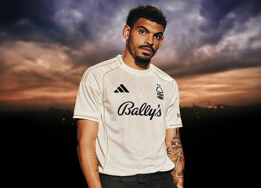
Nottingham Forest have unveiled their new 22/23 Away kit by Macron.

The design is a throwback to one of Forest’s most iconic away kits; the 1978 strip worn by Kenny Burns and co when they lifted the League Cup at Old Trafford after a replay victory over Liverpool.

The away shirt for the 22-23 season is made from polyester-pique, is yellow in colour and is complimented by a blue sublimated design taking inspiration from the ironworks pattern of the iconic Trent Bridge.

The Trent Bridge inspired design appears again on both the collar and the side panels with blue cuffs on the collar and sleeves. The jersey features a blue embroidered Forest crest on the left and Macron logo on the right, as well as “COYR” embroidered on the back of the neck.

cfs Christmas Jumpers 10

This season our away shirt will be completed with a Premier League patch on the right sleeve as standard.

View the: Nottingham Forest 2022-23 Home Kit

View the: Nottingham Forest 2022-23 Third Kit


2.8
86 ratings
Vote now!
  • 8
  • 8
  • 8
  • 10
  • 6
  • 11
  • 35
Cloughie hated Scabs
 · 3 years ago
Comment (Not Required)
Those late 70s and 80s forest kits were things of timeless beauty
This macaroni kit on the other hand is average at best.the colour scheme is completely different to boot
Show more
John
 · 3 years ago
Comment (Not Required)
Worst kit I’ve seen so far this season, horrendous
Show more
abc
 · 3 years ago
Comment (Not Required)
Awful, linking this kit to '78 cup final makes no sense
Show more
B
 · 3 years ago
Comment (Not Required)
Someone please ban macron from making top flight kits, they suck as a company
Show more
Kate Winslet
 · 3 years ago
Comment (Not Required)
Reminds me of Lemon Drizzle Cake.
Show more
  • Terry Venables 3 years ago
    Reminds me of going on a diet
JK
 · 3 years ago
Comment (Not Required)
Different
Show more
AVFC
 · 3 years ago
Comment (Not Required)
Ok but not a patch on the original 1978 addidas kit
Show more
Big Alan 69
 · 3 years ago
Comment (Not Required)
If you look closely enough in the pattern you can see the word ‘relegation’.
Show more
Malky
 · 3 years ago
Comment (Not Required)
Excellent kit... no more words needed
Show more
Matt
 · 3 years ago
Comment (Not Required)
It is a bit of a shame that the design isn't any different from the home shirt. If I'm not mistaken the aspects are actually the same.
Nice colours though and very worthy.
Show more