Sao Paulo 25/26 New Balance Third Kit

Sao Paulo 25/26 New Balance Third Kit

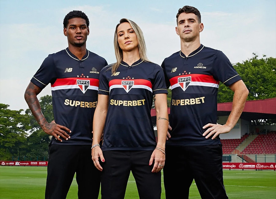
São Paulo FC and New Balance have unveiled their 2025/26 Third shirt, created as a tribute to the club’s historic FIFA Club World Cup triumph in 2005.

The release honours the achievement that placed the Tricolor on the global stage and remains one of the greatest moments in the team’s history.

The New Balance shirt reimagines the goalkeeper kit worn in that final, carrying the traditional red and white horizontal stripes across a black base with the SPFC crest placed in the centre of the chest. Gold details feature on the logos, collar trim, and sponsor prints, highlighting the celebratory theme. Above the badge sit five embroidered stars, while a commemorative World Champions symbol is added as a mark of prestige.

Inside the collar, the years 1992, 1993 and 2005 are referenced in red with the phrase “Um é pouco, dois é bom, três só São Paulo,” connecting this edition to the club’s three world titles. A Japanese inscription also appears within the shirt fabric, underlining the legacy of the 2005 triumph in Yokohama.

cfs Christmas Jumpers 10

The design is completed with black shorts and socks that carry the same gold finishing touches.

View the: Sao Paulo 2025 Home Kit

Click to enlarge images

Load More


4.7
59 ratings
Vote now!
  • 9
  • 15
  • 14
  • 11
  • 7
  • 1
  • 2
Octo
  • Member
  • 454
  • 3
  • 105
 · 3 months ago
Comment (Not Required)
Maybe the sleeves should have white so it looks like the white line continues both sides from the chest. The collar golden detail is useless. Superbet in gold does not play well with the main design motif. White would have been better.
Show more
Bob24
 · 3 months ago
Comment (Not Required)
The shirt design itself is ordinary, and the sponsor logo looks off because the letters follow a curve, while the red/white/black band above runs straight across.
Show more
Sham
 · 3 months ago
Comment (Not Required)
Ive never been a fan of any usa sports wear makers vis a vis making football kits. Nike are undoubtedly the worst , and for those that know are relatively new to football on.a major scale. Late mid 90s (i think 96 world cup they started to appear massively iirc). NB another usa firm are equally as bad imho. This shirt is awful , it looks too american like a college /baseball shirt. I like south american style shirts , or rather brazillian ones etc. But this not the usual style ..its gotta be my worst kit of the year . NB and Nike are both crap at making trainers too.old school casual 70s 80s they werent a thing
Show more
shame
 · 3 months ago
Comment (Not Required)
stop using stickers on shirts
Show more
Shirtswithstories
  • Member
  • 204
 · 3 months ago
Show more
Fløthe
  • Member
  • 1412
 · 3 months ago
Show more
Fredvill
  • Member
  • 40
 · 3 months ago
Show more
Dhem_Kits
 · 3 months ago
Show more
JK
 · 3 months ago
Show more
SP
 · 3 months ago
Show more