Sunderland 24/25 Hummel Third Kit

Sunderland 24/25 Hummel Third Kit

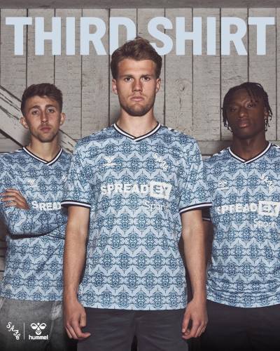
Sunderland AFC have revealed their new Hummel Third shirt for the 2024-25 season.

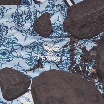
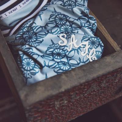
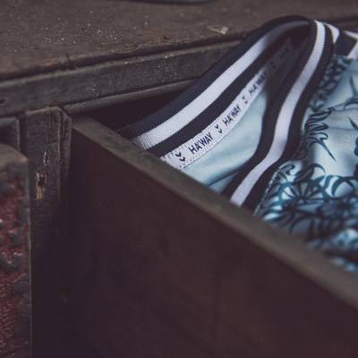
The 24-25 secondary-change release honours Sunderland's deep-rooted mining heritage, with the iconic mining wheel from the club’s crest reimagined as a repeating mosaic pattern. The design features a deep blue base, complemented by a dusty blue hue, with navy chevrons on a white trim across the shoulders.

The revered SAFC script crest is embossed on the shirt, symbolising a significant era in the club's history. The kit is completed with matching shorts and socks and features the branding of the club’s principal partner, Spreadex Sports.

View the: Sunderland 24/25 Home Kit

cfs Christmas Jumpers 10

View the: Sunderland 24/25 Away Kit

Load More


3.3
94 ratings
Vote now!
  • 14
  • 14
  • 11
  • 4
  • 9
  • 9
  • 33
Kit Man Stan
  • Member
  • 4
  • 5
 · 1 year ago
Comment (Not Required)
I get the sentiment with the design attempt but seriously! Looks like your nans curtains from the 1970's
Show more
CSD
  • Member
  • 347
  • 8
  • 79
 · 1 year ago
Comment (Not Required)
I like the idea, but it's executed poorly. The brandings are almost invisible. Also .. ?
Show more
Dunn
 · 1 year ago
Comment (Not Required)
don’t get the hate, for one, it’s a ~third~ kit. the branding it more than legible once seen in person & the blue is far from NUFC colors… the pattern is a fine touch as well. hummel is known for flare taking risks in their designs & this works really well as an homage. sadly we’re 0-1 at the time of writing this whilst wearing, but i still love it lol
Show more
MR TREVOR COLMAN
 · 1 year ago
Comment (Not Required)
Worst shirt I have ever seen
Show more
PB
 · 1 year ago
Comment (Not Required)
I quite like the print, not sure if it's my colour vision deficiency but I really struggle to see the club badge or maker's logo
Show more
Rupert the Fridge
 · 1 year ago
Comment (Not Required)
Quite like the short sleeve version. The long sleeve one looks likes someone’s Xmas pyjamas from the 1970’s .
Show more
Brett Simons
 · 1 year ago
Comment (Not Required)
That's bad!
Show more
Thames bank casual
 · 1 year ago
Comment (Not Required)
Respect the heritage and it means well but you can’t see the badge at all or hardly the sponsor should be in darker lettering
Show more
JK
 · 1 year ago
Comment (Not Required)
What were they thinking
Show more
Razza
 · 1 year ago
Comment (Not Required)
Wonder where Granny's tablecloth got to.
Show more