Sunderland 25/26 Hummel Away Kit

Sunderland 25/26 Hummel Away Kit

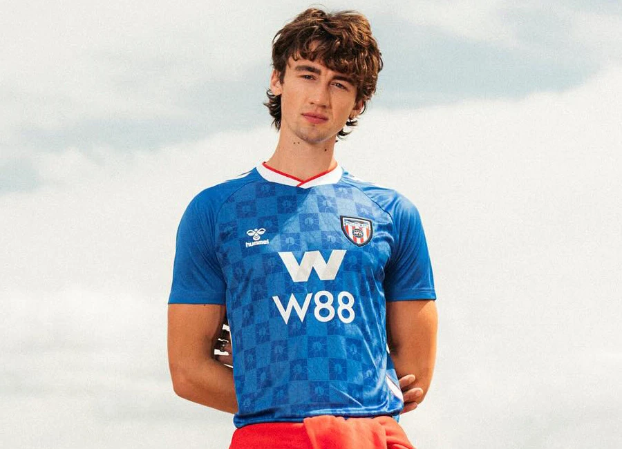
This is the new Sunderland AFC 25/26 Away kit by hummel, the first to be unveiled ahead of the club’s return to the Premier League.

Inspired by the 1989 to 1991 away shirt worn by Marco Gabbiadini and Eric Gates, the new design connects to Sunderland’s maritime identity, incorporating a pattern based on the view of the Roker Beach lighthouse through the ‘C’ Sculpture. This detail is woven into the fabric to reflect the city’s ties to the sea.

The phrase ‘City by the Sea’ is stitched on the back of the neck. Inside the collar, lyrics from The Lake Poets pay tribute to the club’s coastal roots, reading ‘Yes, I come from a city by the sea and its shores and its waters have become a part of me.’

The shirt features a blue base with a bespoke tonal pattern, white Hummel chevrons on the shoulders, a red and white trim on the collar, and the W88 sponsor on the front. It is paired with matching shorts and socks, completing the secondary kit for the 25/26 season.

cfs Christmas Jumpers 10

View the: Sunderland 25/26 Home Kit

View the: Sunderland 25/26 Third Kit

Click to enlarge images


4.6
207 ratings
Vote now!
  • 48
  • 51
  • 28
  • 24
  • 20
  • 15
  • 21
i like football shirts
  • Member
  • 158
  • 6
  • 108
 · 5 months ago
Comment (Not Required)
Decent, sponsor does let it down a bit but overall a nice effort
Show more
b
 · 4 months ago
Comment (Not Required)
nice colour, beautiful crest, horrible sponsor which screams relegation
Show more
  • Bigbackjimmy 4 months ago
    Catchy
Billy
 · 4 months ago
Comment (Not Required)
Standard promoted team procedure, get promoted, sign one year deal with dodgy far eastern gambling company with a logo ruins the kit, get relegated.
Show more
OG
 · 5 months ago
Comment (Not Required)
Have they got a marc almond lookalike to model that shirt ??? Ffs.
It looks basic, castore esque
Show more
Knight of the Vale
 · 5 months ago
Comment (Not Required)
Only thing that spoils it is the sponsor. Can't stand betting companies. Evil
Show more
Kymran78
 · 5 months ago
Comment (Not Required)
I’m a Millwall man. I love this kit but for one thing I don’t like is the sponsor.
It’s a good 8/10.
Put Vaux on it & it’s a 9.5 masterpiece. 💁🏻‍♂️🦁
Show more
  • Errol 5 months ago
    Div
Ged keogan
 · 5 months ago
Comment (Not Required)
Excellent
Show more
Razza
 · 5 months ago
Comment (Not Required)
Better with long sleeves but how short are the short sleeves..Got to be a Rangers reject kit from their time with Hummel. Poor effort
Show more
BigAlan69
 · 5 months ago
Comment (Not Required)
If you look closely you can make out the word ‘relegation’ in the pattern.
Show more
  • Black cat 5 months ago
    Mags strips are absolutely horrific this year 😂
  • mack 5 months ago
    green saudi away kit if you look closely you can see severed heads
    • The black cat 5 months ago
      😂
Smallhausen
 · 5 months ago
Comment (Not Required)
Stunning
Show more
  • Bigbackjimmy 4 months ago
    Relegation