Sunderland 25/26 Hummel Home Kit

Sunderland 25/26 Hummel Home Kit

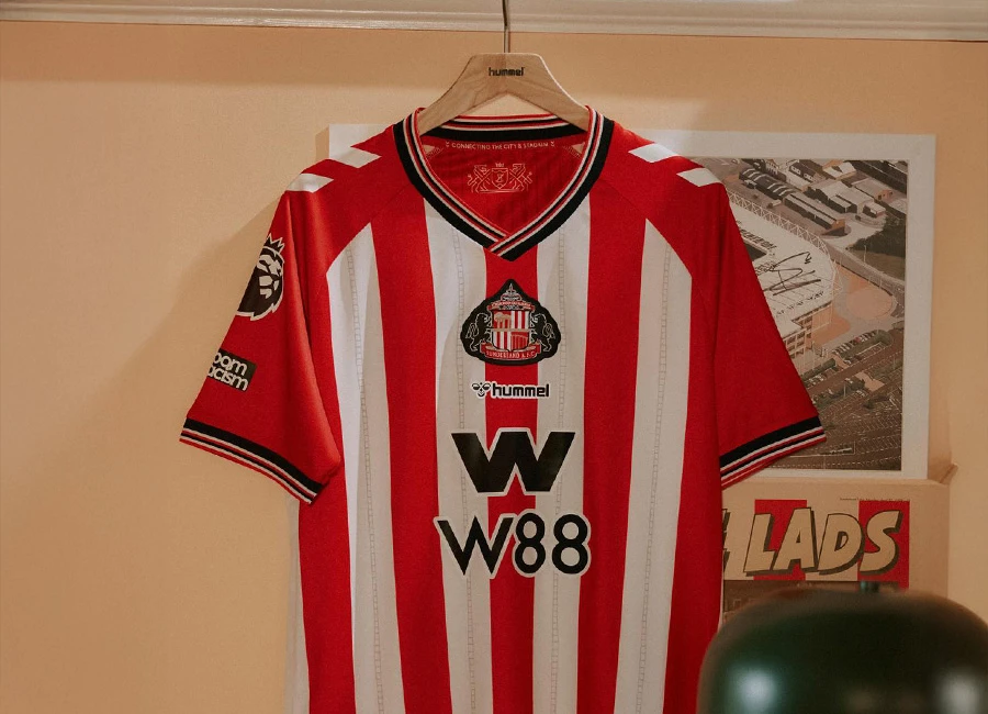
Sunderland AFC have revealed their new 2025/26 Home kit by hummel, which pays tribute to the club’s heritage while embracing contemporary elements.

The design revisits the iconic 1986 to 1988 shirt era, with the club crest returning to a central position for the first time in decades.

The red and white striped shirt includes subtle vertical detailing within the white stripes, referencing the structure of the Keel Crossing bridge. A silhouette of the bridge is placed on the back of the neck, while the inner collar is printed with the message “Connecting the City and Stadium” to symbolise unity between the club and the wider Sunderland community. The city’s coat of arms is also printed inside the collar.

Striped cuffs and a V-neck collar are styled with black, red and white lines, echoing popular designs from the 1980s. The kit features hummel’s ECO8 fabric made from recycled plastic. The W88 sponsor logo appears on adult shirts, while junior kits carry Utilita branding.

cfs Christmas Jumpers 10

The match version of the shirt includes a solid panel on the back to meet number visibility regulations. However, following discussions with the Premier League over the summer, the Club has chosen to offer only the fully striped back version at retail, maintaining the traditional appearance for supporters. Unsponsored versions will be available across all kits this season.

The new kit will be completed with black shorts and matching red socks, and will debut against Hearts in pre-season.

View the: Sunderland 25/26 Away Kit

View the: Sunderland 25/26 Third Kit

Click to enlarge images

Load More


4.3
160 ratings
Vote now!
  • 30
  • 28
  • 29
  • 23
  • 22
  • 8
  • 20
Razza
 · 4 months ago
Comment (Not Required)
Too much goung on down the middle, but it's the bottom 3 Sunderland will be in. Screams relegation kit
Show more
Matt
 · 4 months ago
Comment (Not Required)
Actually that's a great shirt.
I like it
Show more
Knight of the Vale
 · 4 months ago
Comment (Not Required)
Too much going on in the centre. Nice collar and cuff trims. Would have preferred white sleeves and no sponsor, or not that one
Show more
Allan
 · 4 months ago
Comment (Not Required)
Black border round the badge looks awful, especially in the middle of shirt.
Show more
.
 · 4 months ago
Comment (Not Required)
.
Show more
Comment (Not Required)
The outer candle flame 🔥 badge design looks inept. I prefer original design, and positioned to the left. I do like the collar and sleeve trims. Aye, I never did like advertised logos on football shirts! Luv the Black Cats.
Show more
Tim
 · 4 months ago
Comment (Not Required)
All the nice work put into it, but ruined by the layout on the front
Show more
Stephen Campbell
 · 4 months ago
Comment (Not Required)
Hummel could have come up with something much better for our return to the premiership. The sponsorship is to big the badge doesn’t look right. Sorry won’t be buying this one 😡
Show more
Brett Simons
 · 4 months ago
Comment (Not Required)
Badge is too big, and everything else in the centre spoils the shirt.
Show more
avf
 · 4 months ago
Comment (Not Required)
Decent kit ruined by aligning everything down the middle.
Show more