Tottenham Hotspur 24/25 Nike Away Kit

Tottenham Hotspur 24/25 Nike Away Kit

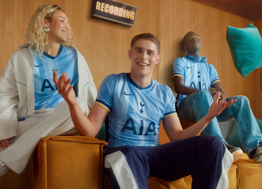
English Premier League side Tottenham Hotspur Football Club (FC) have unveiled their new Nike 24-25 Away shirt.

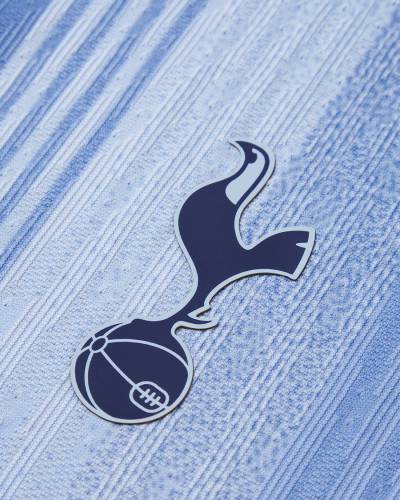
The 2024-25-season Spurs primary-change release is in tones of blue - predominantly sky - and has a stylised-stripe effect that intentionally brings to mind Le Coq Sportif and Hummel looks from the 1980s.

The “Swoosh” from the US supplier takes up its usual position, while the cockerel crest is centralised and other partner/sponsor logos appear in navy to match - including that of AIA, which appears in the red on the Home shirt.

Calling all shirt collectors: FootballShirtCollector.com is coming soon!

We’re launching a new community site created especially for shirt collectors. It’s a dedicated space to connect with others, create your profile, and join a growing network of fellow football shirt collectors.

FSC community

Trim is in navy and - sparingly - yellow and the shorts and socks that complete the kit are in sky blue.

View the: Tottenham Hotspur 2024-25 Home Kit

Load More


3.3
138 ratings
Vote now!
  • 13
  • 22
  • 15
  • 17
  • 17
  • 18
  • 36
BEAT42
  • Member
  • 3
  • 2
 · 1 year ago
Comment (Not Required)
To me this is a masterpiece. This kit reminds me of the 1982/1983 away shirt that I had at the time.
https://www.google.com/search?q=spurs+1983+uitshirt&rlz=1C1GCEU_nlNL820NL820&oq=SPURS+1983+uitshirt&aqs=chrome.0.69i59j69i60.3527j0j7&sourceid=chrome&ie=UTF-8#vhid=N6KY4hNFmLUlsM&vssid=l
Show more
  • Moby 1 year ago
    Dikk
i like football shirts
  • Member
  • 97
  • 6
  • 66
 · 1 year ago
Comment (Not Required)
Collar ruins an otherwise good shirt. Quite like the total 90 style Nike logo and crest placement.
Show more
Stan
 · 1 year ago
Comment (Not Required)
Apart from the awful collar, if I was a Spurs fan I'd be happy with that, not bad from Nike for a change.
Show more
Aylott
 · 1 year ago
Comment (Not Required)
Its nothing like the le coq sportif kits of the early 80s . Nothing similar !! lacks style, creativity and panache..it looks cheap, and looks more akin to a copy of a sunday league type Spall template shirt circa 1987. Usual nike fair - s***
Show more
Razza
 · 1 year ago
Comment (Not Required)
Not bad, not good either. Average just like Tottenham Hotspur F.C.
Show more
Karesz
 · 1 year ago
Comment (Not Required)
my grandfather's pajamas
Show more
Bad shirt mate
 · 1 year ago
Comment (Not Required)
Nike are taking the p iss with this effort, collar is bad and the stripes are awful, also i resent how its bright in some photos and dull in others so can't really tell the shading, if the shirt was a former spurs player it would be someone like Soldado
Show more
tv
 · 1 year ago
Comment (Not Required)
inspired by your grandads old handkerchiefs
Show more
Bob
 · 1 year ago
Comment (Not Required)
Is this is commemorate the 1987 FA Cup final defeat to Coventry?
Show more
  • Dr. Professor 1 year ago
    Hahahahahaha
  • Paragon 11 months ago
    No. They wore white shirts then.
Billy Twarm
 · 1 year ago
Comment (Not Required)
For a spurs away kit, it's not too bad.
Show more