Wolverhampton Wanderers 24/25 SUDU Home Kit

Wolverhampton Wanderers 24/25 SUDU Home Kit

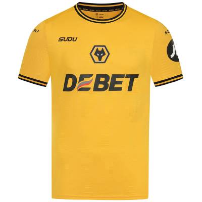
This is the new 24-25 Home shirt for Midlands-based English Premier League side Wolverhampton Wanderers Football Club (FC) - Wolves.

The 2024-25-season primary design, from SUDU, is in the famous “old gold” with black embellishment and has subtle references to the Molineux home ground in the fabric.

The crest is centrally placed, partner/sponsor logos are largely in black and the first-choice kit will be completed with black shorts and old gold socks, although the launch featured old gold change shorts too.

View the: Wolverhampton Wanderers 24/25 Away Kit

cfs Christmas Jumpers 10

View the: Wolverhampton Wanderers 24/25 Third Kit

Load More


3.6
108 ratings
Vote now!
  • 7
  • 18
  • 22
  • 12
  • 16
  • 13
  • 20
eightsouls
  • Member
  • 24
  • 6
  • 8
 · 1 year ago
Comment (Not Required)
maybe make something new and care about shirt sales?
Show more
O Waddock Hunt
 · 1 year ago
Comment (Not Required)
Subu Wasn't she that Scottish woman on the x factor?

Looks like some knock off crap you'd buy off the market and would bring you out in a rash on first contact with human skin.

So perfect for the Dingles fans then. Only hope Subu manage to knock out an xxxxxxl sized version.
Show more
Brett Simons
 · 1 year ago
Comment (Not Required)
Yellow, should be Old Gold.
Show more
Maldini
 · 1 year ago
Comment (Not Required)
Wolves kits always look beautiful to me
Show more
  • Milk, no sugar 1 year ago
    Thanks for sharing that .I think it's dreadful
Sharon
 · 1 year ago
Comment (Not Required)
This kit looks yellow and not what it should be, Old Gold. Too much like Wolves have borrowed a Watford kit.
Show more
Tony cee
 · 1 year ago
Comment (Not Required)
Embellished over priced t.shirt....no style...
Show more
  • Smeghead 1 year ago
    ???
Bob24
 · 1 year ago
Comment (Not Required)
Time will tell as to the quality, but nothing wrong with the design, as basic as it is. I'm sure Wolves fans would love it if the club actually used old gold as the base colour once more, instead of varying shades of yellow.
Show more
SAMU design
 · 1 year ago
Comment (Not Required)
Nice, classy shirt .......but the badge is out of place in relation to the SUDU!
Show more
  • Adhidhas 1 year ago
    Eh?
AndiTheRam
 · 1 year ago
Comment (Not Required)
Not too shabby at all
Show more
Neon Trotsky
 · 1 year ago
Comment (Not Required)
Dreadful
Show more
  • SMEGHEAD 1 year ago
    Stop describing your sex life......