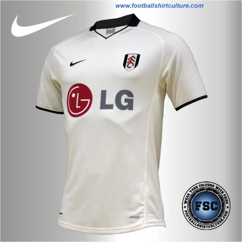
Fulham 2008-2009 Home Nike kit

Fulham officially unveiled their new Nike 08/09 Home Kit. The kit will be officially launched on 15th July when it goes on sale in the Club shops and online.

However if you pre-order before July 4th you will receive your kit before it goes on sale, in the week commencing July 7th.

The shirts are made with Nike FIT performance fabrics and have been designed with a complete layering system to keep players comfortable in a variety of conditions. Feedback from the squad has been extremely positive and we are sure that it will be a big hit with the supporters.

Calling all shirt collectors: FootballShirtCollector.com is coming soon!

We’re launching a new community site created especially for shirt collectors. It’s a dedicated space to connect with others, create your profile, and join a growing network of fellow football shirt collectors.

FSC community

fulham_08-09_home_kit_nike_shirt.jpg

fulham_08-09_home_shorts_nike.jpg

fulham_08-09_home_socks_nike.jpg

fulham_08-09_home_kit_nike.jpg


Write comments...
You are a guest ( Sign Up ? )
or post as a guest
Loading comment... The comment will be refreshed after 00:00.
  • This commment is unpublished.
    fsc · 17 years ago
    i think its a classy kit. They could have got more established players like bullard, dempsey and murphy to showcase the kit to get the fans more \"into\" it, instead of going for leijer, omozusi, nevland, hangeland and johnson. Not quite great marketing of the kit there boys.


    Simple and effective. Since we came to the league, we\'ve had a decent adidas kit ruined by a pizza hut logo, a puma jersey with far too much detail and design, a shocking effort by airness when we were sponsored by Pipex, and last years nike effort which was a bit dull, and the halved white on the shirt didnt work neither did the collar.

    So this is technically our first plain clean and design free kit since we\'ve entered the top tier. i like it, and theres no need for over the top designs such as canterbury or wigan and champions effort...
  • This commment is unpublished.
    fsc · 17 years ago
    A clean, white shirt. Exactly what Fulham should have - you would think. Crap sponsor doesn\'t help it.
  • This commment is unpublished.
    fsc · 17 years ago
    Rather than being \"sick of this template\" I am genuinely pleased to see plain shirts.

    It\'s a classic look and that never goes out of style.

    The best strip I saw all last season was the United Munich tribute kit, and that was because of how \"uncluttered\" it was
  • This commment is unpublished.
    fsc · 17 years ago
    it\'s nice and simple, good fit, the only thing I don\'t particularly like is the collar
  • This commment is unpublished.
    FDV · 17 years ago
    Sick of this template
    but 3/5
  • This commment is unpublished.
    Thomasinho · 17 years ago
    I like it, It\'s simple. Classy.

    I\'m fed up with all others complicated designes, overloaded shirts with stripes going in all directions.

    It\'s clear, tidy.
    Thumbs up to Nike.
  • This commment is unpublished.
    fsc · 17 years ago
    Even though nothing really stands out it still looks like a good quality shirt that has a nice shape and fit to it.
    Loads of teams are either going over the top with there shirts and everyone saying \'what are they doing?\' or they are going to simple and everyone saying \'boring\' and i think that simple is better because then there\'s less things you can get wrong with it.
    I personally think its an improvement from last years top and i especially like the collar with the Fulham detailing on the back and also the black tipping to the sleeves.
    Overall i would give it a 3/5 and a thumbs up (Y).
  • This commment is unpublished.
    fsc · 17 years ago
    it looks tight fitting LOL
  • This commment is unpublished.
    fsc · 17 years ago
    yawn yawn. make an effort Nike.
  • This commment is unpublished.
    fsc · 17 years ago
    Very nice kit indeed - glad the design is simple rather than these insane kits like cantebury ect where they put all these pointless over the top designs for no reason - this is a proper shirt - simple and effective.
  • This commment is unpublished.
    Guest · 15 years ago
    aww naw mate a woodny buy that hing an am a celtic supporter:no:
  • This commment is unpublished.
    Guest · 15 years ago
    ugly :no:
  • This commment is unpublished.
    john.mac · 16 years ago
    Really nice desgin would buy this if it were on sale . I think Umbro did a pin stripe version which was similar to this in the early 80's . Love the fonts for the names and numbers . Nike take note
  • This commment is unpublished.
    Guest · 16 years ago
    hahahahahahaha thats not even it lol :lol: :lol: :lol: :lol: :lol:
  • This commment is unpublished.
    Guest · 16 years ago
    :no: looks like s*i*
  • This commment is unpublished.
    Guest · 16 years ago
    love the deisng but since it beign at thir kit id think it would rarely be used, to be honest i woul like it if the shorst and socks were blakc instead of white lol, but great esigns all the same =] f*c*in love celtic
  • This commment is unpublished.
    Guest · 16 years ago
    I LOve the writing and numbers with the shamrock . looks very irish but where's the nike mate?
    c'mon the hoops
  • This commment is unpublished.
    Guest · 16 years ago
    would buy this real quick
  • This commment is unpublished.
    stemcg1983 · 16 years ago
    g31s3r loving the numbers and font
  • This commment is unpublished.
    stemcg1983 · 16 years ago
    do you know its d*c*s like you above who dis-hearten designers on here with you s*u*i* 1 or 2 word comments, if you dont ahve any good comments to say dont bother, constructive criticism is all good, as long as its not just, ;ugly, s*i*, etc etc... at least we have some origional desings on here done by talented people such as this author, and not the very tired run of the mill template designs we see.