Wolves 08/09 Away Le Coq sportif football shirt

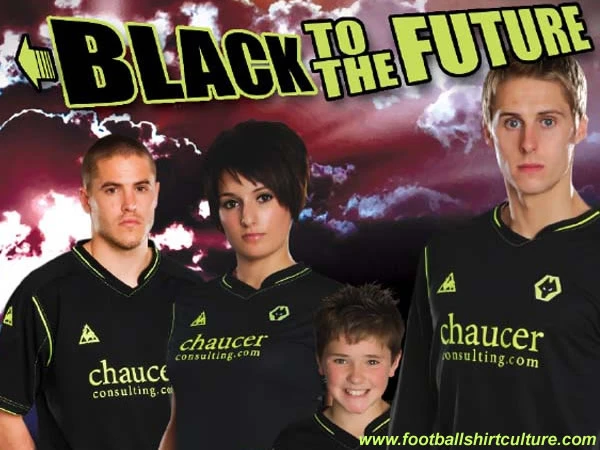
Wolverhampton Wanderers unveiled their new away shirt made by Le Coq Sportif for the 08/09 season.

We already showed you a leaked picture of it back in April, but now it's official. The reaction from Wolves' supporters suggests it is going to be one of the club's most popular change strips ever.

wolves_08_09_le_coq_sportif_away_shirt_kit.jpg

cfs Christmas Jumpers 10


Write comments...
You are a guest ( Sign Up ? )
or post as a guest
Loading comment... The comment will be refreshed after 00:00.
  • This commment is unpublished.
    FDV · 17 years ago
    1/5

    Why lime green and no gold?
    Why that crappy collar???
  • This commment is unpublished.
    rexstone11 · 17 years ago
    hahaha id just buy the jersey so i would be protected on my midnight jogs, those jerseys look like they glow in the dark
  • This commment is unpublished.
    fsc · 17 years ago
    horrible wouldn\' twear it in the bog
  • This commment is unpublished.
    fsc · 17 years ago
  • This commment is unpublished.
    fsc · 17 years ago
    Its just wrong in so many ways.

    I can understand a black away kit but with fluorescent yellow?

    Fluorescent colours just don\'t work!

    Just because Chelsea used it doesn\'t mean every team should have to use it even though the colour has no meaning to the club.

    As a Wolves fan i am just fed up with Le Coq Sportif and there oversized poor attempts of football shirts. Man City are the only team to get some sort of decent design out of it.

    2 things they should focus on for the near future.

    1.] The pattern of the shirt must be symmetrical without any random design.

    and

    2.] The fit of the shirt must be modern and not oversized like every Wolves shirt has been since i\'ve been born.

    GET RID OF LE COQ SPORTIF PLEASE!
  • This commment is unpublished.
    fsc · 17 years ago
    shirt design is verey average, with a ridiculously awful collar!

    not as nice as the blue away

    poor shirt for a poor football team


    Boing Boing Baggies :D
  • This commment is unpublished.
    fsc · 17 years ago
    other than the collar thats a top class shirt for wolves well done Le Coq sportif
  • This commment is unpublished.
    fsc · 17 years ago
    the collar.....wtf?
  • This commment is unpublished.
    Nick · 17 years ago
    Lime green trimmings-why?
    Old gold is so much better-the model looks a touch on the perplexed front! Can\'t say I blamer the poor soul, the coller does look as if it isn\'t sure what it is meant to be + it looks as if it isn\'t going to comfortable to plasy in-which is the entire point of these kits and will the shorts clash-mainlly due to the fact they are the same similar colour to the home shorts.
  • This commment is unpublished.
    fsc · 17 years ago
    not a scratch on hull city\'s away shirt.

    flint coloured shirts are the future.
  • This commment is unpublished.
    fsc · 17 years ago
    I\'m with everyone else, that would be a great kit if it wasn\'t for that freaky collar. It\'s the first thing that catches your eye and really detracts from the overall shirt.
  • This commment is unpublished.
    fsc · 17 years ago
    erm, tis ok I suppose. Last season\'s navy blue effort was much better.
  • This commment is unpublished.
    fsc · 17 years ago
    The collar looks awful
  • This commment is unpublished.
    Thomasinho · 17 years ago
    The collar is weird but the overall design is quiet simple.
    I like it.

    3.5/5