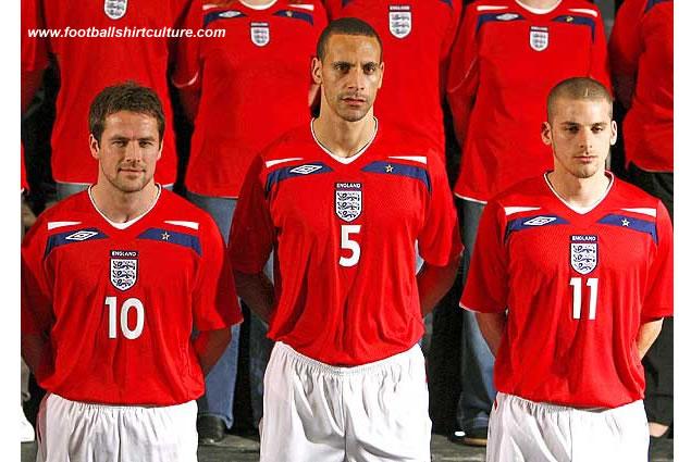
New England 2008 away Umbro kit launched

The new 2008 England Away Kit was officially launched this afternoon and will make its debut at Wembley on Wednesday for Fabio Capello's first game in charge.

The new shirt, which sees the Three Lions crest in the centre of the chest, will be worn during the 2010 World Cup qualifying campaign and will mark the beginning of a new era for the team. England’s rich heritage is married with revolutionary technology by incorporating a QR (Quick Read) code into the shirt’s label. This effectively serves to bring the shirt to life, enabling fans to access a unique QR website.

Upon photographing the code with their mobile phones, fans will be taken to the website where they can obtain exclusive content about UMBRO and England.

This is the first time that QR code has ever been incorporated into a football shirt.As regards the strip’s other technical features, comfort and ease of movement is central in the shirt's design. The shirt has been anatomically cut to emphasise the athleticism of the player, whilst a twill mesh body fabric ensures that it is both lightweight and breathable. Other benefits include a hybrid neckline and a specially shaped underarm gusset, which maximise comfort and mobility.

Calling all shirt collectors: FootballShirtCollector.com is coming soon!

We’re launching a new community site created especially for shirt collectors. It’s a dedicated space to connect with others, create your profile, and join a growing network of fellow football shirt collectors.

FSC community

The new shirt, which sees the Three Lions crest in the centre of the chest, will be worn during the 2010 World Cup qualifying campaign and will mark the beginning of a new era for the team

New england kit 08/09 by umbro


Write comments...
You are a guest ( Sign Up ? )
or post as a guest
Loading comment... The comment will be refreshed after 00:00.
  • This commment is unpublished.
    fsc · 17 years ago
    I don\'t know why the people here didn\'t like it. I think it\'s beautiful. I like Umbro shirts much more than Adidas or Puma.
  • This commment is unpublished.
    johnnycakes · 17 years ago
    looks like a york city/crewe alex kit!
    agree about the badge too,why did they start putting ENGLAND above it.And the star belongs above
  • This commment is unpublished.
    fsc · 17 years ago
    :-x :-x :-x its not very nice at all. the star is in the wrong place and the number is too big :angry: :angry: :angry:
  • This commment is unpublished.
    fsc · 17 years ago
    i have hated other umbro kits this season but this is gorgeous i wish it was the umbro template used for other kits. I also wish this was the home kit ! Suberbe x
  • This commment is unpublished.
    cronaldo7 · 17 years ago
    Not too bad, in my opinion. It\'s different, that\'s for sure. It\'s ten times better than the current umbro line, that\'s for sure.
  • This commment is unpublished.
    fsc · 17 years ago
    i guess you have to qualify to get good kits :P
  • This commment is unpublished.
    fsc · 17 years ago
    ugly
  • This commment is unpublished.
    fsc · 17 years ago
    a lot nicer than the current home, but the badge in the middle ruins it.

    bring back red numbers on the home shirts.
  • This commment is unpublished.
    fsc · 17 years ago
    It would look alrite if it wasnt for those s*u*i* ugly navy and white flashes.And I think the badge always looks crap when centrally positioned.
  • This commment is unpublished.
    fsc · 17 years ago
    I\'ve never forgiven Ummm... bro for the all maroon debacle and the grey striped away shirt kit from Euro 96. This is appalling.

    Also, another bug bear for me: why does the England badge, the three lions, one of the most famous emblems in the history of football have to have the word \"England\" written above it? It\'s like writing \"Mona Lisa\" all over the Mona Lisa. God I hate marketing people.
  • This commment is unpublished.
    fsc · 17 years ago
    thats ugly:sad: i wish umbro would just disapear off the planet they\'ve made some ragged horrible shirts
  • This commment is unpublished.
    fsc · 17 years ago
    It\'s g*s*! Ugh.
  • This commment is unpublished.
    fsc · 17 years ago
    I quite like it...was fearing a generic umbro kit like the home one with diamonds everywhere but it looks alright. The blue bits make it look a bit different. Why is Gareth Barry modeling it? As well as he played against Israel and Russia surely he\'s not one of our top players?
  • This commment is unpublished.
    fsc · 17 years ago
    i hope this isnt wat every single other umbro shirt will be like next season
  • This commment is unpublished.
    ali · 17 years ago
    horrible :-x
    umbro are horrible
  • This commment is unpublished.
    fsc · 17 years ago
    it\'s navy blue.

    it\'s a bit similar to the WC 82 away kit
  • This commment is unpublished.
    fsc · 17 years ago
    the England Logo and Number are to cloose to each other for my taste and

    what is the black for - in memmorial of not qualifying ?!