The new kits for the 2007-2008 season have been revealed by Adidas and Fenerium with some elegant and modern designs on show, which took place at Fenerbahce Faruk Ilgaz Facilities.
The new centenary kits for the 2007-2008 season have been revealed by Adidas and Fenerium with some elegant and modern designs on show, which took place at Fenerbahce Faruk Ilgaz Facilities.
A new yellow-white striped away shirt is in the collection to add to the new striped home design , the legendary shirt synonymous with Fenerbahce. There is also the brand new turquoise shirt symbolising the power and pride of being a Turk. The new design has been presented by our footballers and models.
Haluk Özmutlu, the head manager of Adidas, said that they are very proud to work with Fenerbahce. ’We have been working with Fenerbahce for three years. We are proud of every title Fenerbahce has won. I hope that Fenerbahce will win lots of titles in this upcoming season.’
The new kits for the 2007-2008 season have been revealed by Adidas and Fenerium with some elegant and modern designs on show, which took place at Fenerbahce Faruk Ilgaz Facilities.
The Vice-President Murat Özaydinli thanked our sponsors and fans for being supportive. ’We instituted our official fanshop Fenerium 7 years ago. Our first shop was a small room. Today Fenerium has become one of the most prestigious fanshops in the world. I thank you for helping us with the development of Fenerium.’
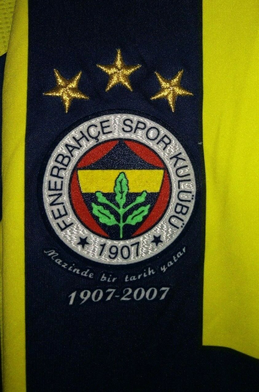
The Fenerbahçe emblem was designed by Topuz Hikmet who played left wing in 1910 and was made by Tevfik Haccar (Taşcı) in London. The emblem consists of five colours. The white section which includes the writing Fenerbahçe Spor Kulubu 1907 represents purity and open heartedness, the red section represents love and attachment to the club and symbolises the Turkish flag. The yellow middle section symbolises admiration and envy, while the navy symbolises nobility. The oak acorn leaf which rises from the navy and yellow section shows the power of Fenerbahçe. The green colour of the leaf shows the success of Fenerbahçe is imperative.
Topuz Hikmet describes the story of the emblem:
After the change of the club’s colours from yellow and white to yellow and navy, it was an issue to create an emblem with our new colours. My friends left the design of this emblem to me. Firstly, I brought together the colours of our national flag, red and white. Then drew a heart shape over the red and gave it a yellow and navy colour, adding an acorn leaf that represents resistance, power and strength. I wrote the club name and foundation date on the white section. When drawing our emblem, I tried to give this meaning: Serving the club with dependence from heart. The design was favored by my friends and our new emblem was made through the guidance of Tevfik Haccar, who was in Germany at time. After the new alphabet was approved, the design was protected, but the club name on the emblem was changed to Fenerbahçe Spor Kulübü - 1907.

